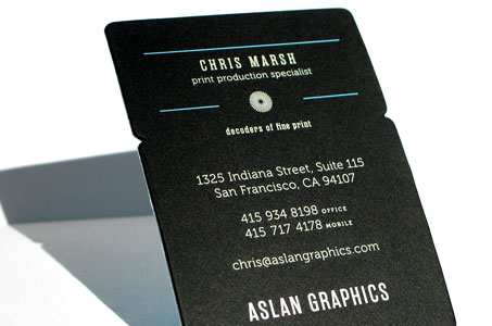
You’d expect a print broker to have a great business card, and that’s exactly what Aslan Graphics has. Feast on these designer elements:
The texture of the raised engraved ink against your fingertips …
That white against black on the edge of the card …
Those lovely little notches in the side …
The great thickness from laminating two stocks together …
One side the business card contains all of these physical attributes. It’s something that simply can’t be simulated on a computer screen.
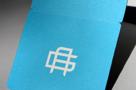
I also like the other side of the card for completely different reasons. Using a full bleed robin’s egg blue is a soothing relief from the drama of the black side. But there is still visual interest – a bold monogram-inspired logo reversed to white and a subtle crosshatch pattern that balances the weight of the logo.
So, expectations have been met … and then some.
Aslan Graphics Business Cards were featured as a Paper Inspiration.


