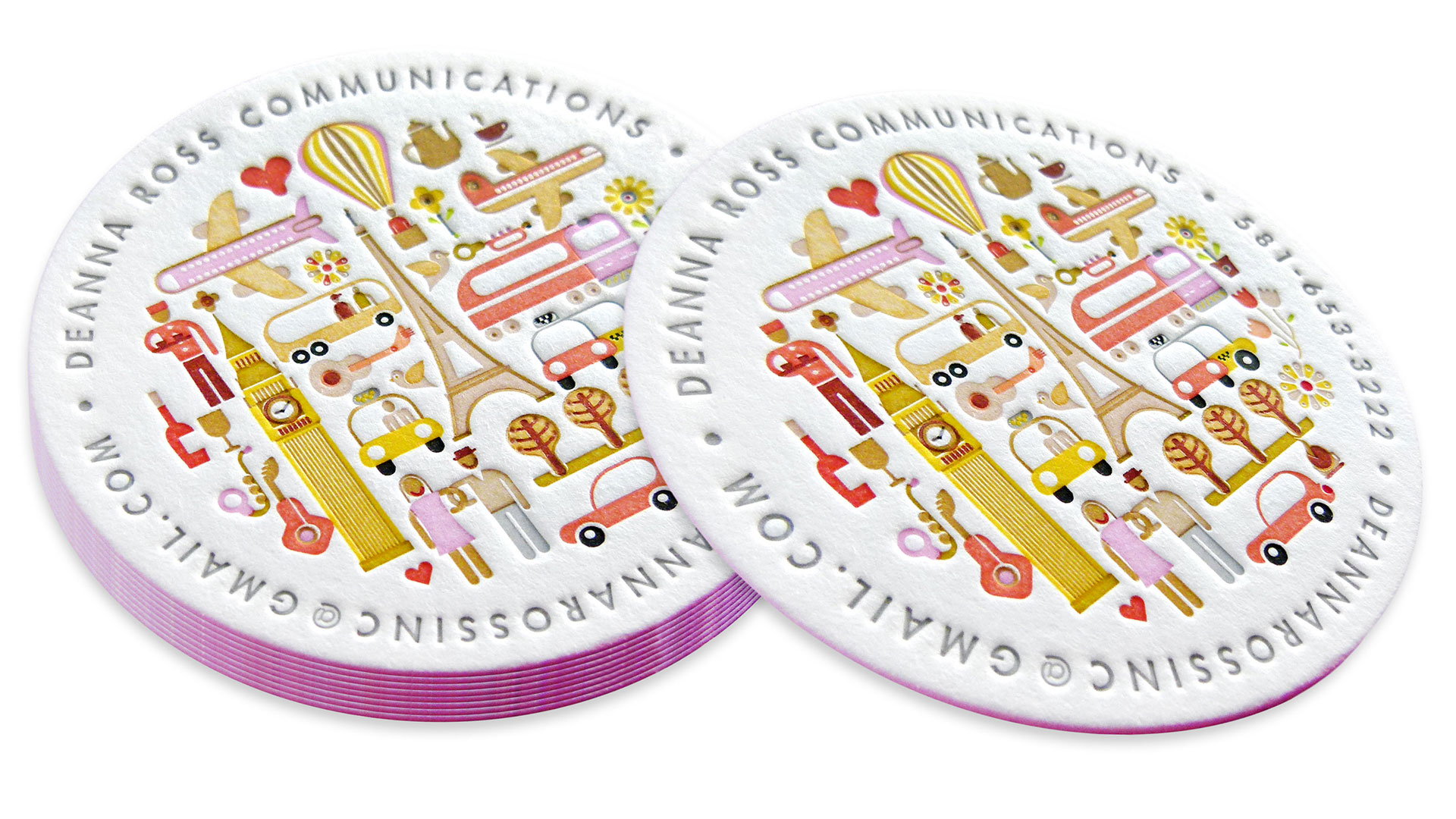
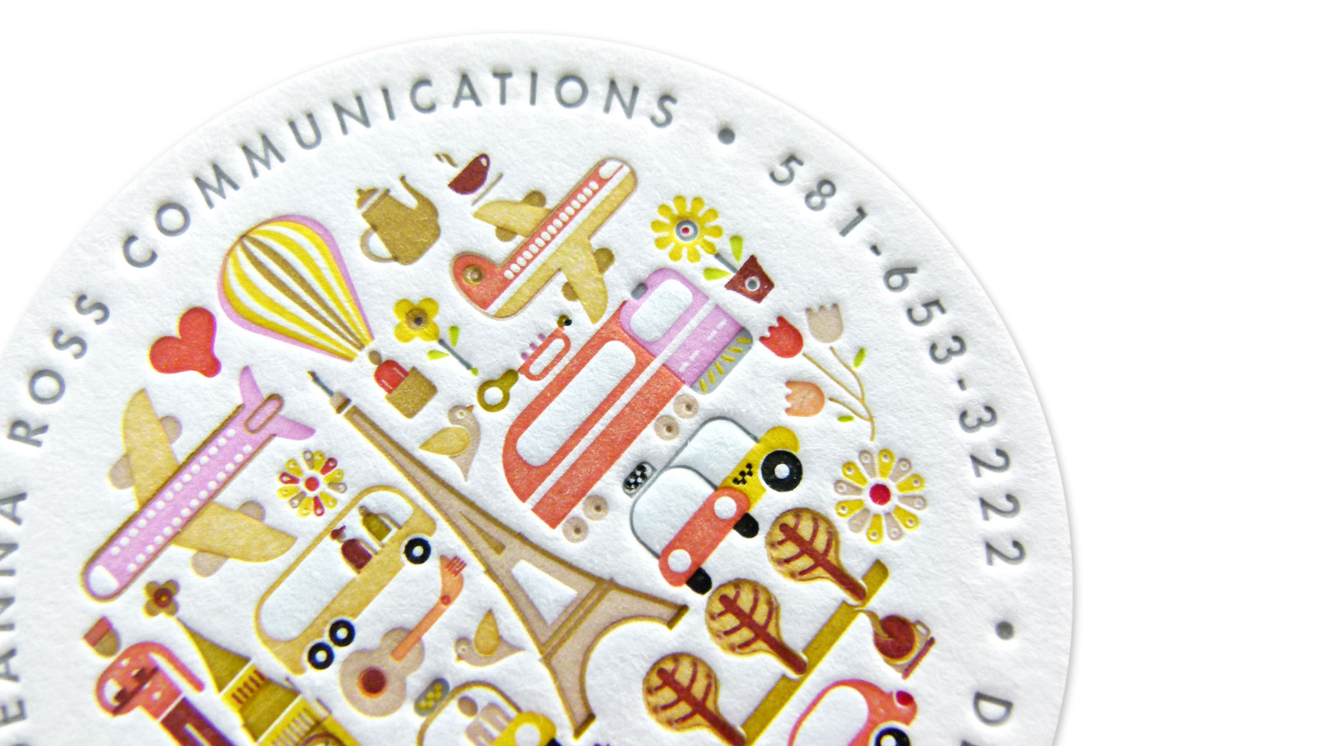
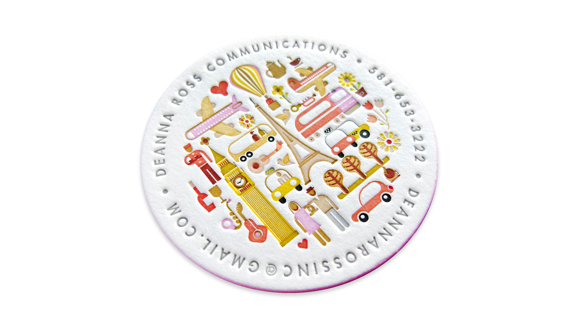
If you want to pacify a child these days you give the little darling your smartphone. And to get a little peace and quiet from a designer? I recommend handing them a letterpress-printed business card from Jukeboxprint.com. This one for Deanna Ross Communications is a wondrous example of why we love Jukebox: an uncommon shape, compelling edge painting, and more colors than you can shake a paintbrush at.
Delightfully designed by Dan Jazzia, this is a brilliant example of a business card that gives you all the relevant contact details without sacrificing an inch of aesthetics.
“The design is a perfect fit for letterpress,” says Jukeboxprint.com. “Produced with a deep impression that you can feel, this design is letterpress at its very finest…. Business cards don’t need to be square. By going with these 2.5″ circular cards the design only adds more flavor to its specialness.”
Reinforcing that “deep impression that you can feel” is Neenah Crane’s Lettra Cotton Fluorescent White 220 Cover DT sheet. “The bright white cotton stock is our highest recommended stock for showcasing the crisp impression of the letterpress details,” says Jukebox, “and shows off each individual color to significant effect.”
“Each individual color,” as in 15 Pantone colors, including a rich pink around the edges of each card.
In an age when sending a person a LinkedIn request seems to be de rigueur for swapping contact details, there’s something deeply civilized about being handed such a beautiful piece.

