Production and the printer are the most important part when it comes to complicated designs!
– Denice Sanchez, Clampitt Paper
For 13 years Clampitt Paper has honored the sacred bond between designers and the grape with its “Wine Label Competition.” And in the interests of leading by example, its 2016 call for entries was equal parts clever and whimsical, with just the teensiest bit of intoxication thrown in for good measure.
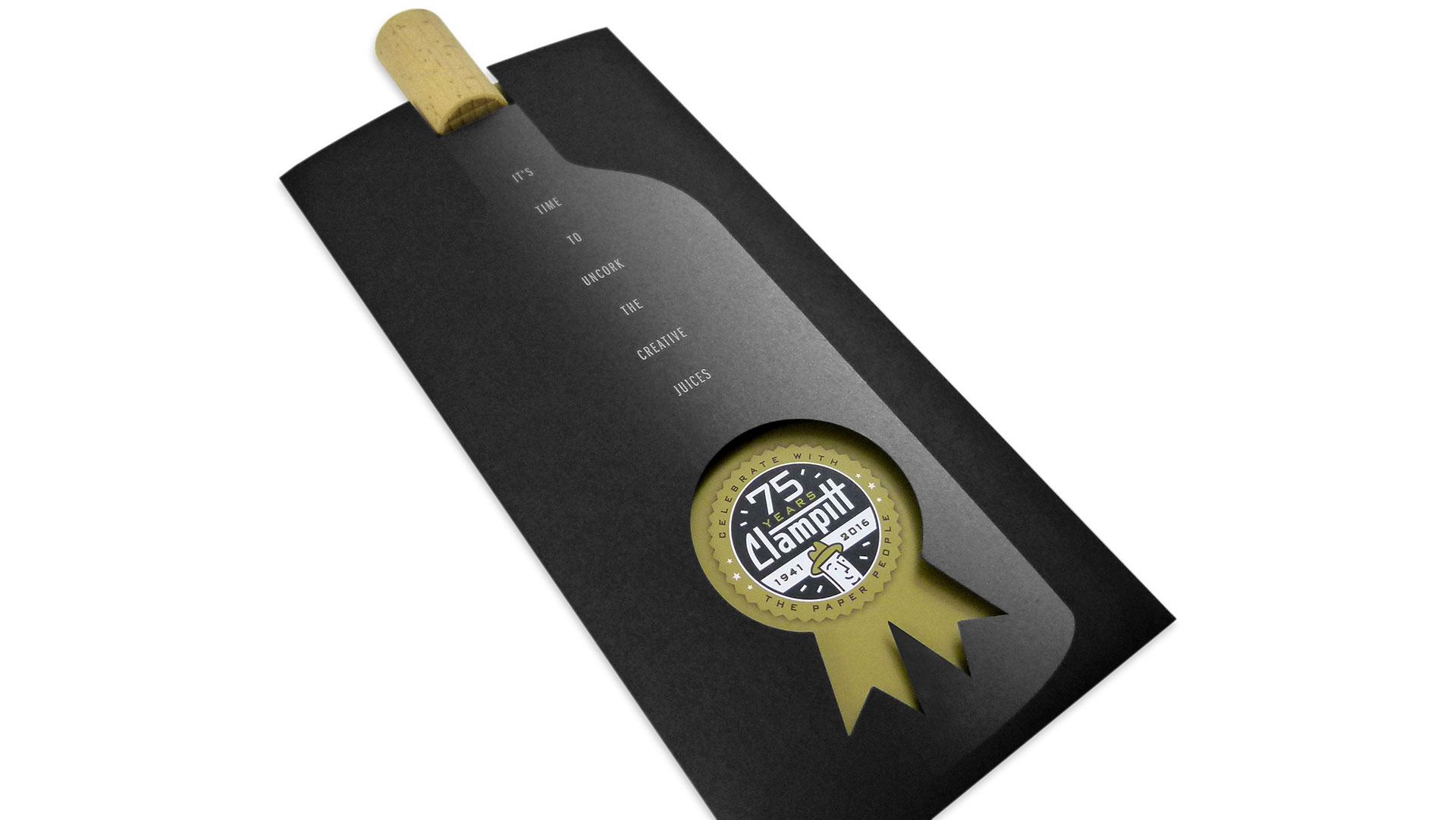
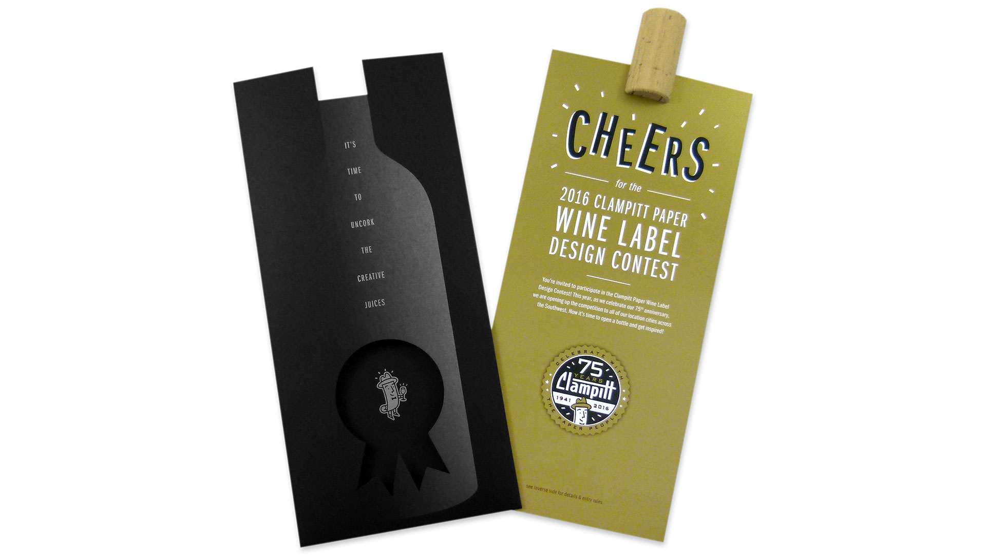
Crafted by Dallas’ O&H Brand Design, the piece was printed offset with metallic inks by that city’s Ussery Printing. The gradient printing on the Neenah Classic Crest Epic Black 130 lb. Cover for the holder is downright inspired, giving the subtle impression of a black wine bottle emerging from the shadows.
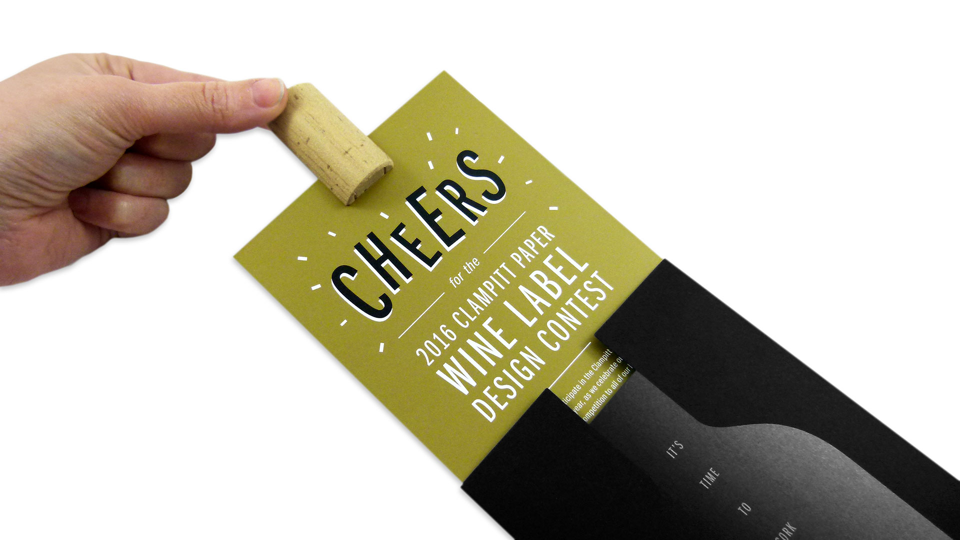
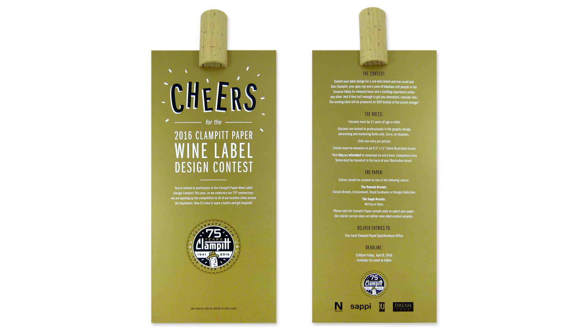
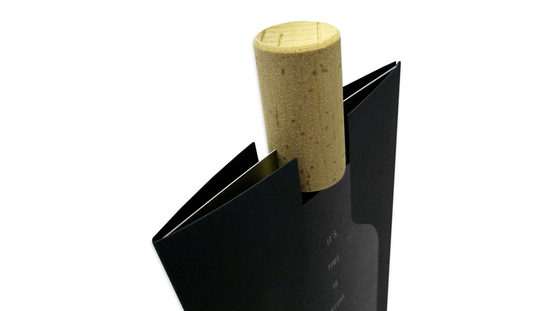
“The holder was die cut, then scored and folded to hold the card,” explains Clampitt Paper’s Denice Sanchez. “The cork was slit with a contraption made by the printer, and then a drop of glue was applied with a syringe to each cork slit and applied to the card. I also love how the cork ties into our event and can be used as a stand for the card.”
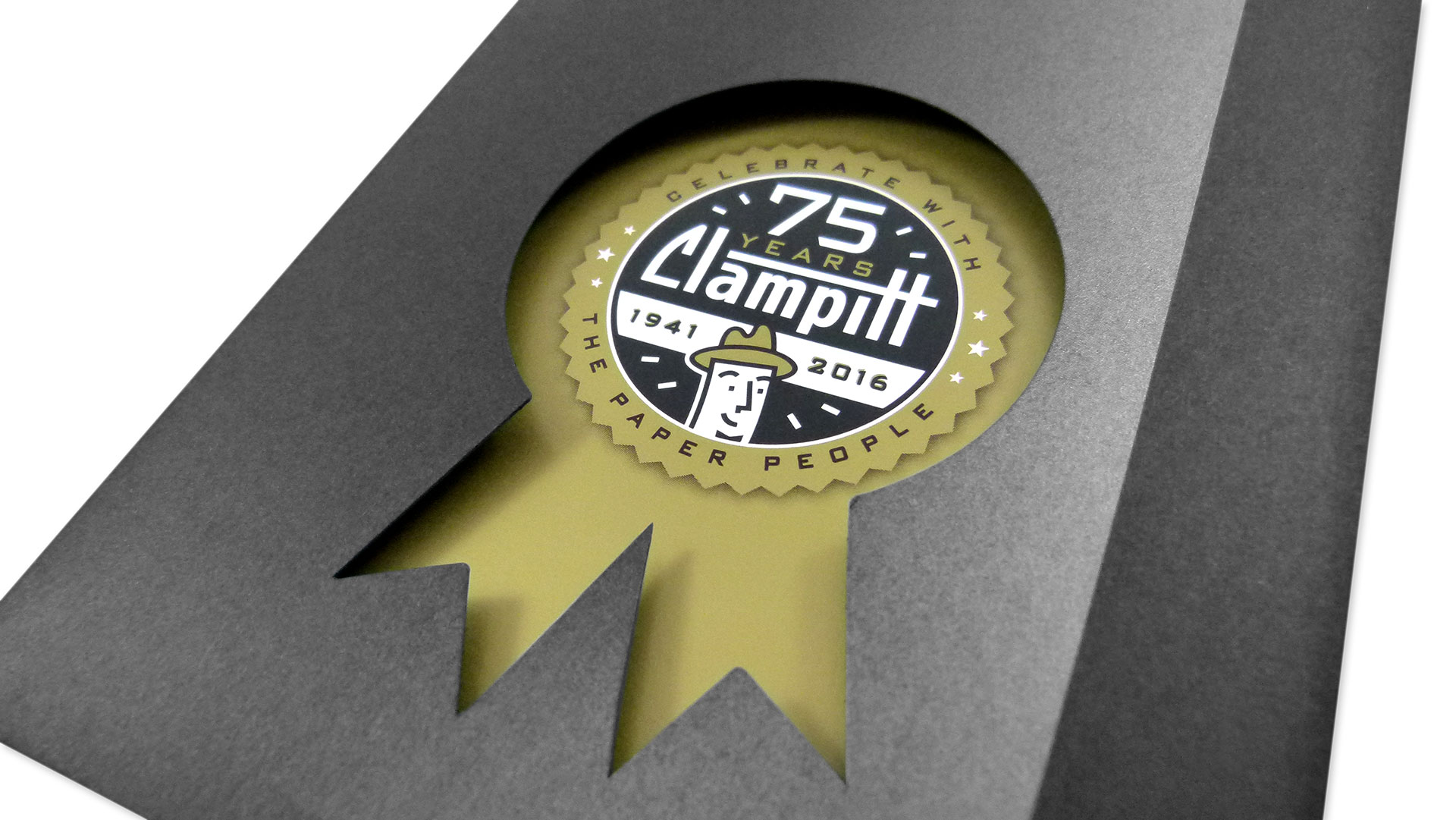
That contest-ribbon die cut is particularly effective as it lines up perfectly with the Clampitt seal printed on the Sappi McCoy Silk 130 lb. Cover card inside.
“I think the die cut where our character (Barney Fiber) is holding a glass of wine after you pull out the card is a subtle yet super cute addition to the piece,” Denice admits. “Also the metallic inks look super sharp on this.”
Perhaps the most impressive detail is the way in which the wine-bottle-shaped printing on the holder combines with the cork at the top to fool the brain into thinking you’re actually holding something that possesses a bottle’s curvature. It’s an impression that only deepens after a glass or two of your favorite vintage, of course. After all, you wouldn’t want Barney Fiber to have to drink alone 😉

