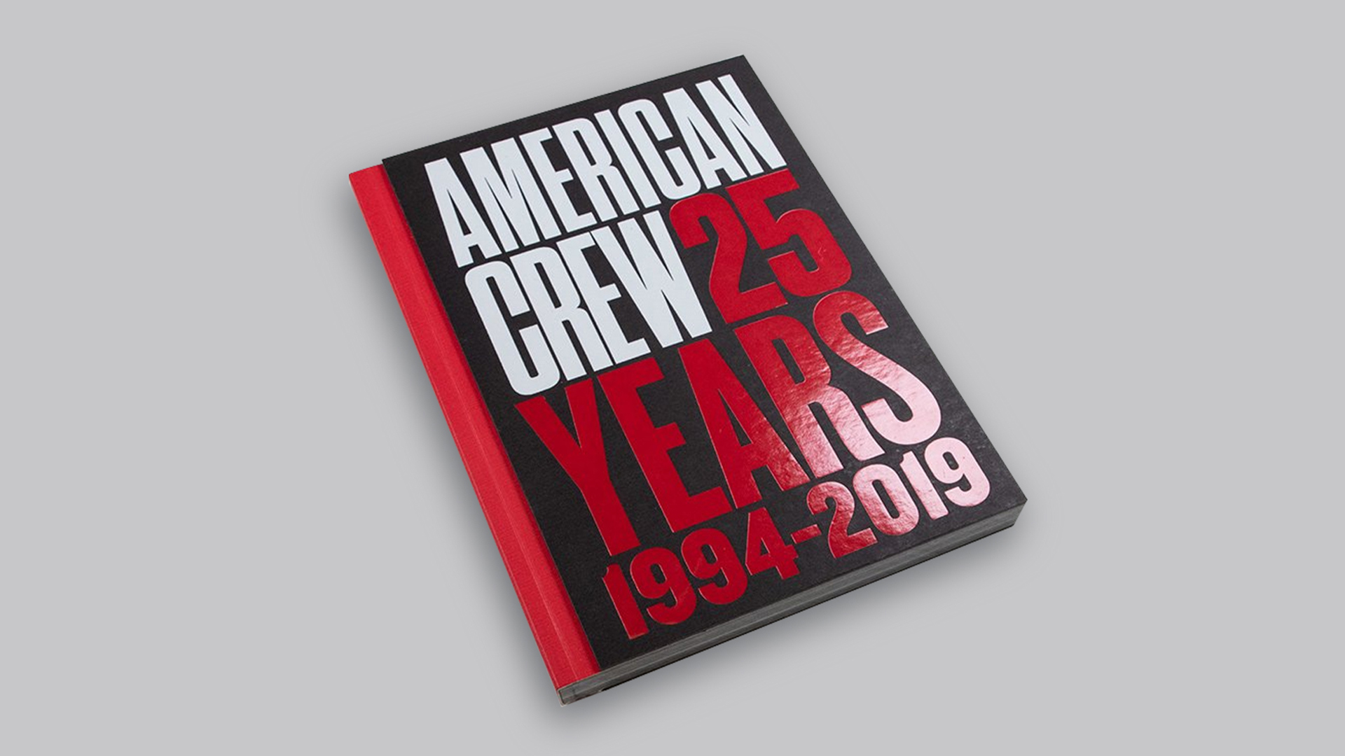
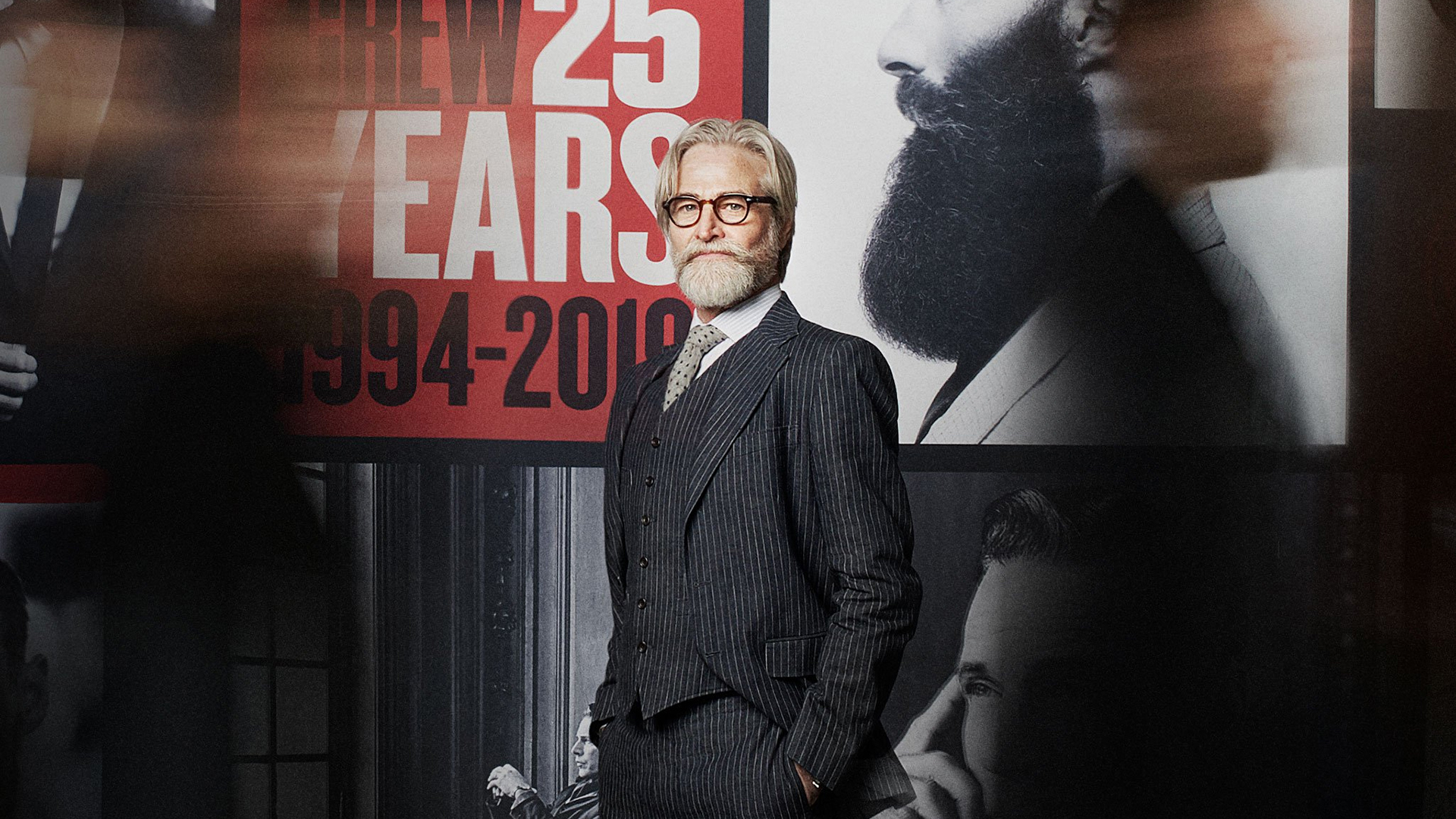
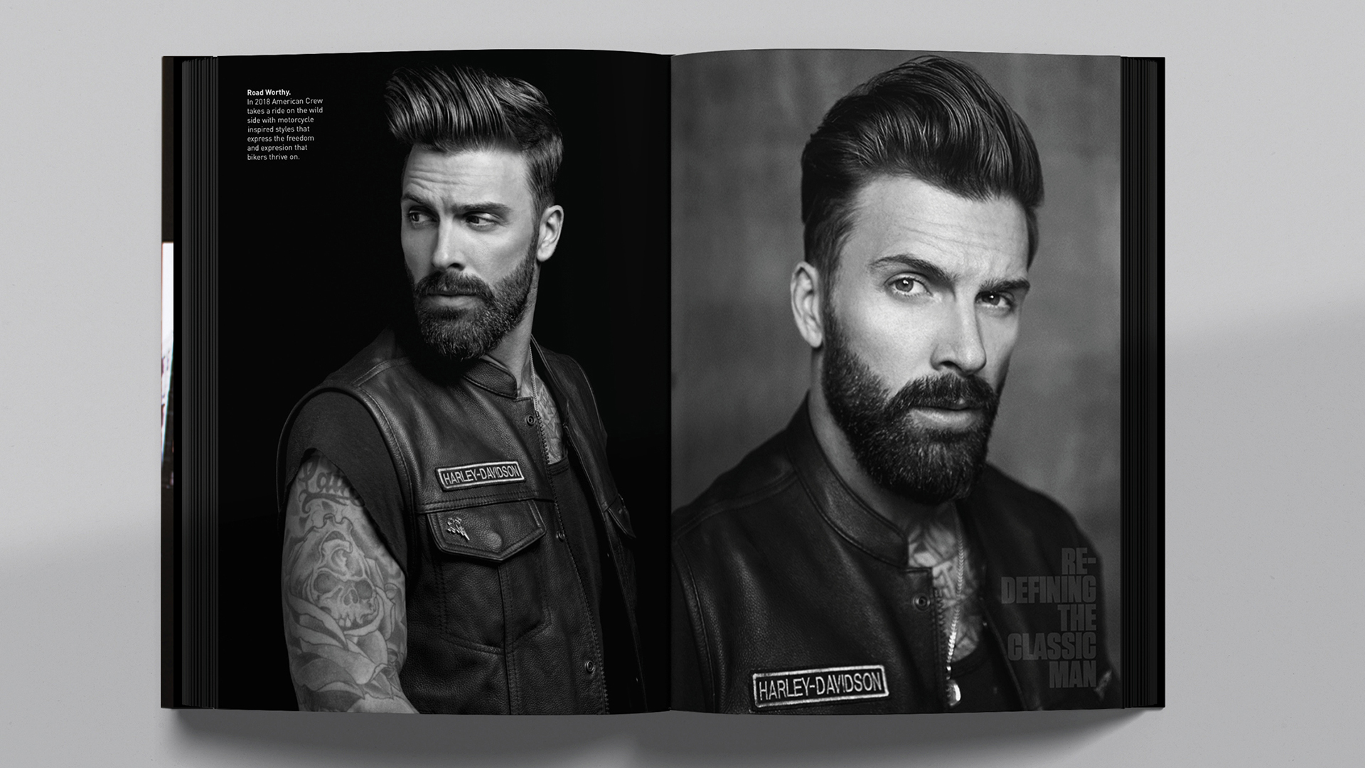
From sculpted locks to finely trimmed beards, many men are quite particular about their personal grooming these days, but it wasn’t always that way. Credit for this trend is often handed to grooming products brand American Crew, whose 25-plus year legacy is lovingly documented in a riot of high-contrast design, compelling photography, and rich texture that you only get from uncoated paper.
A Past-Meets-Present Aesthetic
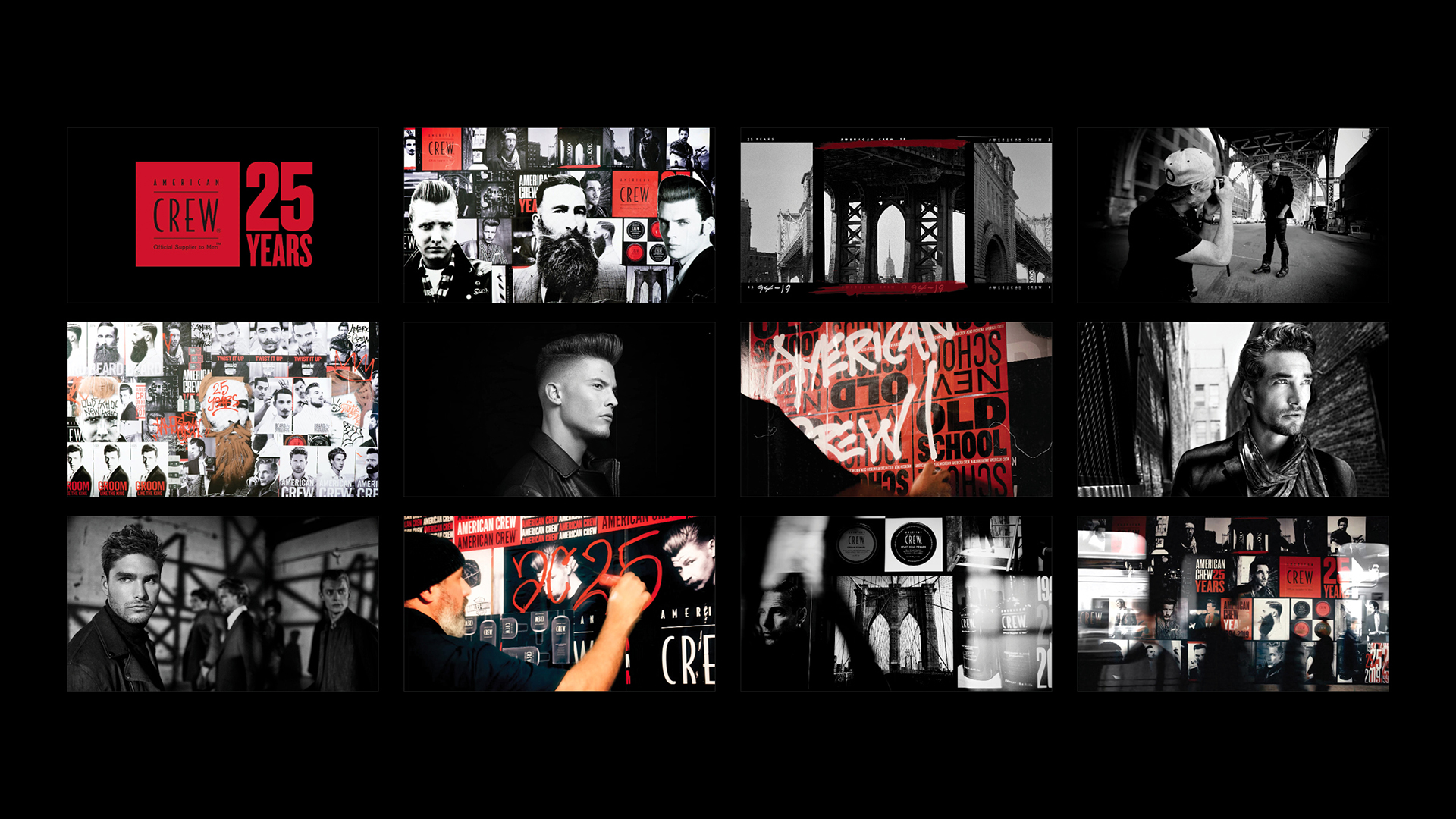
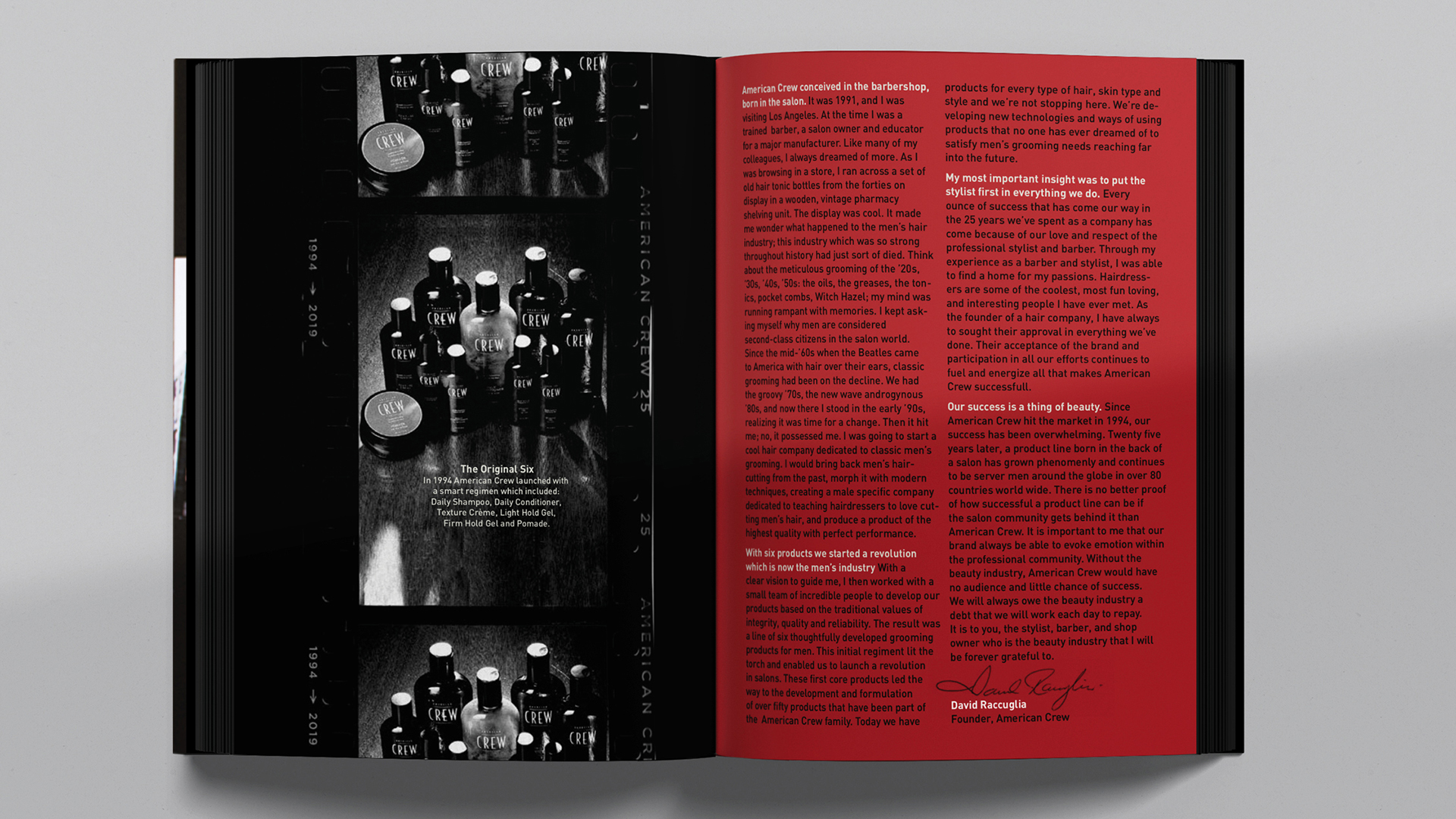
Founded by Chicago hair stylist David Raccuglia in 1994, American Crew has grown to include dozens of grooming products sold directly to salons and individuals, from shampoos and colognes to mustache waxes and lotions. And from the very beginning design firm TODA has, working closely with David and his photography, shaped the look and feel of the brand in its marketing materials. A quick flip through the book “American Crew 25 Years” reveals just how effective this unique aesthetic can be.
Displayed in salons across the country this book, which allows clients to browse styles while waiting for the next empty chair, feels utterly timeless. This is due to the creative tension between TODA’s modern design and David’s moody, high-contrast monochrome photography. In this mix of past and present, it is the past that clearly wins out.
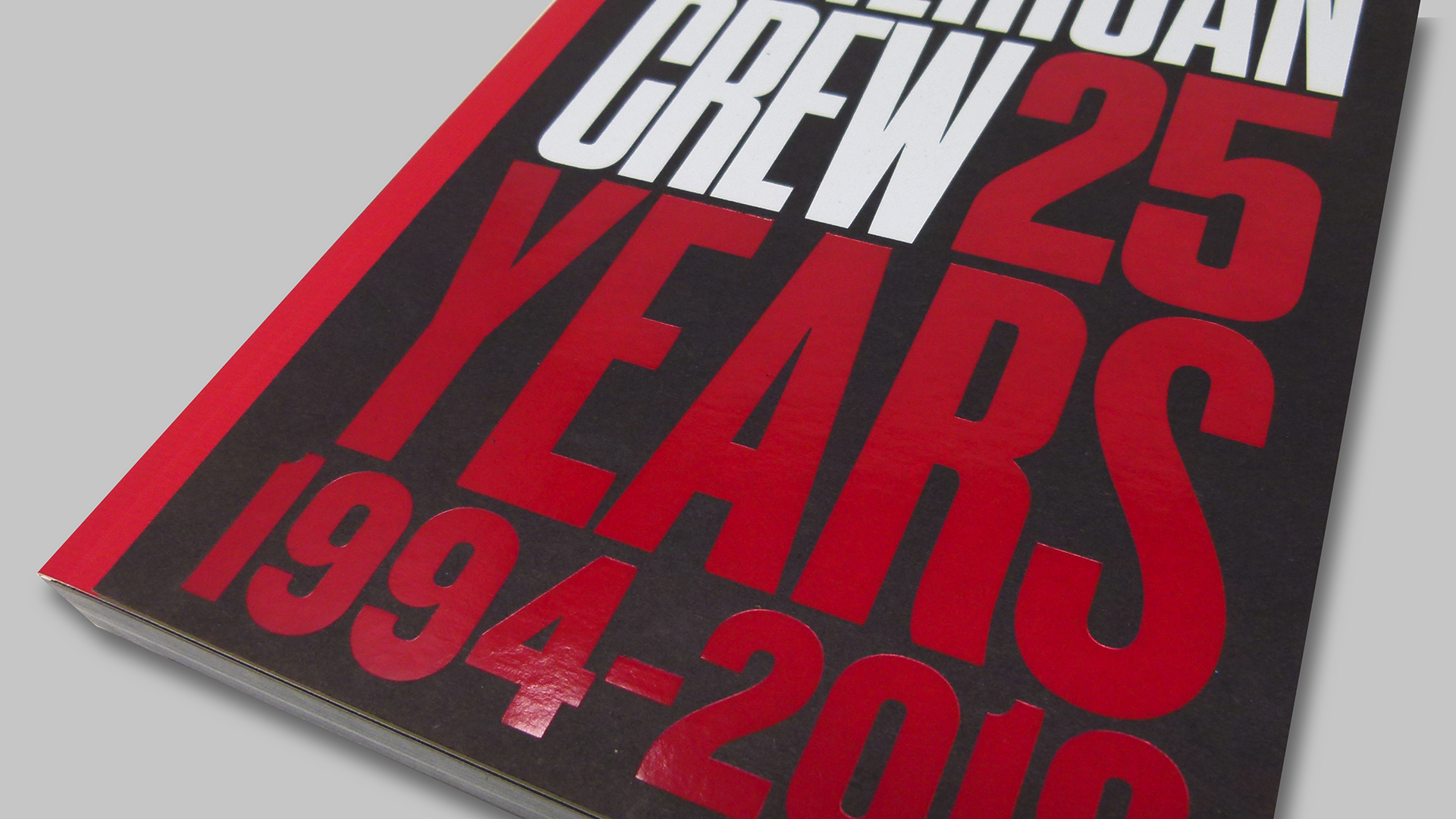
From its sparing use of just a few accent colors to the occasional glimpse of American Crew’s packaging, it’s not hard to see the influence that tonic bottles and photography of the 1940s had on David, the brand, and ultimately, this book. The one big nod to the present here – Red and White hot foil stamping on the super-thick Black cardboard cover – makes this a hard volume not to pick up.
A Raw & Textured Paper Choice
The use of Domtar Cougar’s uncoated paper [PRO members: Get Swatchbook!] for this book – the go-to sheet for previous American Crew publications, as well – accomplishes a couple of things at once. First, from a design standpoint, its texture enhances the fine details of the hairstyles depicted, while also showing off the rich Blacks used throughout. (TODA specifically requested 2 hits of Black.) One of the biggest challenges facing the book’s printer, Active Graphics (projects / website): keeping those Black areas super-dark without losing the highlights in the high-contrast photography.
The second benefit of an uncoated sheet might be psychological. With its rough, raw feel, it gives off a certain masculine air, which can’t hurt when you consider American Crew’s target audience. (Though you certainly don’t need a Y chromosome to appreciate an uncoated sheet 😉 )
While perfect binding was the perfect choice for this book, there are so many different binding options they could’ve used, many of them providing the “lay-flat” quality you need for a coffee table book meant to be opened again and again.
Discover the pros and cons of nearly every binding option there is – download your free PaperSpecs Binding Cheat Sheet now!

