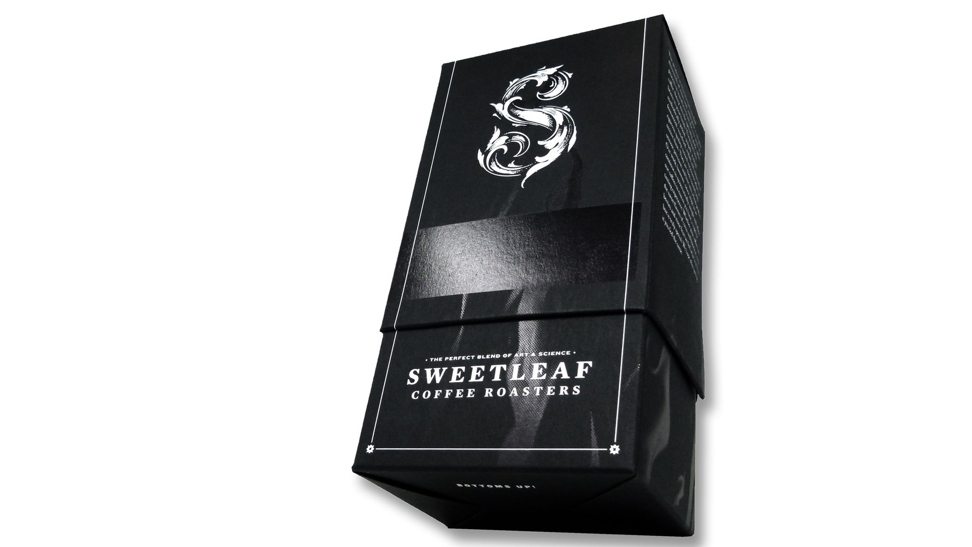
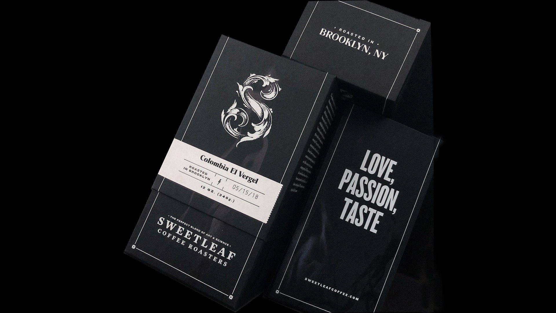
However much today’s printing techniques help you to make colors “pop,” sometimes nothing stands out quite like the stark contrast between black and white. This is something design studio Topos Graphics and letterpress masters Studio On Fire ably demonstrated with their creative packaging for New York City coffee roasters Sweetleaf. Its combination of dazzling foils and hand-crafted-looking letterpress labels is as eye-opening as their strongest artisanal blend.
What Makes this Creative Packaging?
With names like Easy Rider and flavor profiles that include Pineapple, Creamsicle and Agave, the coffee’s packaging had to reflect its uniqueness.
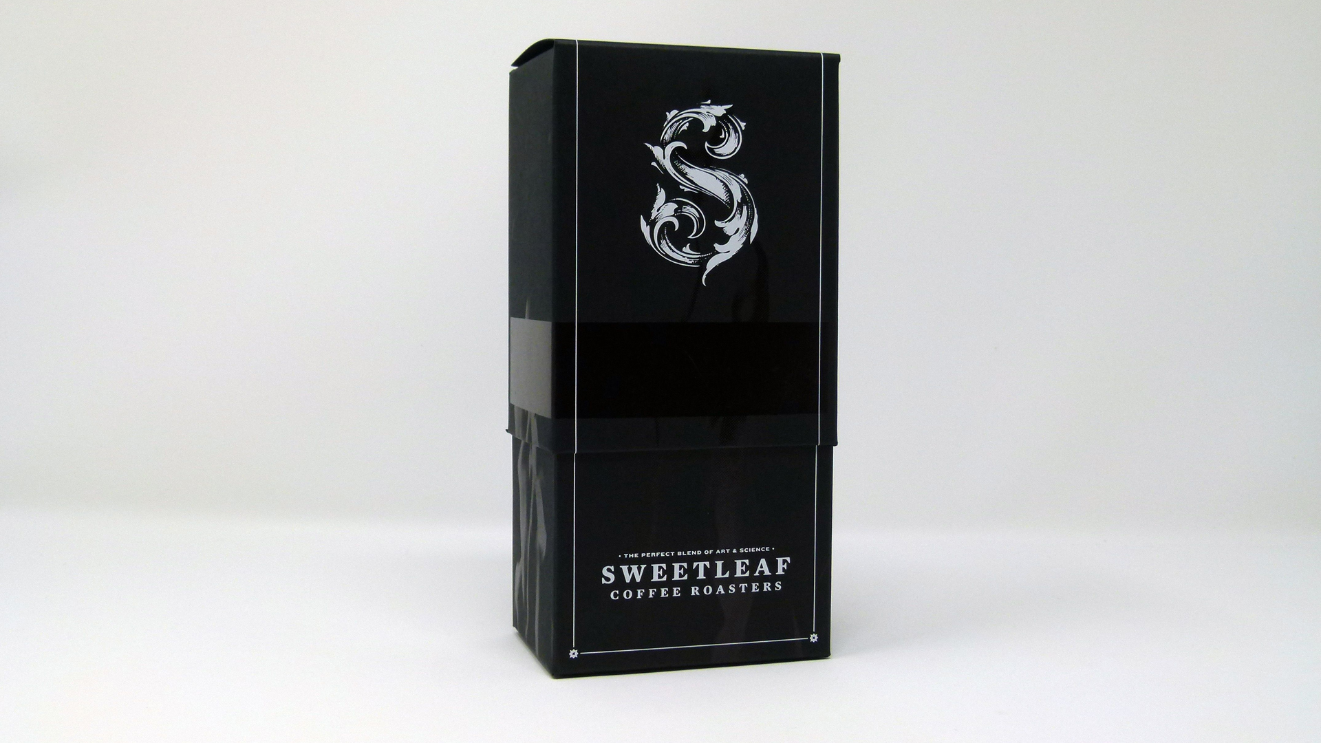
Unlike other coffee packaging, the creators opted for a rectangular box with a telescoping lid – something more associated with lifestyle products such as makeup and perfume than freshly roasted coffee. (Though Studio On Fire is in no stranger to this when it comes to cannabis packaging – check out their work for Zoma here.) Each half is crafted from 120 lb. Deep Black Neenah Folding Board [Get Swatchbook] with that finger-pleasing Eggshell finish.
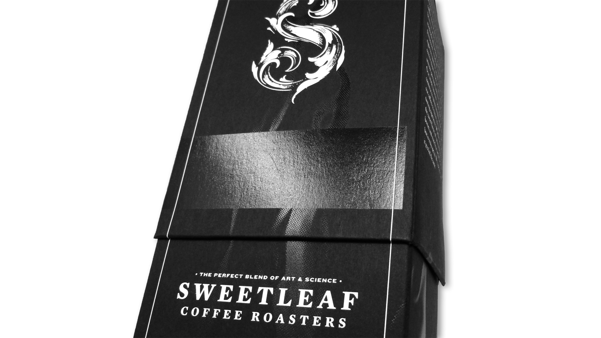
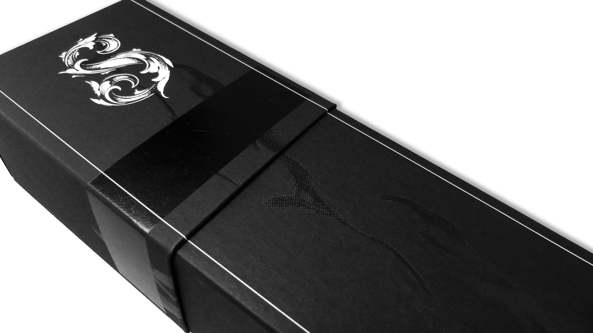
In what might be a nod to Sweetleaf’s namesake – the company takes its name from Black Sabbath’s 1971 paean to marijuana – this creative packaging is also bedecked with Black foil steam that rises to entangle itself with a baroque “S” made of White foil.
In a feat of utter perfectionism, the steam is imprinted on the top and bottom halves of the box, which gives the appearance of the steam growing taller as you pull up the lid, the steam image fitting perfectly where the two box halves overlap.
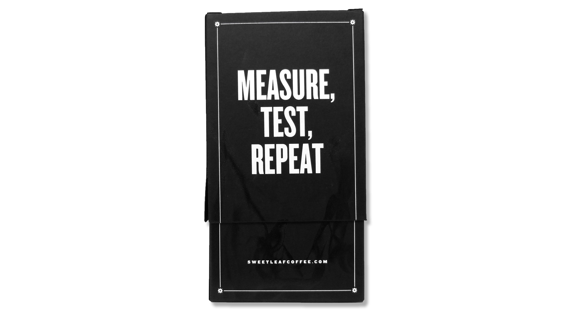
The rest of the package is admirably restrained, with only the words “Measure, Test, Repeat” on one side, and a short mission statement on another.
The finishing touch, and it’s a delicious one, is a white kiss cut label letterpress printed with the basics, including the coffee’s name, the beans’ countries of origin, varietal and taste notes (e.g., “chocolate”).

