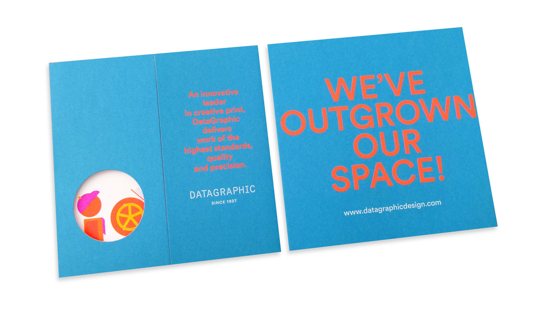
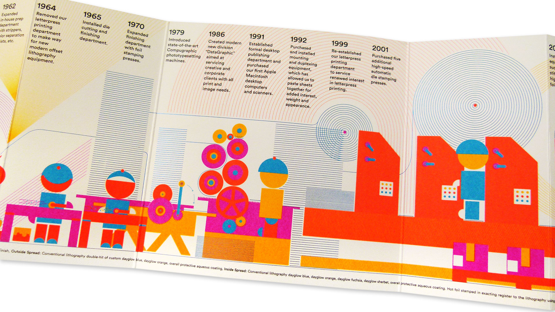
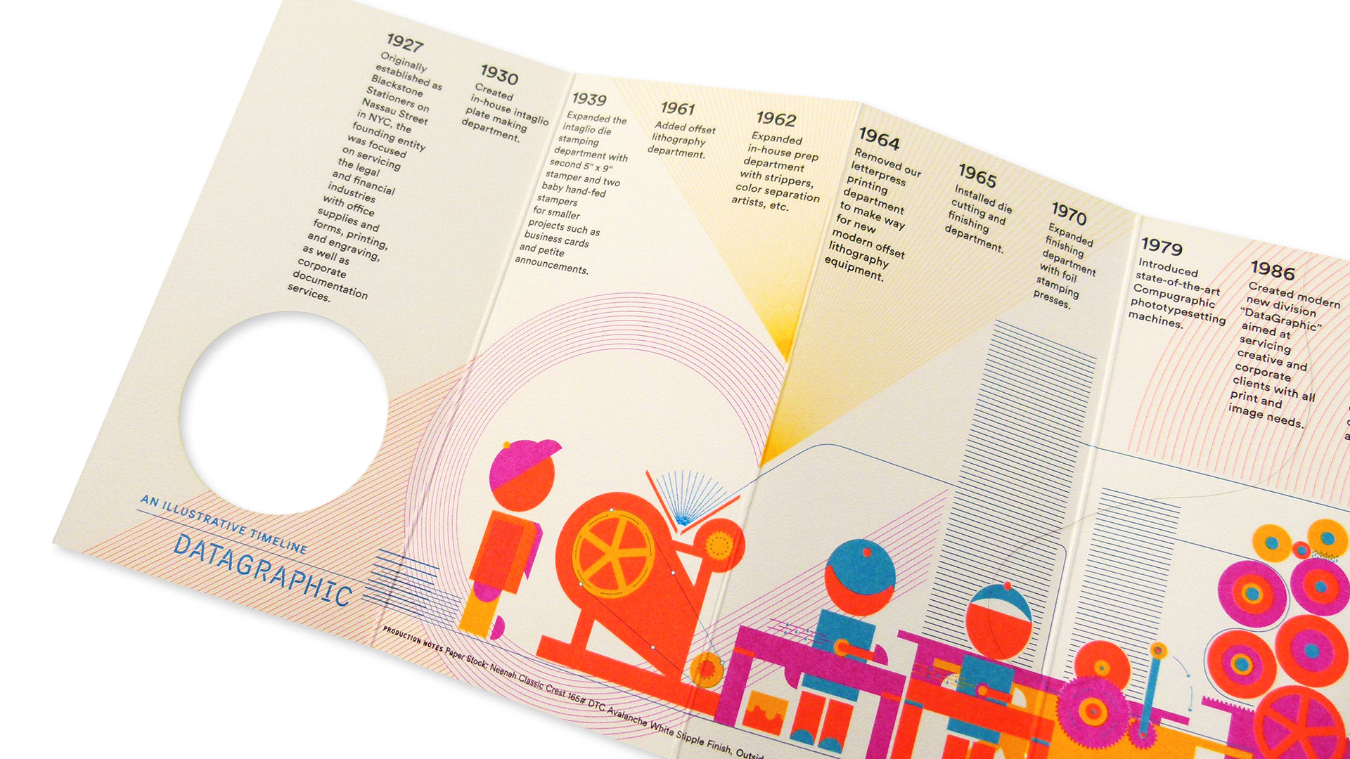
When the time arose for 82-year-old printing company DataGraphic to move to larger digs, they teamed with designers Claudia de Almeida and Margaret Swart of o Banquinho to create a direct-mail piece that would help spread the word.
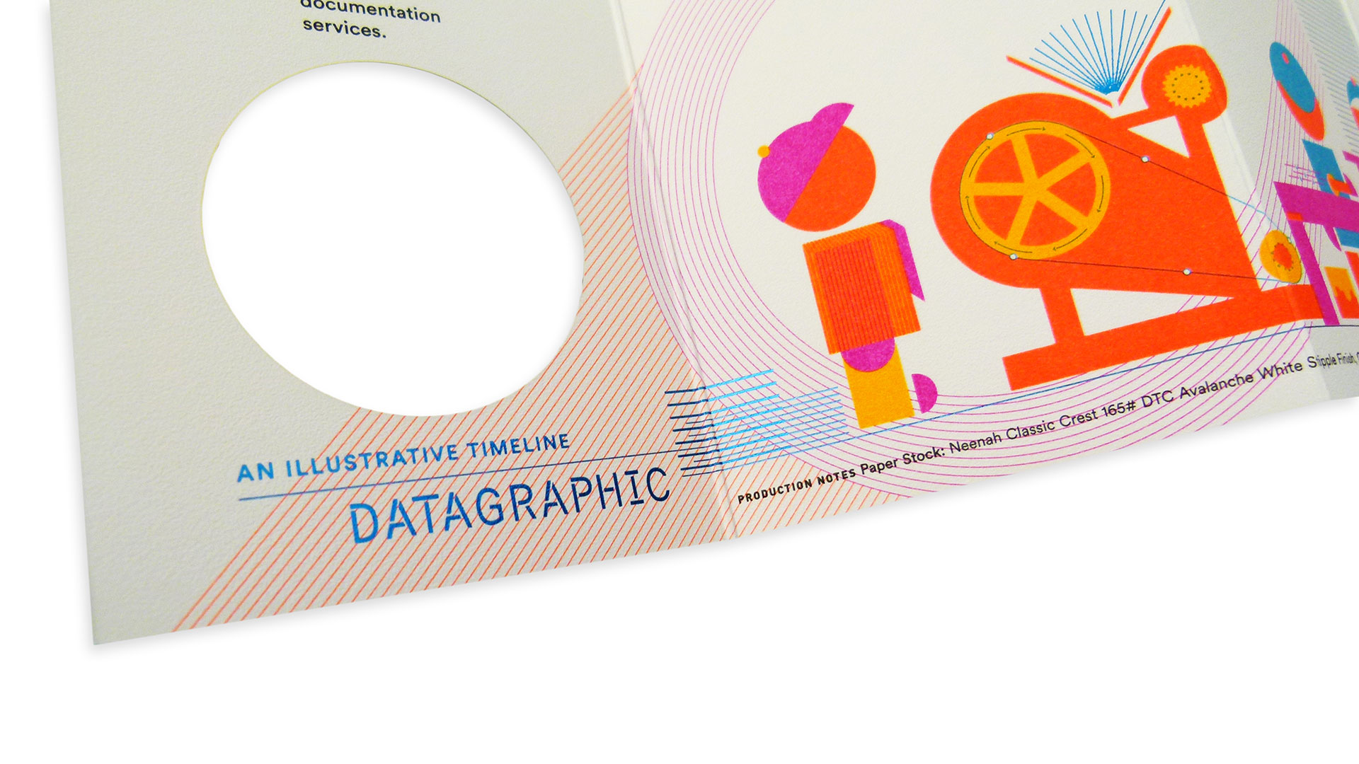
The subtle, fine blue-foil lines sprinkled throughout are just enough to capture your attention without distracting from the overall message. Paired with the Neenah Classic Crest Stipple finished cover and high-impact fluorescent palette, the piece has an incredible look and feel.
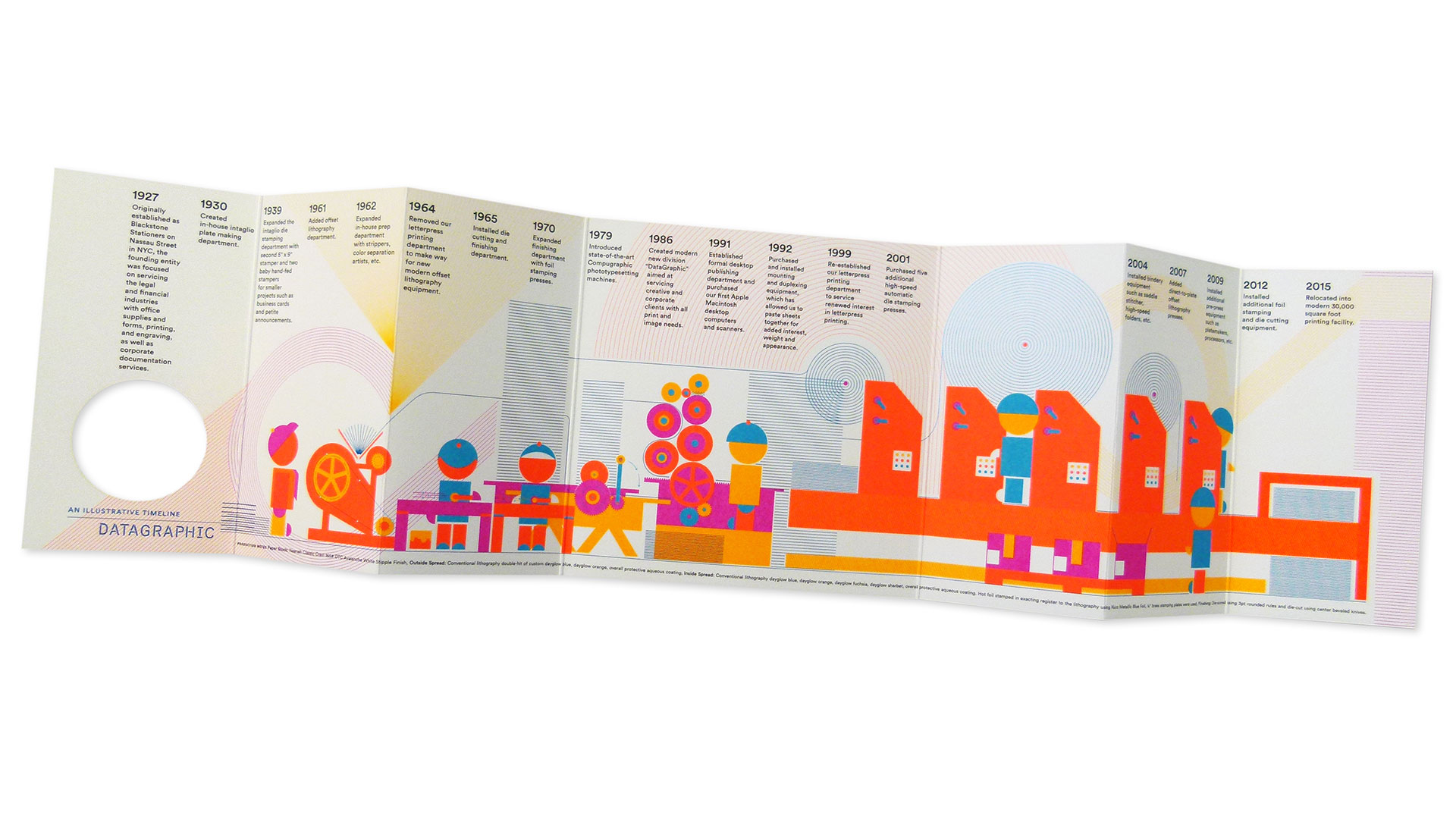
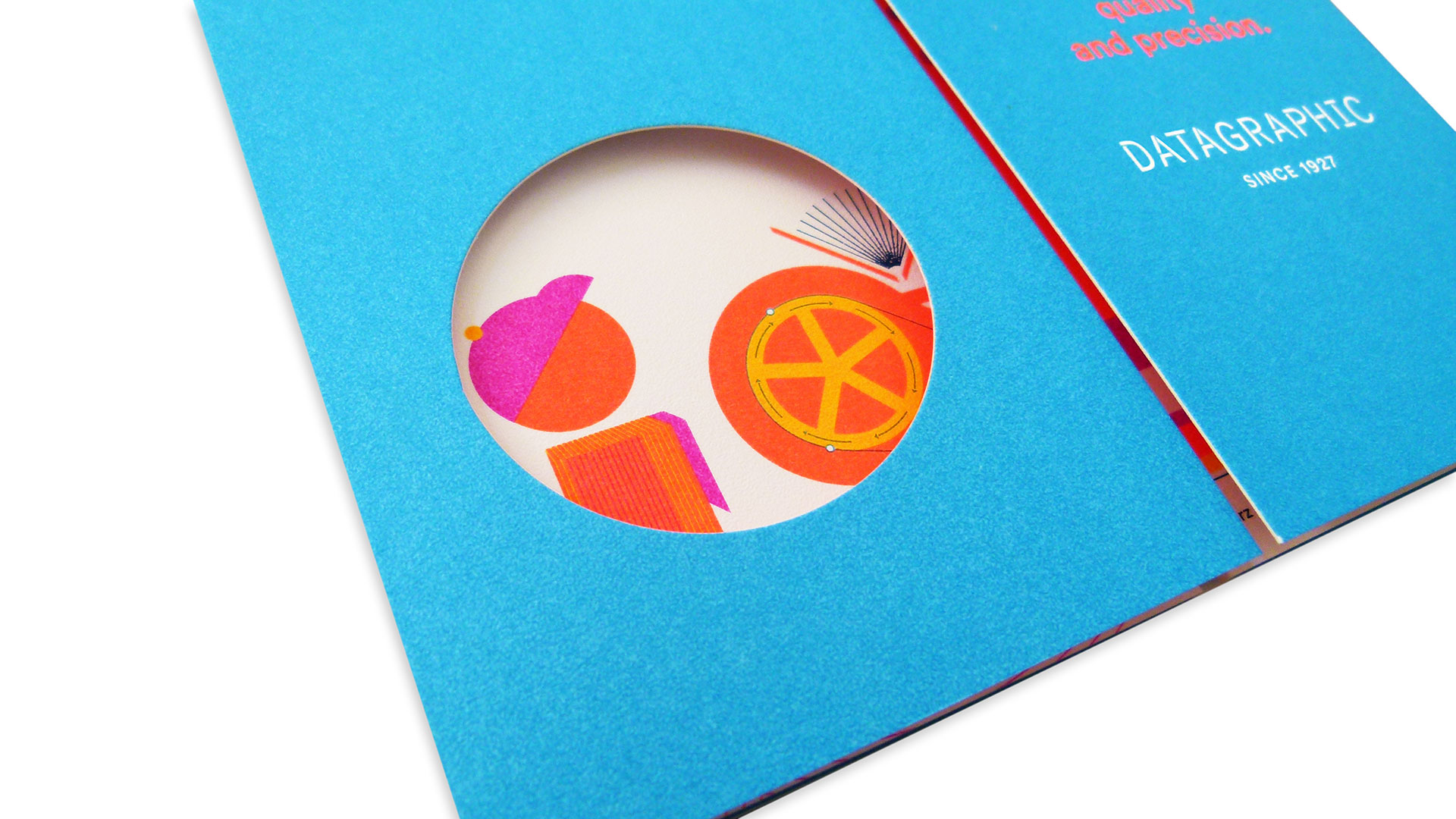
What’s really rave-worthy, though, is the way this mail piece unfolds to an astonishing 28”! Talk about visual impact! A small die cut circle on the outside front cover teases what is to come, but outer panels that accordion fold inward on both sides of the center spread is not what you might expect.
When fully opened, it unveils an intriguing infographic that takes you time-hopping through the family-owned printing company’s history, from their start in 1927 to their exciting announcement of an upgrade to a 30,000 square foot facility.
Kudos to DataGraphic not only on their big upgrade, but on the big way they chose to share the news. You almost might call it…historic.




I like to get these emails but I have a difficult time understanding what you are saying in the videos. I miss your name and intro in the beginning as you are speaking so fast and the sound quality is poor (echo). I do enjoy the content and look forward to receiving it.
Ken Winston
Sorry, Ken. Sabine’s enthusiasm sometimes takes over and she is a fast talker as it is. We will certainly take this under advisement.