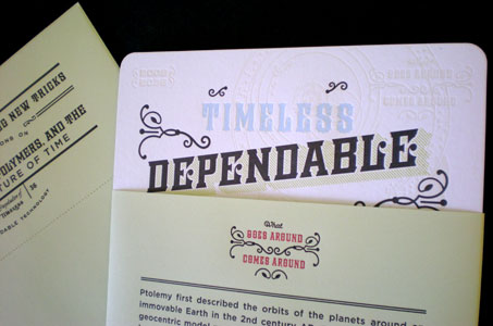
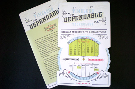
As a self-promotion piece for a letterpress printer, this perpetual calendar is out of this world!
The designer’s inspiration came from two things the client possessed: a love for old planetary charts (intricately designed and printed illustrations of outdated ideas) and an old perpetual calendar (a metal version) that he’d held onto for years.
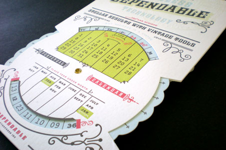
I’d never seen this type of perpetual calendar before. What at first glance appears complicated is in fact easy and amazing in its simplicity. Line up the year under the month (seven columns that seem to have no rhyme or reason), and voila, the days and numbers of the week are aligned perfectly.
The true star of this project though is the letterpress work. The intricacies of the illustrations and the six colors used create a heavenly study in texture and detail on beautiful Mohawk Loop stock.
The diecutting and eyeleting that bring the calendar together are flawless. A line of tiny letterpress perforations that circles the outer envelope is just the kind of attention to detail that set the better designs apart from their competitors. Plus, special touches like the typeface on the days of the week (they resemble zodiac symbols) really sent me into orbit!
Dependable Letterpress Perpetual Calendar was featured as a Paper Inspiration.


Gosh that looks as cool as a moon phase watch. I want one! (Not the watch, incidentally)