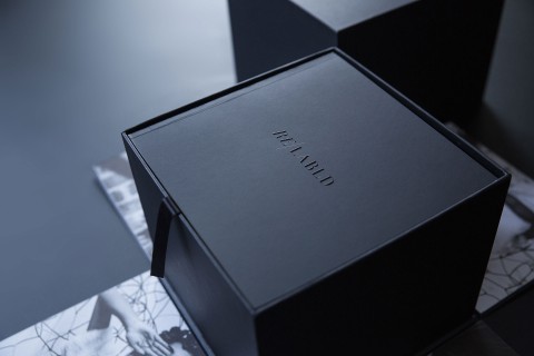
Today’s wine and spirits shelves are packed with high-end labels, many resembling art meant for a gallery.
But Craig Frazier’s design for luxury winemaker DuMOL combines elegant line work, digital and letterpress printing, and sculptured embossing to evoke both the Russian River Valley’s natural beauty and the Scottish heritage of the winery’s founder.
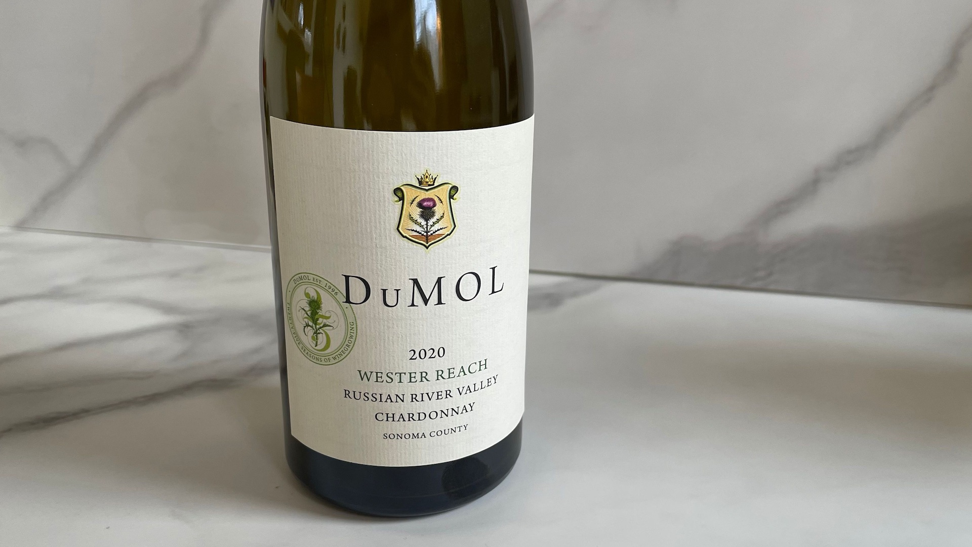
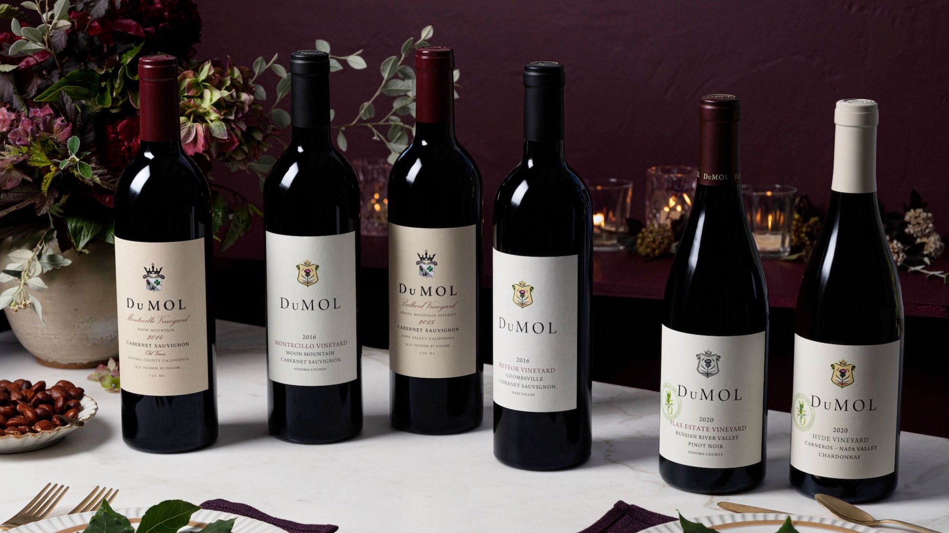
At the core of DuMOL’s identity lies a vibrant crest featuring a thistle, a plant native to both the Sonoma Valley and Scotland.
A Subtle Yet Impactful ’25’
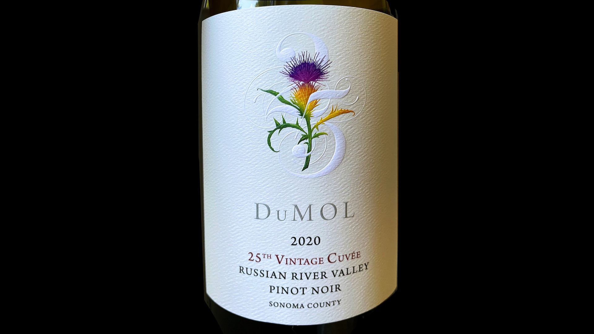
For DuMOL’s 25th anniversary, Frazier enhanced this iconic thistle for a special magnum label. MCC digitally printed it in CMYK and added a sculptural emboss on 60 lb. Neenah Estate Label Felt. This elevated the design to capture the winery’s legacy.
Part of the anniversary label includes an intricate “25” intertwined with the thistle. Frazier kept this number knocked out to reveal the paper’s pure white beneath a light beige background, letting it subtly stand apart.
He initially drew this detailed thistle and “25” in Spencerian script by hand, then digitized it in Illustrator.
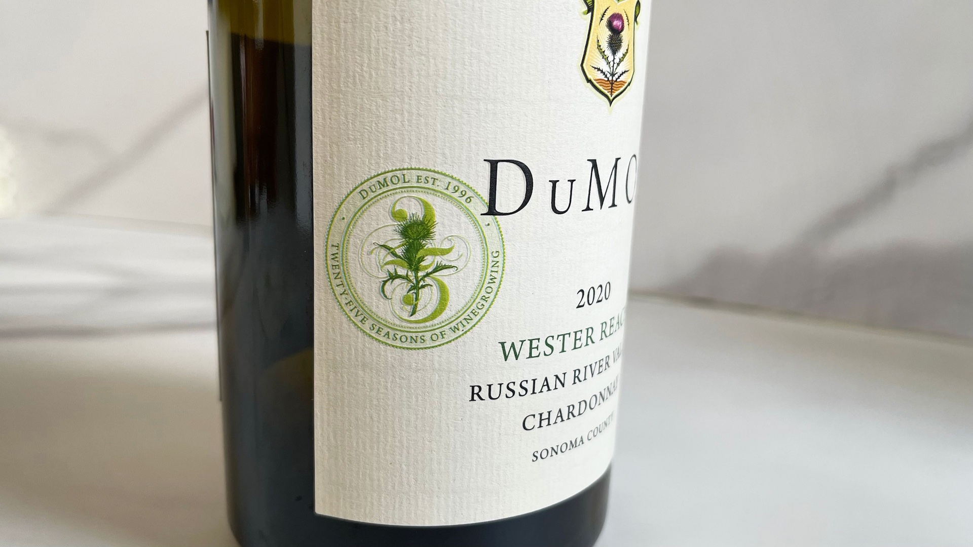
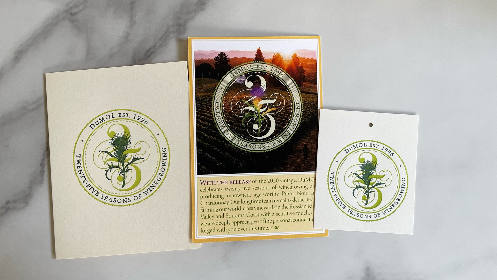
Frazier extended the thistle design into a seal for all anniversary-year wine releases. Here, he used only two colors to keep attention on each wine’s unique crest.
Classic Techniques Meet Modern Innovation
This commemorative seal also adorned print pieces, such as hangtags and letterpress-printed welcome cards, created by Michael Rylander on 120 lb. Mohawk Superfine Eggshell cover stock. A four-color release card printed by AD-Vantage Marketing completed the anniversary presentation.
From the vivid colors of the label’s crest to the exquisite embossing, DuMOL’s branding unites traditional and contemporary methods seamlessly. This bold identity pairs cutting-edge design with timeless techniques—just like a perfect pairing of Gouda with a rich Pinot Noir. Cheers!

