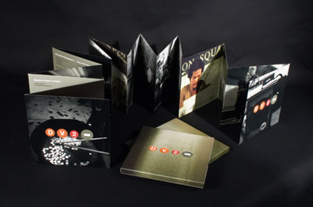
The cost of a round-trip ticket on the subway ride of this promotional piece is well worth the purchase price.
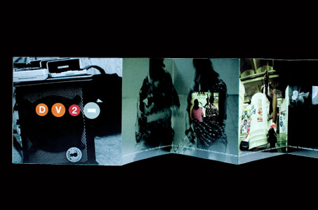
Gluing the front side of the brochure to the back side of the brochure showed great ingenuity in not only achieving the heft of two paper thicknesses, but also in creating all of the incredible 105 accordion-folded inches! And yet, it never felt clumsy to handle. Opening each spread became a stop along the narrative line … a moment to linger and listen to the stories this music told.
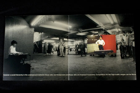
I also appreciated the juxtaposition of the earthy black-and-white images with the full-color, spot UV treated ones – like the spirit of the musicians coming to life amid the environment of the sooty underground transit system.
And what can you say about the diecut circles on the front of the slipcase in the size of a penny, nickel, dime and quarter? Clearly, everyone was in tune with this capability brochure. It’s a beautiful collaboration of designer, photographer and printer. I’d ride with this trio any day.

