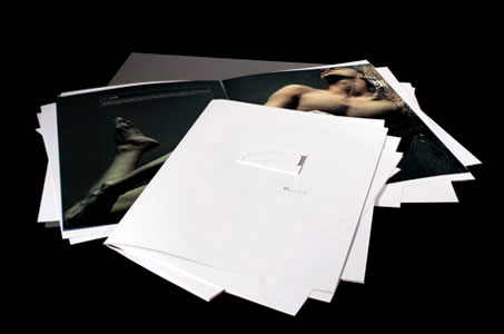
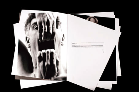
The inspiration for this capability brochure came from trying to reassemble elements that dropped out of a project folder! To get that look of papers no longer in perfect alignment, the 4-page forms were diecut to produce angles reminiscent of a Stealth fighter jet. The spreads were then gathered together and secured with a clear rubber band.
“A binding method to torture the printer?” you ask.
“No! To show off the printer’s capabilities … and the design’s twisted beauty,” I reply. (Not to mention the spreads turn into posters should you so desire.)
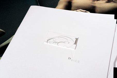
But it’s also the little things that are Dvine – the debossed dialogue box on the front cover is topped with a business card-sized pocket that houses an introduction card.
“Did they include a thumb-notch to help you get the intro card out?” you ask.
“Yes! But this one is off center and in the shape of a 1,” I reply.
The piece definitely took guts to produce – from the design to the copy, from the images to the execution – and had to have been passed around, discussed and admired. And that’s the whole point!
DVice One (1) Brochure was featured as a Paper Inspiration.

