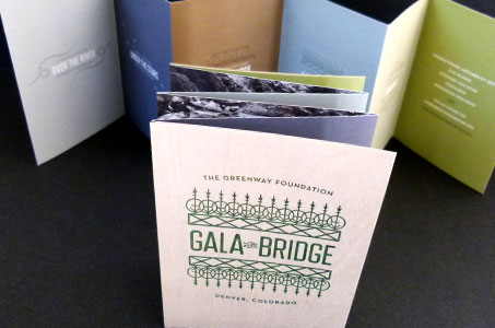
I’d pay the toll to cross this bridge any day. There’s an amazing design view from this earthy and creative invitation.
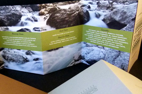
The accordion fold here is sublime for so many reasons – from the front side, you cross the invite as you unfold. Event details flow from one end to the other. Then you make the return trip from the back side where event organizers and sponsors are featured.
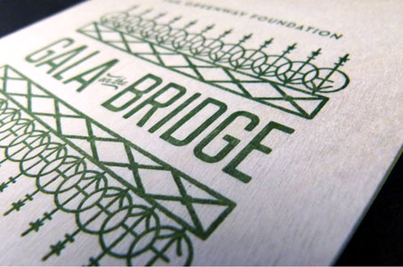
My favorite part has to be the wood veneer – one piece tipped onto the first panel and the second tipped onto the last panel forming the “covers” of the invitation. It’s pure thematic and textural genius.
Decorative elements on the invite were taken directly from the decorations on the bridge itself – like the wrought iron motif printed on the wood cover via letterpress.
But you see those decorative touches applied meaningfully throughout – the swirls on the “Over the River” panel, the structural geometry on the “On the Bridge” panel, and the Victorian-styled ribbons on the “Honoring” panel.
From the kraft paper envelope and Classic Crest stock to the modern, subdued palette, these designers forged a solid connection on this piece – end to end!
Gala on the Bridge Invitation was featured as Paper Inspiration.

