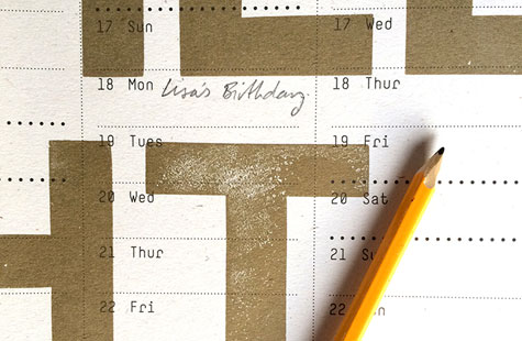
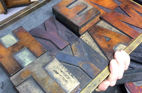
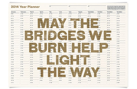
No requisite card for those end-of-year holiday greetings from KVGD. Glasgow-based Kerr Vernon gave his clients something visually pleasing and eminently useful. The year planner/wall calendar/poster features old handset type, letterpress printing combined with offset, and eminently touchable stock … all the elements that make it worth keeping.
Love the message that emblazons the piece. It’s thought provoking and just the right amount of irreverent. For you fontophiles, the type is Grotesque 229. Gold ink complements the color of the 120 gsm Cairn Straw while the chips and cuts in the vintage woodblock type play beautifully against the uncoated paper’s flecks.
And what about that slick, reflective copper-colored mailing envelope with the silver interior? Oh yeah. Somebody knows how to get my design attention.
Love this piece?
Like it and share with your friends below.

