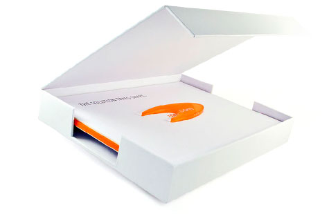
“Let Us Lighten the Load.” To convey this marketing message, Cacao Design created a truly unique corporate brochure that literally floats inside its white presentation box. Cutouts on either side of the box reveal a stripe of signature color (orange) and a feat of levitation that would make David Copperfield proud.
How’d they do it? A system of opposing magnets hidden in the brochure itself. But this is just the start of the design magic. The clean and minimal approach (grey type and spare use of orange) allows each page to strengthen the concept in a visually arresting way.
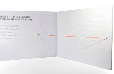
A plexiglass logo adds dimension to the front cover. The use of embossing and gloss silkscreened varnish to create a grid pattern of dots reinforces the copy on text pages. An orange string runs across one spread to “connect the dots” of a consistent and memorable brand. Extremely thick cover and text pages (Xper from Italian papermaker Fedrigoni) further distinguish the brochure.
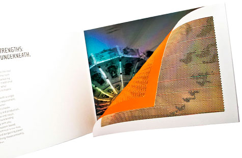
The dot grid on one page is accomplished through laser diecutting on what appears to be a piece of thin metal. The resulting mesh screen is adhered to the printed page beneath to create a holographic illusion. Even the binding method is uncommon – a Bodonian style with slightly protruding text pages covered in orange linen glued to the end pages and then to the covers. Remarkable.
Love this piece?
Like it and share with your friends below.


