So, your client manages money, lots of money … at least you hope it’s lots of money. This can be a tricky identity to create. On the one hand, the firm needs to be conservative (no one wants hippie-dippie Howie investing their capital). On the other, the look should speak to the company’s expertise and success in a tastefully upscale way. How did this design fare at the closing bell?
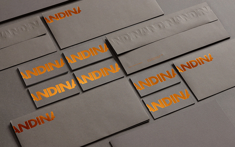
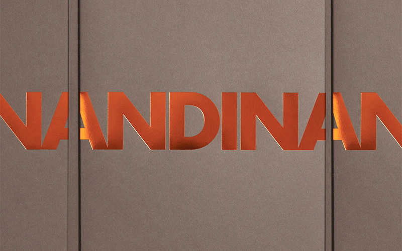
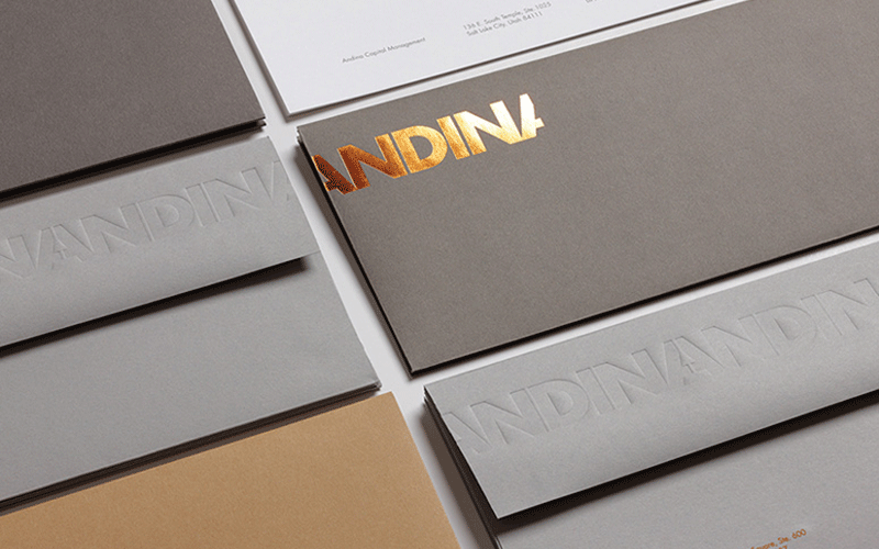
Way up! The team at Hint Creative put together an impressive portfolio of stocks (couldn’t resist the pun) from Mohawk for the task. The feel is luxuriously smooth and the palette a contemporary array of greys and tan. Copper foil reminds us that a penny saved is a penny earned. Custom envelopes show off foil stamping, amazing register blind embossing and foil engraving on the tiny 7 pt. type.
The repeating Andina name was designed to reflect the concept of a continuum and a perpetually strengthened invested capital. In fact, the logo not only recurs on each individual piece but lines up to repeat across the various substrates and print methods. Impressive return.
Love this piece?
Like it and share with your friends below.


