I’m definitely showing two major symptoms after being exposed to this tasty little bug of a greeting: repeated touching of fine paper products and involuntary smiling.
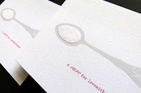
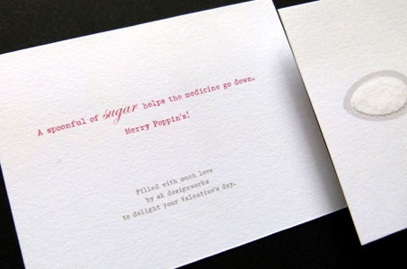
The designers created a self-promo direct mail piece especially for Valentine’s Day to show off their skills. Choosing the theme “a spoonful of sugar helps the medicine go down” keeps the metaphor sweet, without relying on the same-old, same-old chocolate imagery.
A simple and effective color palette includes platinum gray and red. The feel of the 110 lb. Crane’s Lettra is as soft as a cuddly teddy bear. The “SK” monogram on the spoon is a cute piece of detail, as are the matching gray-and-white labels.
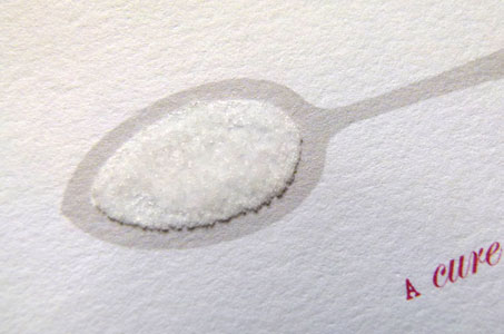
The sweetest element in the design is definitely the sugar that’s adhered to the printed spoon on the front of the card. Touching is not optional here, and I must confess that I struggled with an overwhelming desire to lick it … but resist I did.
A Cure For Lovesickness was featured as a Paper Inspiration.


