“A website is invaluable in the property management business, but the high quality of the design and the craft and attention to detail in the printed materials create a lasting impression and help separate our client from all other properties a prospective renter might have visited.”
– Holly Robbins, Co-Creative Director, Designer
Seldom do you see much thought put into the marketing of an apartment development these days, even a luxury one. That’s not the case with Currents, a Plymouth, Minn. community whose online nautical theme blends creatively with a truly sumptuous identity system.
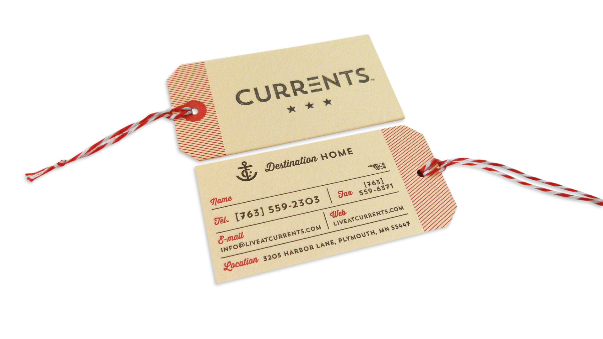
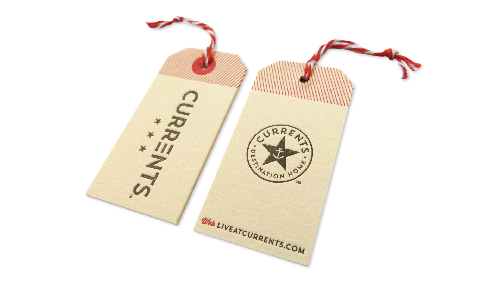
Minneapolis design studio This is Folly went overboard (in a lovely way), crafting materials that “were inspired by steamship-era design and by rusty, patinaed metal,” Robbins explains. “The stars stand for both quality and navigation. The triple bars and stripes are abstracted waves or current lines. The tag forms for the business cards are inspired by luggage tags and travel documents.”
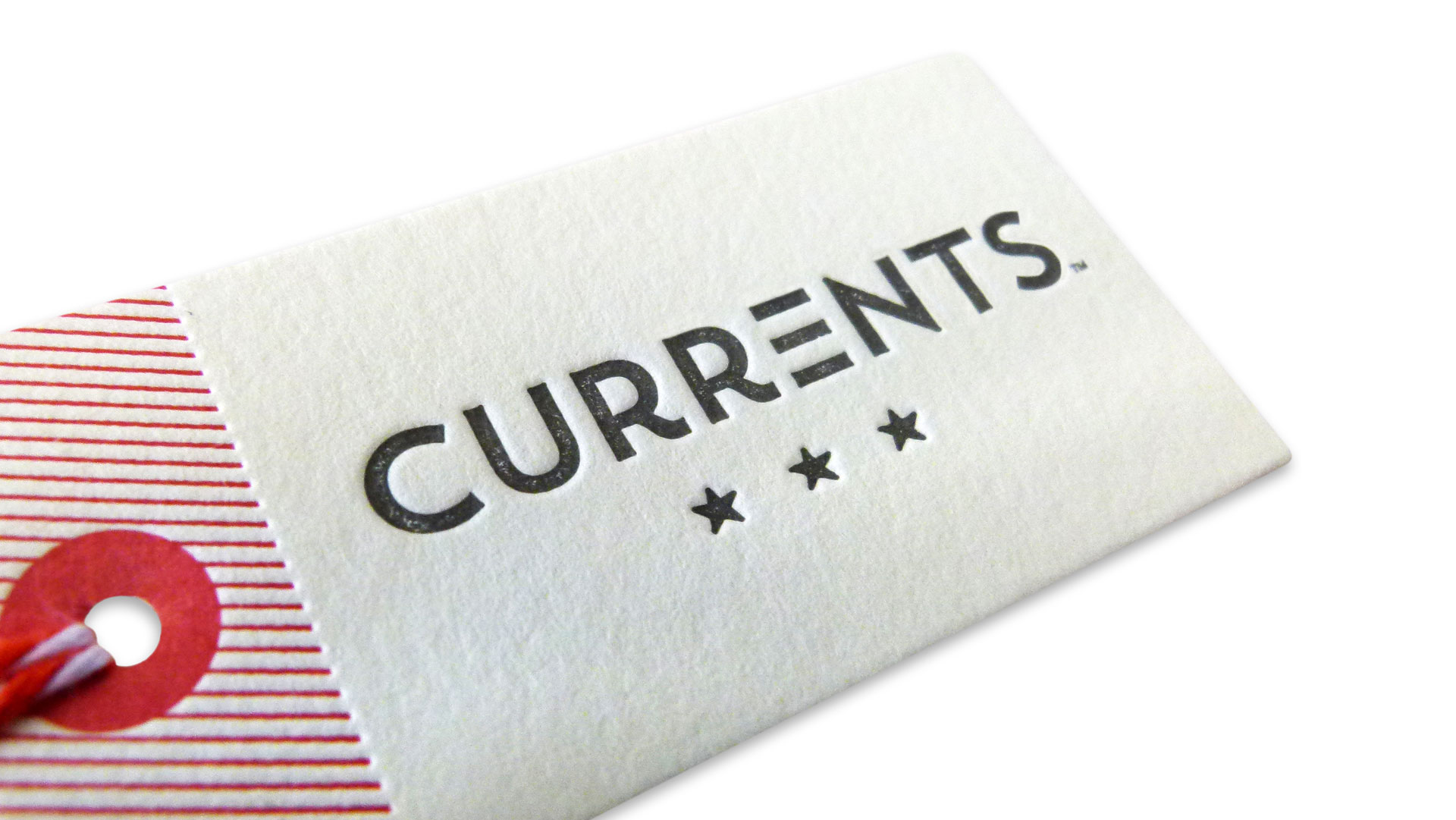
Oh those business cards. Essentially hang tags, these pieces – like their smaller key fob counterparts – were letterpress printed by the always amazing Studio on Fire on Neenah Crane’s Lettra Ecru 110 lb. Cover, then hand-duplexed to 220 lb., drilled and trimmed.
The icing on the cake? A one-two punch of snazziness and sustainability. Employees who only hand out a few cards can simply jot down their name and number directly on the cards, while those who use many have their info printed on stylish red tapes that are affixed to the same cards. Not only does this prevent the need for throwing away a former employee’s cards when they leave, but it also adds another touch of class to the cards themselves, an additional reminder of their hand-crafted quality.
It all comes together to send one clear message: If you lived here in the lap of retro-luxury, you’d be home by now. Bon voyage!

