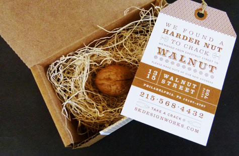
Just when I thought pistachios and Stephen Colbert were my favorite nuts, this fun change of address announcement came our way. SK Designworks used the coincidence of street names as their inspiration.
Old Address: Chestnut Street. New Address: Walnut Street. As any nut-lover knows, walnuts are much harder to crack than chestnuts … hence, a harder nut to crack. The design team managed to find the perfect materials to make all the elements come together. The final piece includes: the walnut, straw-like filler, a tag, twine, a box, and mailing label.
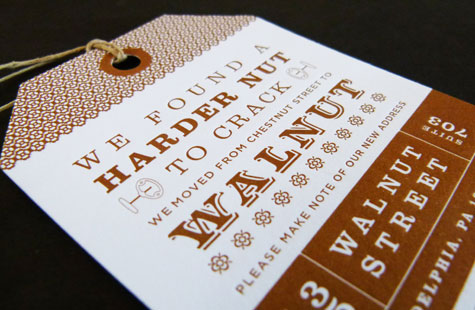
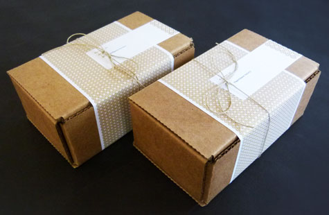
The outer label gives a sneak preview of what’s to come inside – that real walnut. The palette for the announcement tag complements the walnut, as do the nutcracker icons used as decorative elements. Letterpress printing was amazing given all the fine detail in the pattern and the tried-and-true Lettra feels wonderful. It seems to me they cracked the code to great design.
Love this piece?
Like it and share with your friends below.


