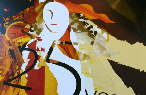
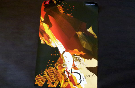
Designing a commemorative poster for the 25th anniversary of this iconic Adobe product was in the very capable hands of the company’s in-house design team. Who better to extoll the virtues of the software that’s de rigueur for illustrators and the backbone of today’s design workflow.
The light play and drama of raised-ink effects and beautiful paper are worthy of its inspiration – Botticelli’s Venus. Her voluptuous shape was a perfect symbol for PostScript’s Bézier curves so it’s great to see the goddess acknowledged once again.
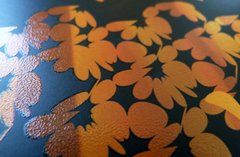
Printed on McCoy Silk Cover, the spot varnishes – dull, gloss and sandpaper (swoon) – give this piece the texture and dimension we love to touch. A palette of bright, intense colors set against a rich-black background adds a vibrant, contemporary touch to the now-classic iconography of the brand.
(This video http://www.youtube.com/watch?v=8Vj37x2jScU of John Warnock’s demo for Illustrator 1.1 is a hoot. Take a look at the computer in the background.)
Illustrator: 25th Anniversary Poster was featured as a Paper Inspiration.


