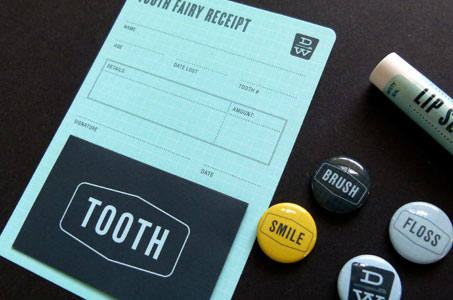
Talk about a design challenge! Here’s one for you: make going to the dentist fun. Seriously … not even if the printer could put a laughing gas scratch ’n sniff on the collateral would folks think of dentist and fun in the same breath.
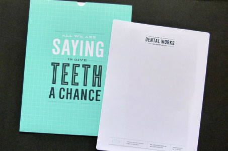
But these designers changed my perspective with a great big shot of humor injected into every piece of copy: “Make Appointments Not War” … “All We Are Saying Is Give Teeth a Chance” … “Keep Calm And Carry Dental Floss.”
From the tooth fairy receipt (complete with small envelope to place said tooth) to the dental care guide, from the business cards to the appointment cards, from stationery to the open-top folder, consistent and versatile branding ran across quite an array of fun components.
The turquoise and black color palette was bright and modern, yet soothing and serene. And the pieces felt as smooth as a freshly buffed tooth on the Strathmore Premium Wove (in Ultimate White of course).
KC Dentalworks Identity was featured as a Paper Inspiration.


