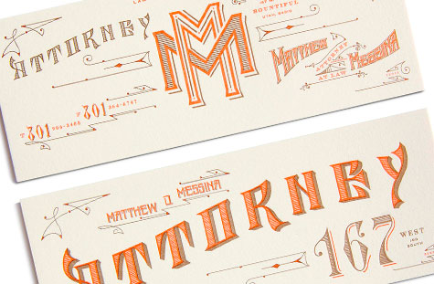
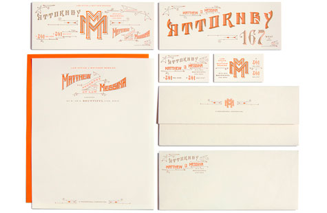
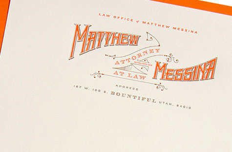
If I asked you to imagine an identity suite for a law office – and I’m talking all the pieces: letterhead, #10 envelope, business card, and notecards – this is likely not what you’d picture. In fact, it’s so atypical, I’m thinking the design team or the client is a risk-taker. Of course, the real story is much more interesting.
Kevin Cantrell Design used the client’s lineage, which goes back to Utah’s pioneer days, as inspiration. The wonderful hand-drawn letterforms imbue the pieces with a genuineness and authenticity reminiscent of this 18th century heritage. Even the notecards remind me of old bank notes or insurance notes from the time period.
Superb letterpress printing (check out those thin lines) and richly tactile Crane’s Lettra are perfect choices that serve the motif well. An orange and brown palette; two versions of business cards; the interlocking, double M monogram; decorative swirls and swashes – it’s all just gorgeous.
Love this piece?
Like it and share with your friends below.


