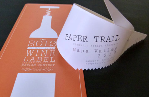
Every three years, Clampitt Paper sponsors a special competition for designers in the Dallas/Fort Worth area. The company has a passion for wine as well as paper, so designers compete to name a wine and design its label. You might say Clampitt got quite the run-around with this winning entry.
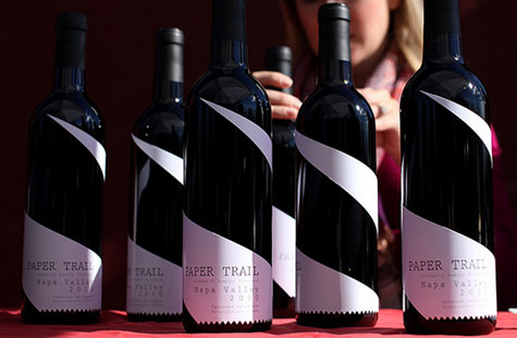
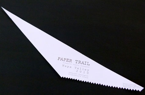
Inspired by a retail receipt, the label is diecut in the shape of a wedge that wraps around the bottle – wide end starts at the bottom front with the narrow end stopping just about where the neck of the bottle begins. Given that the name of the wine is Paper Trail, the shape perfectly reflects a path drawn in perspective, the trail heading off into a distant infinity.
The designer created a simple and elegant label printed in one color and black foil stamping on two different stocks (the labels for one barrel of wine were done with McCoy White Silk Text and another barrel with Classic Crest Stipple Text). A sawtooth edge adds fun and again pays tribute to that retail receipt inspiration.
Paper Trail Wine Label was featured as a Paper Inspiration.


