Drawing on the brand aesthetics as well as the product’s attributes, I began to work around the concepts of personal care and space.
– Dayala Levenson, Designer
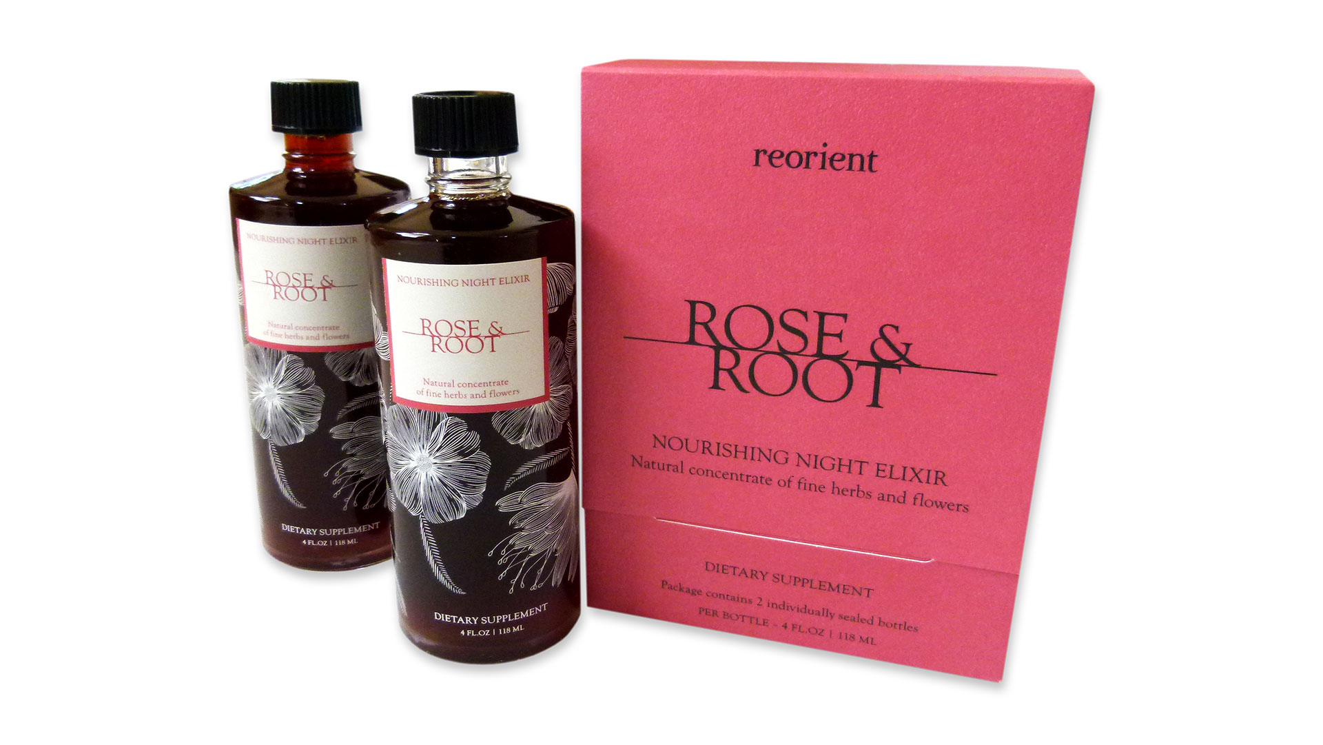
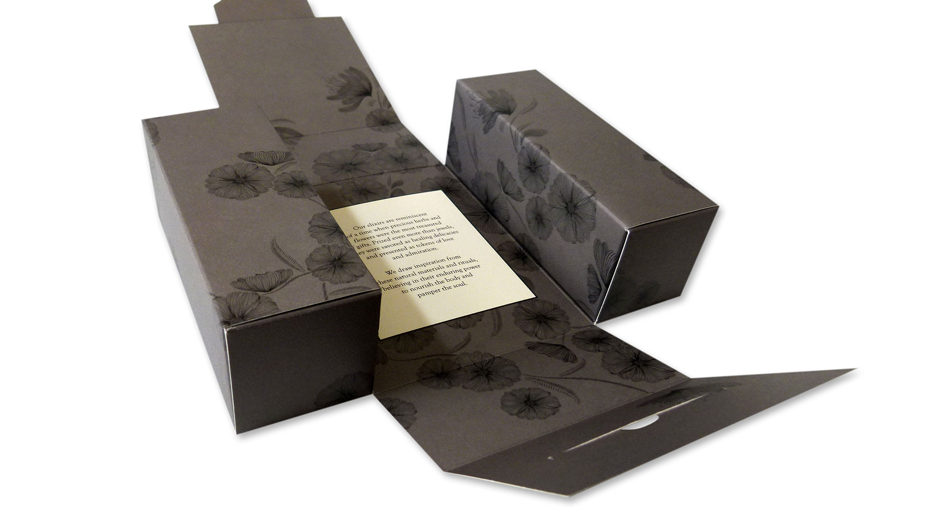
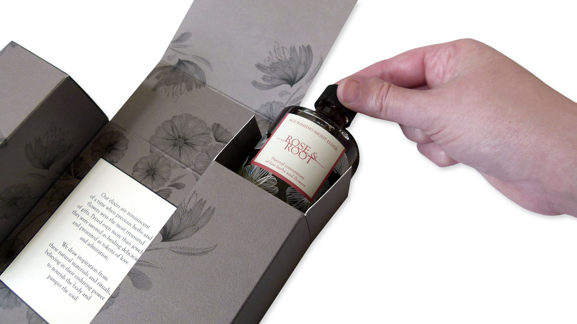
When you’re a company like Reorient that sells people on beautiful bottles of something you refer to as an artisanal herbal “elixir,” your packaging should appear every bit as magical and exquisite as your product sounds. No problem, said Aslan Graphics, who developed a unique box indeed for Reorient’s Rose & Root tonics. When the cover is lifted up, two distinct compartments housing the bottles are revealed; an insert with additional information comes into view when these housings are rolled outward.
Levenson leveraged two creative inspirations to help define the overall packaging design, she says. “Women’s vanity dressers from the ’30s, which often folded inward, as well as the small shrines that you find in people’s homes. Both speak to self-care and the quiet intimacy of personal space and the time before we sleep.”
The Neenah Classic Crest Stipple 130 lb. Cover turned out to be a great choice, she explains. “For various reasons we did not want to include any corrugated inserts. However, the two bottles needed to be packaged together and protected. I wanted to make sure that we could have several layers in order to maximize the cushioning while elegantly housing the two bottles.”
Reorient’s signature horticultural illustration was tastefully printed by Moquin Press with both UV offset and screen printing throughout the design scheme.
“Our trademark botanical pattern was consistent throughout, from the print on Neenah Paper’s Stipple paper to the screen printing on the bottles,” says Reorient founder Jess Ng. “We are so pleased with the package and how it translates the luxury of our products and Eastern inspiration in a modern and compelling way.”
Illustrations: Charmian Liang and Emily Berry at BerryCreative
Love this piece?
Like it and share with your friends below.

