Lapping ocean. Check. Azure sky. Check. Singing birds. Check. Breathtaking vistas. Check. Soothing amenities. Check. Everything you need for a tropical paradise experience. Now … how do you convey all that luxury and relaxation in a printed marketing piece? You wrap it all up in texture of course!
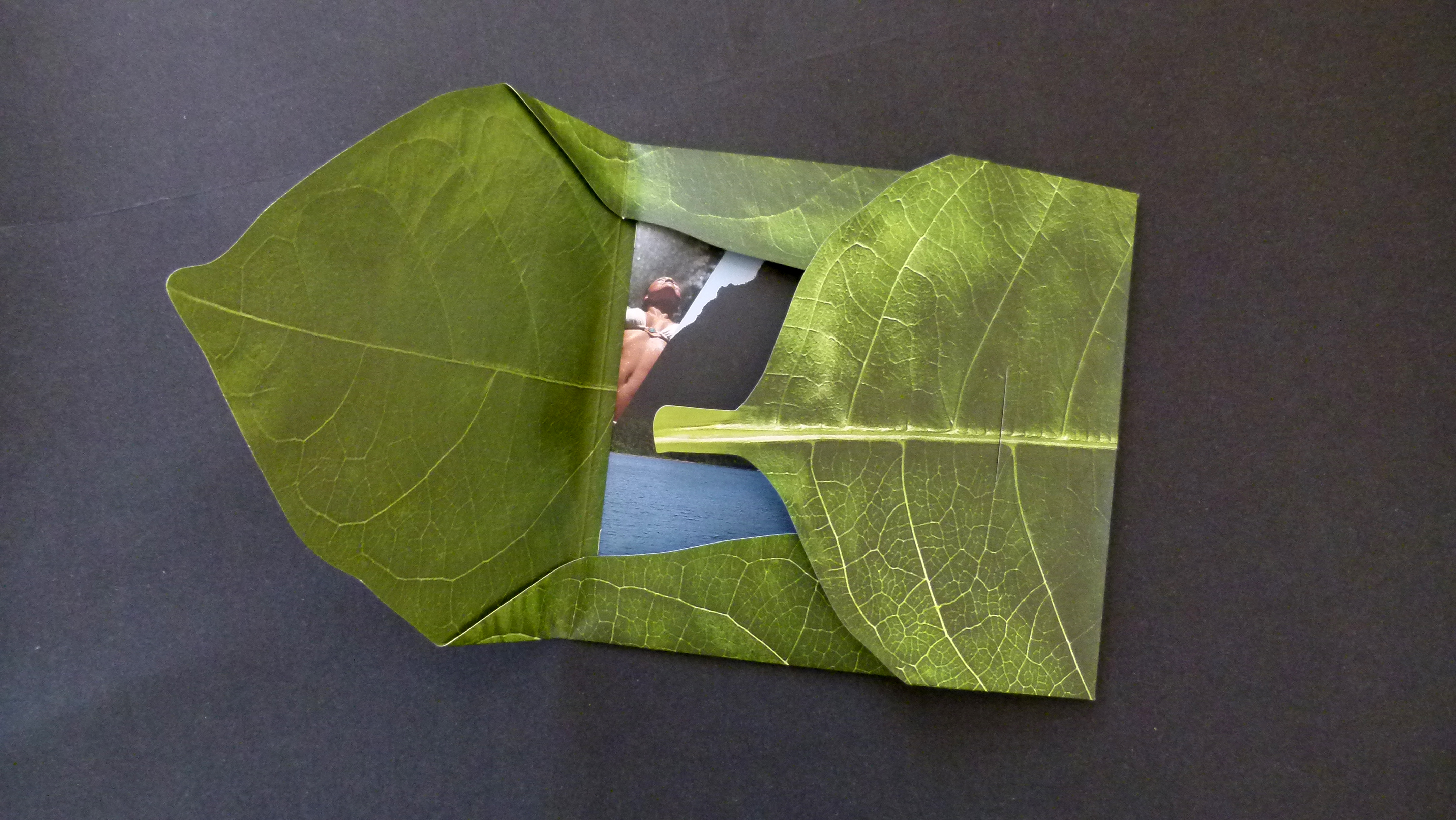
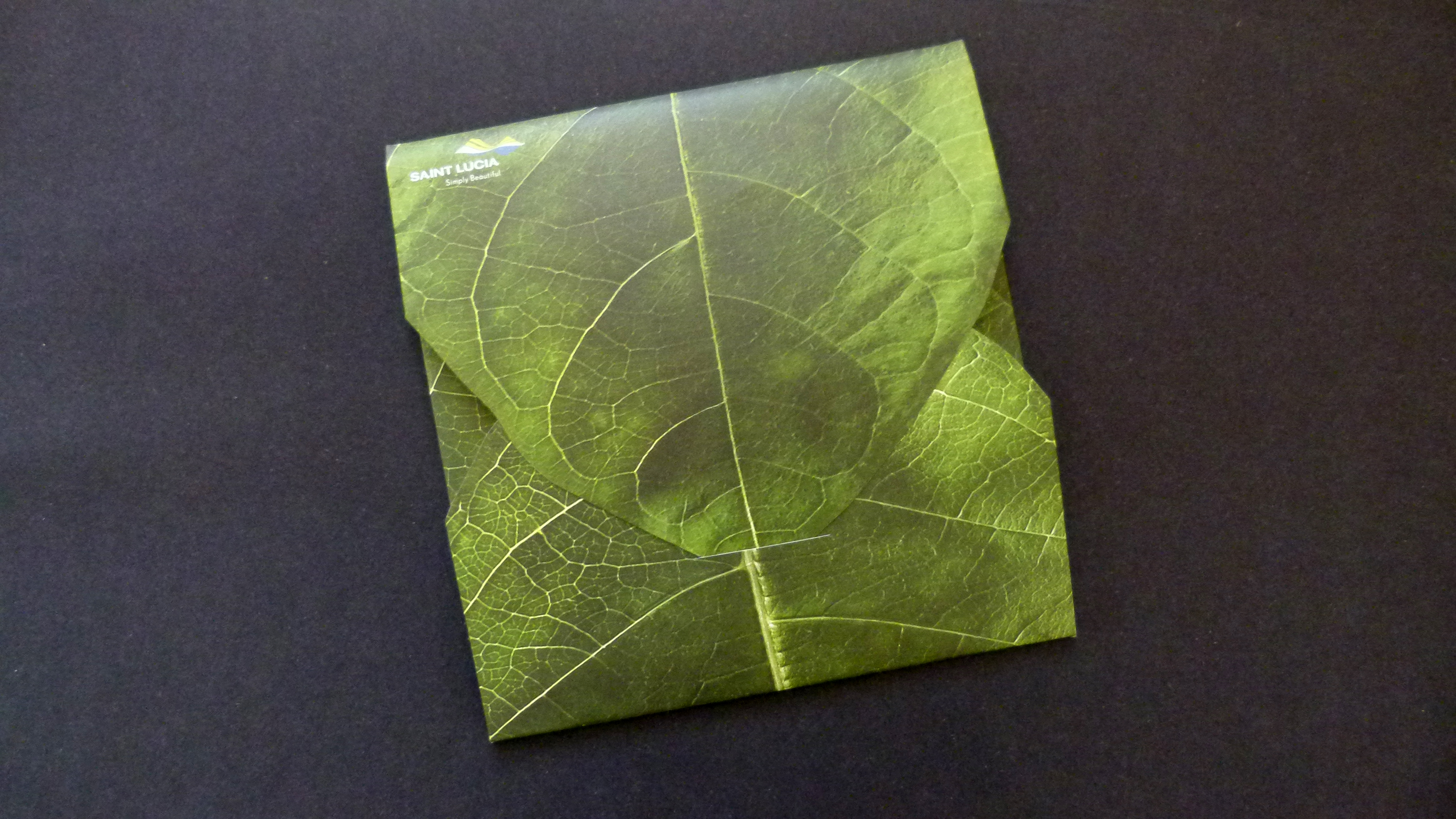
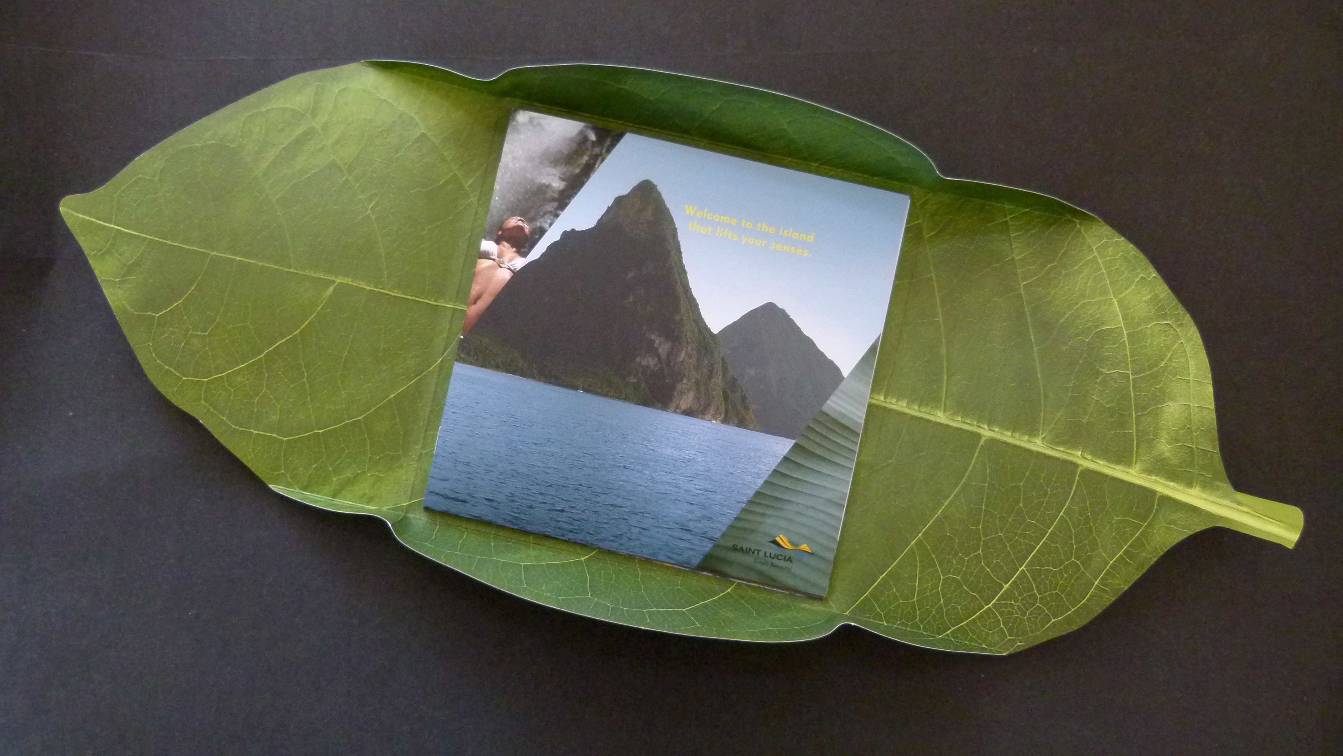
The designers of this amazingly textural brochure took inspiration from a banana leaf. The leaf is printed on both sides to look like the real deal. And yes of course, it’s diecut to give us the shape. But here’s that something extra that takes good design work to great.
Thanks to the silk finish of the Astrolite and some incredibly positioned embossing, the outer wrap FEELS like an actual banana leaf. Since embossing on one side produces debossing on the opposite side, you get that three-dimensional quality that takes this travel brochure to an attention-grabbing level. I know I’m ready to book a reservation!
St. Lucia Travel Brochure was featured as a Paper Inspiration.


