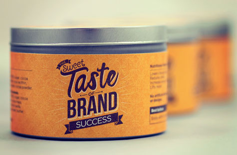
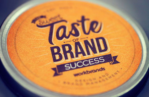
What is it about tins? Is it the oh-I-can’t-wait-to-get-inside thing? Or maybe it’s the I’m-gonna-use-this-for-something-else-when-I’m-done thing? Whatever the “it” is, tins are the it-girl of packaging. This self-promotional piece from brand design agency, Workbrands, definitely has “it” and something sweet to boot.
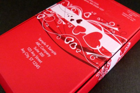
I’m also a great admirer of corrugated paper – those exposed flutes add texture, earthiness and an unpretentious sense of getting down to business – so this outer box had me at square one. A pumpkin hue on the box closure, tins labels and mini brochure was a nice bright contrast without making your eyes squint.
The contents (artisan truffles) and the content (clever copy) memorably convey the central theme of the direct mail package: the sweet taste of brand. The cover of the mini-booklet is the first bit of copy you see (“We know what you’re thinking … ‘Not ANOTHER direct mail.’”). A parting fun analogy leaves you with a pleasant aftertaste of how the company is just like chocolate (lowers blood pressure, reduces stress and boosts creativity). Okay, I’ll bite!
Love this piece?
Like it and share with your friends below.


