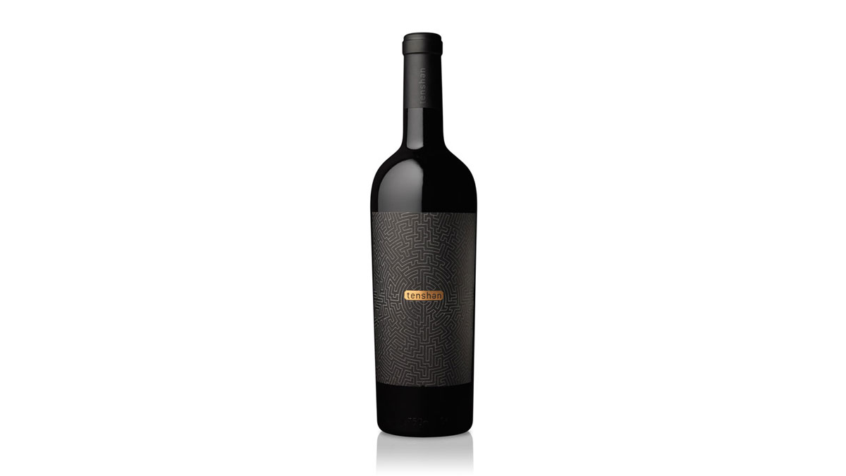
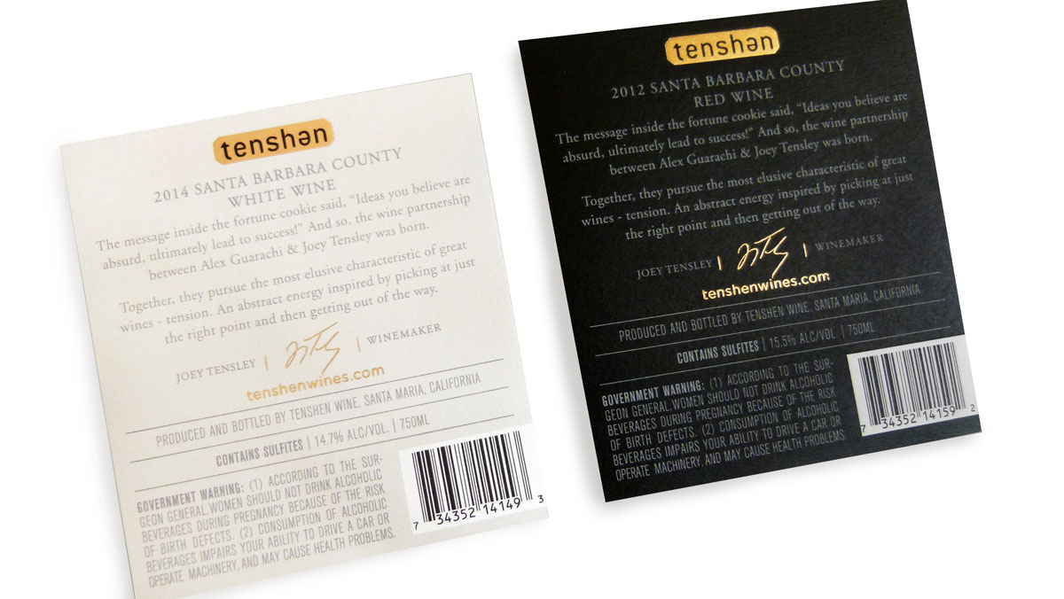
It takes a certain talent to make the elaborate seem effortless, the complex seem simple. And so it is here with these two labels for Tenshen Wines. Cult Partners uses the underlying theme of tension (the kind involved in making the right move at the right time) to create a visually memorable brand.
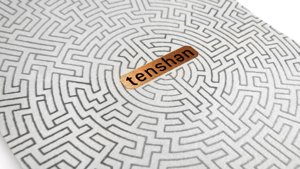
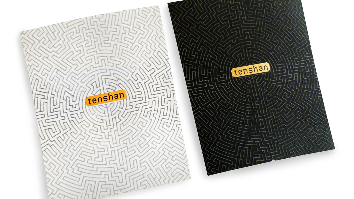
A labyrinth dominates the label. Symbolizing the winemaker’s tension, the intricate angles and bends tell a story of making numerous correct decisions throughout the journey to reach his final destination – the perfect wine. (Sound like design to anyone?!)
That maze graphic works equally well for both white and red varieties thanks to the clever background color choice. Copper foil adds a nice contrasting bit of shine to the Fasson Felt label stock. A high-build matte varnish gives the label an eminently touchable quality, which any wine lover can appreciate when pouring that first glass.

