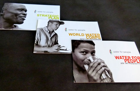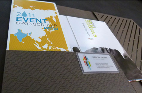
This letterhead and identity fill our design cup to overflowing with refreshing, effective and satisfying creative. All the pieces – pocket folder, letterhead, business card – seamlessly come together in way that mirrors the thoughtful mission of this organization.
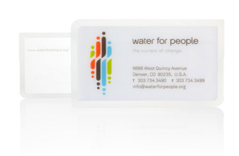
For the logo, the designers used simple dots and strokes to paint a picture of people and water droplets. The elements are inverted to reflect their silhouettes onto a pool of water. A palette of rainbow colors adds life to the mix.
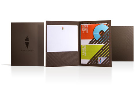
Diecut diagonal slits on the inside of the pocket folder (done in French Construction Charcoal Brown) echo the feel of the logo and recall rainfall. The diecuts aren’t just decoration though, but serve to hold business materials snugly in place.
Our favorite has to be the business card produced on clear PVC material treated to look frosted. The translucent look brings water to mind once again. The amazing printing process used four PMS colors, flood matte UV and spot gloss UV over six whites, one PMS and flood matte UV. A slight notch is diecut on the right side of the cards to accommodate a label that personalizes the card for each user.
Water for People was featured as a Paper Inspiration.

