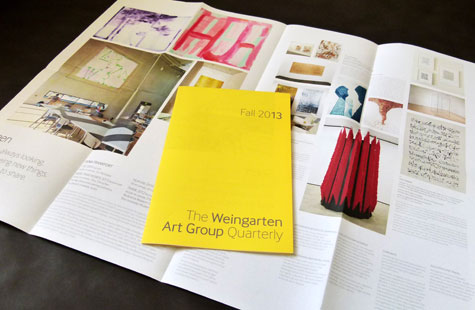
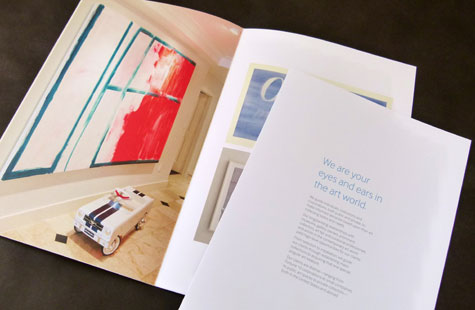
The communications pieces designed for this international art consultant are as crisp and fresh as the work of a breakout artist hanging on the walls of your favorite gallery. Filled with light and air, the unconventional approach gives the brochure and newsletter a timeless appeal.
I get the feeling Rigsby Hull knows its client’s aesthetic well. The brochure has clean fonts, headlines done in an eye-soothing blue hue and blocks of copy balanced perfectly on the page. The binding is interesting too in that there is none. The forms are gathered and nested together conveying an effortless (but intentional) casual style.
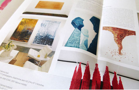
The poster format for the newsletter is a great choice. The bright spotlight yellow of the exterior juxtaposes sharply with the serenity of the interior. Images are hung salon style suspended around copy that flows.
Love this piece?
Like it and share with your friends below.
