Every year I know many of us make New Year’s resolutions to live more sustainably. Inevitably, though, other things capture our attention and we forget. Which is why Tokyo’s Ichikudo Printing produced this quirky, clever piece. Like an advent calendar of guilt, it reminds you month by month of all the environmentally damaging materials lurking in your home and office, giving you an opportunity to do something about them once and for all.
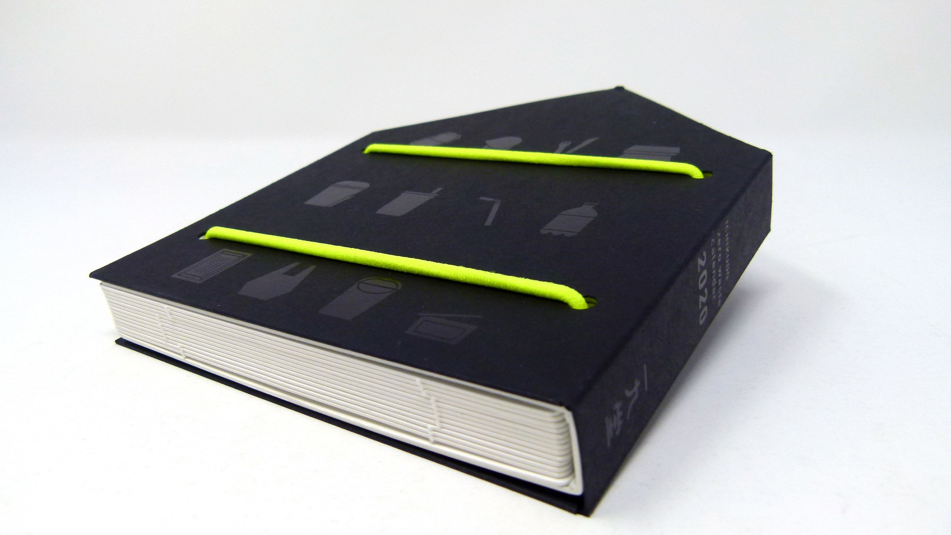
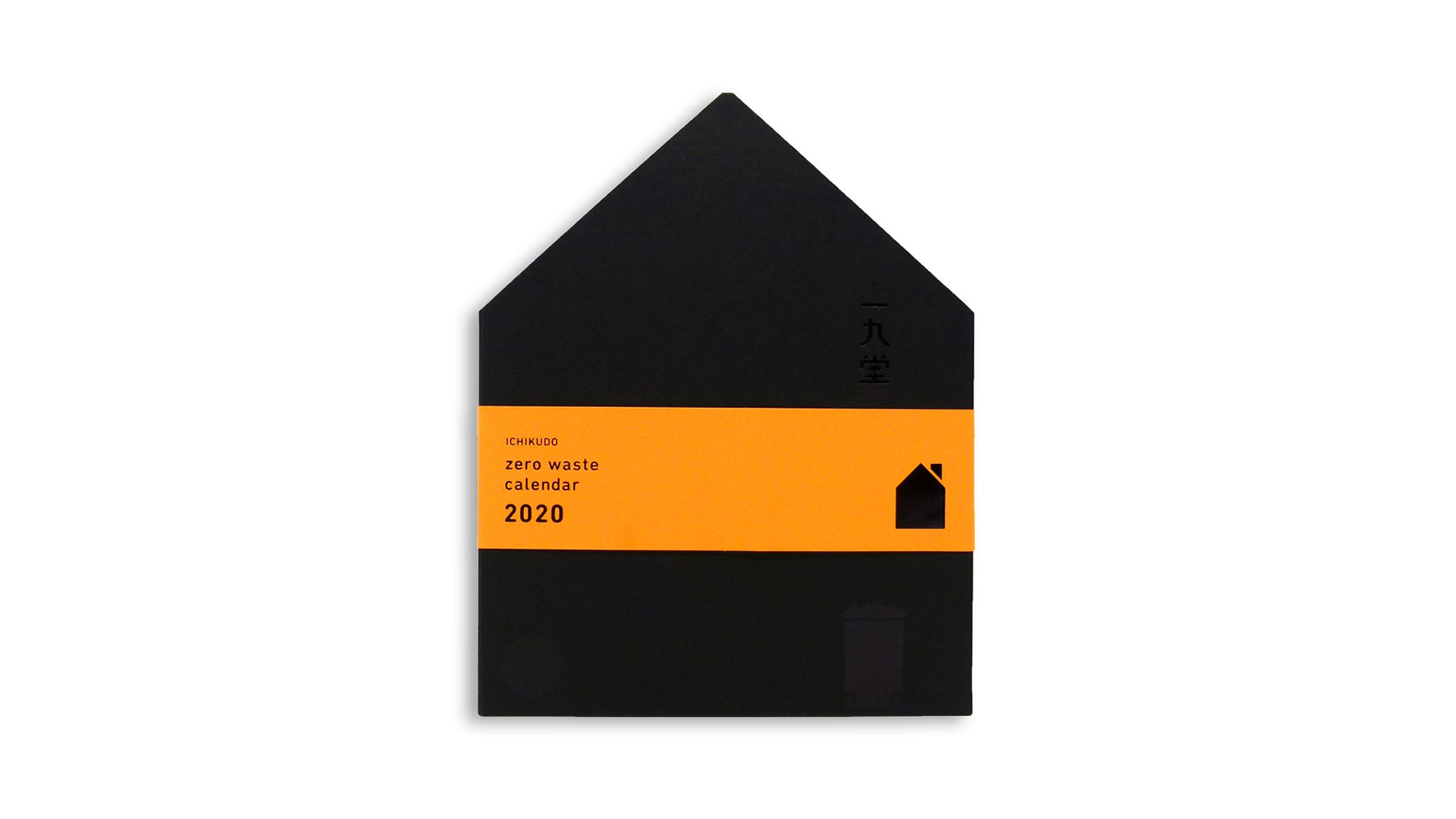
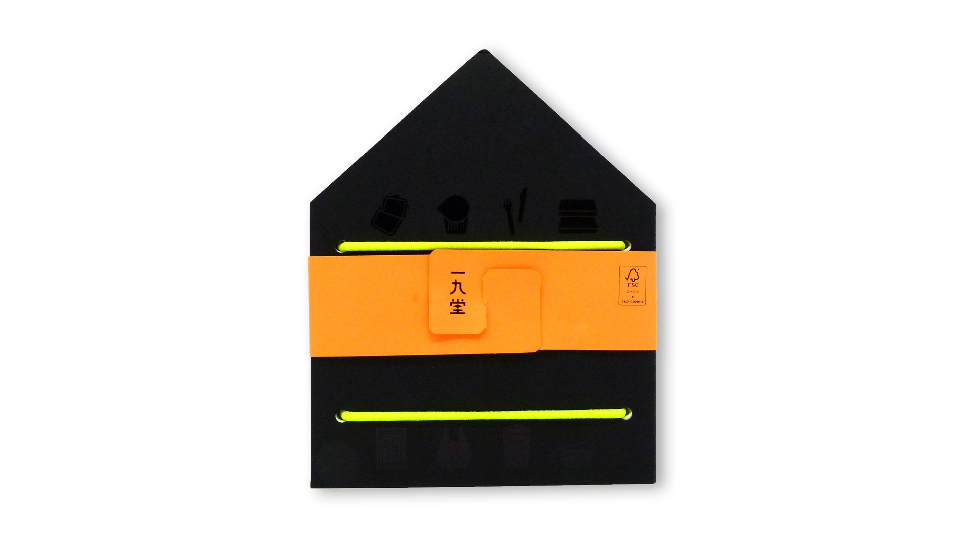
Created in collaboration with Hosoyamada Design Office, this creation immediately commands attention with its packaging, which features a 350 gm (230 lb.) James Cropper Black Espresso cover [Get Swatchbook] die cut in the shape of a house, and held closed by an Orange bellyband printed with the words “Ichikudo Zero Waste Calendar 2020.” UV screen printed on the front cover is a recycling wheelie bin; on the back, icons for the various environmentally-UNfriendly household items featured inside. Also on the back: two Neon elastic bands that disappear mysteriously into the piece.
A Peek Inside
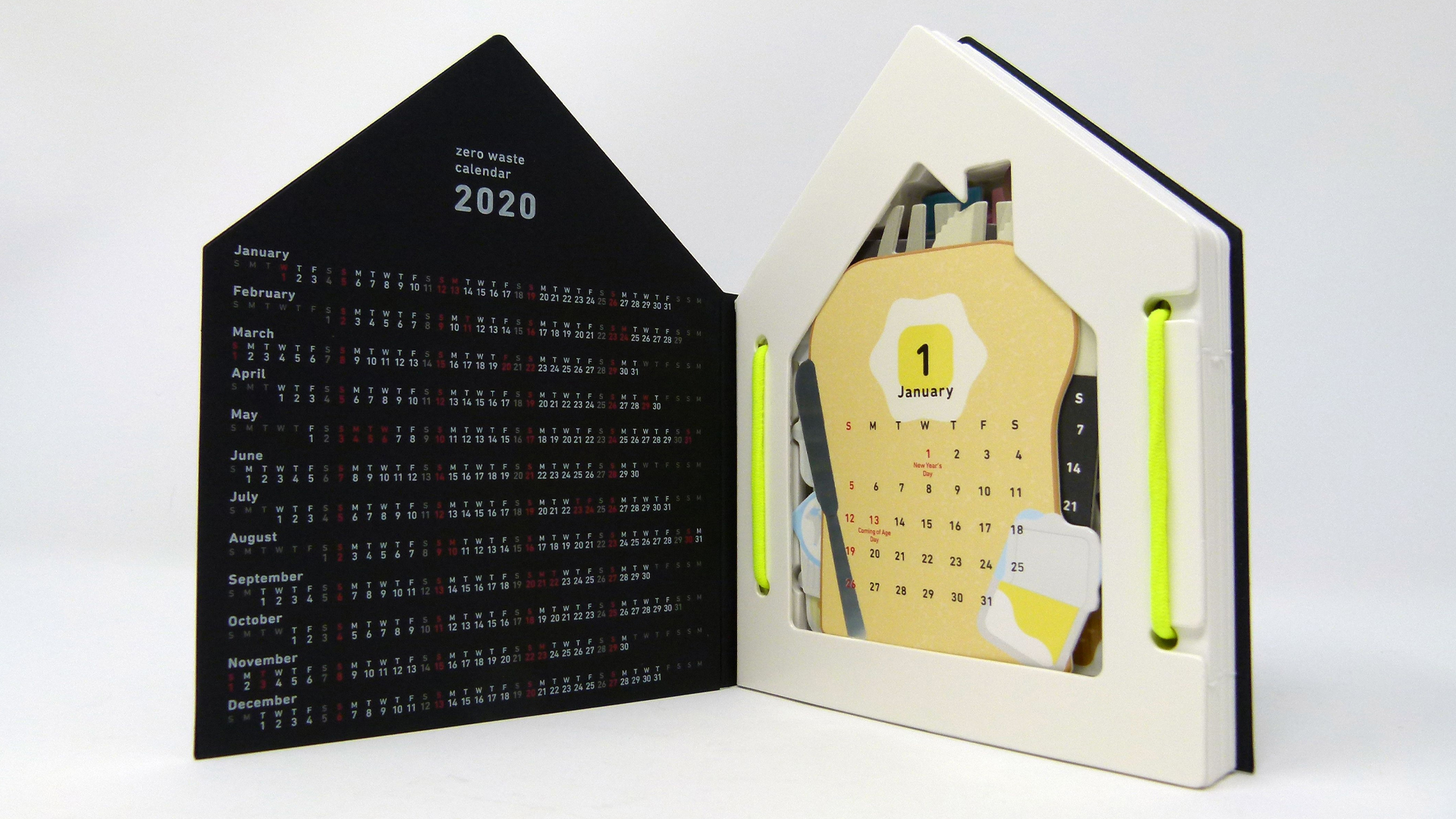
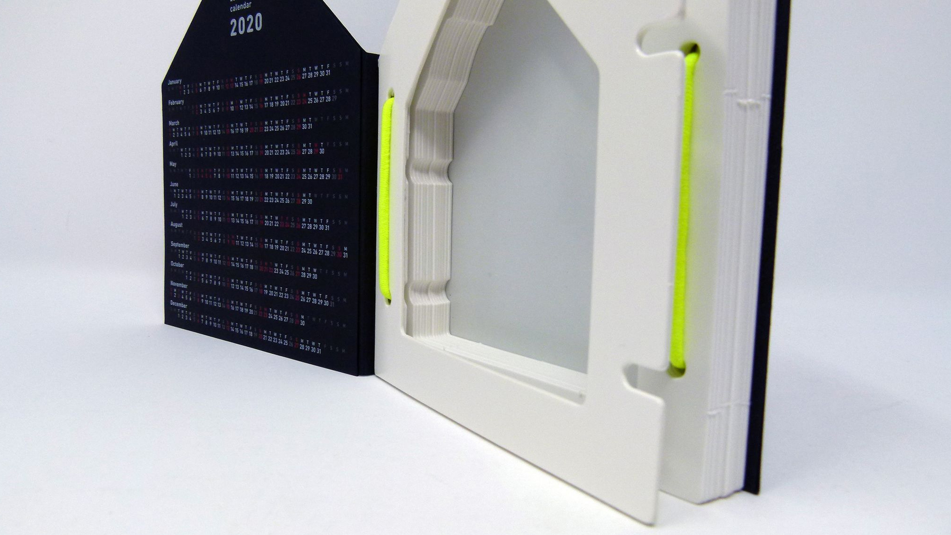
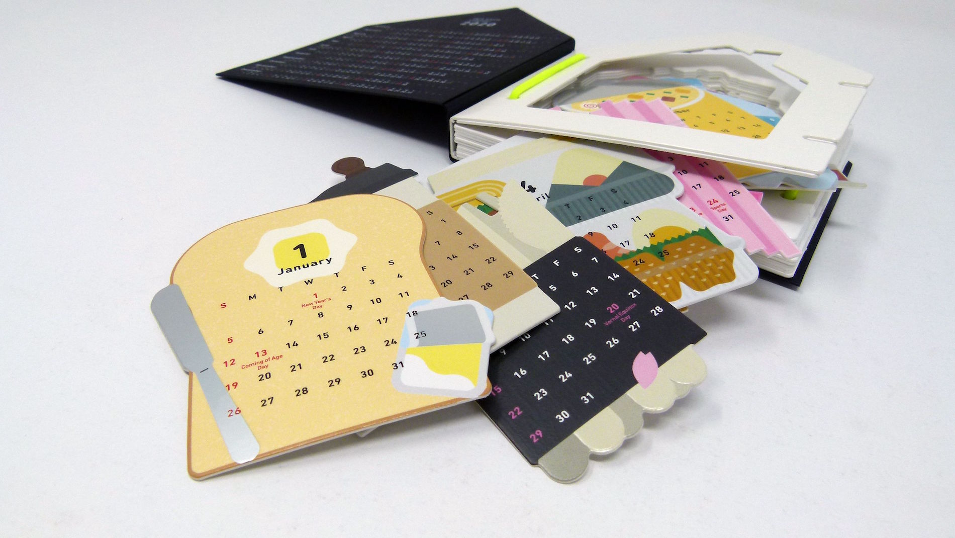
Opening the calendar reveals the full year offset printed on the inside front cover, and a stack of separate uniquely shaped cards – one for each month of the year – resting inside a die-cut paper frame. But wait, why don’t the cards simply fall out? Aha – that’s because of one clever detail.
You see, what seems like a single, solid White frame is actually several frames held together with those mysterious elastic bands, all boasting the same die cut shape: a house with a chimney. Essentially, they are all cut using the same die except for the one at the very front, whose opening is just a little bit smaller than the rest – just small enough, in fact, to keep the cards from tumbling out.
How it Works
As the year progresses, you simply undo the elastic band on the right so that you can shuffle the outdated card for that month to the back, replacing the deck inside the holder with the current month’s card now on display. (The elastic band on the left is part of this unique binding technique, keeping the whole piece together.) Now, about those cards…
A Monthly Reminder of Waste
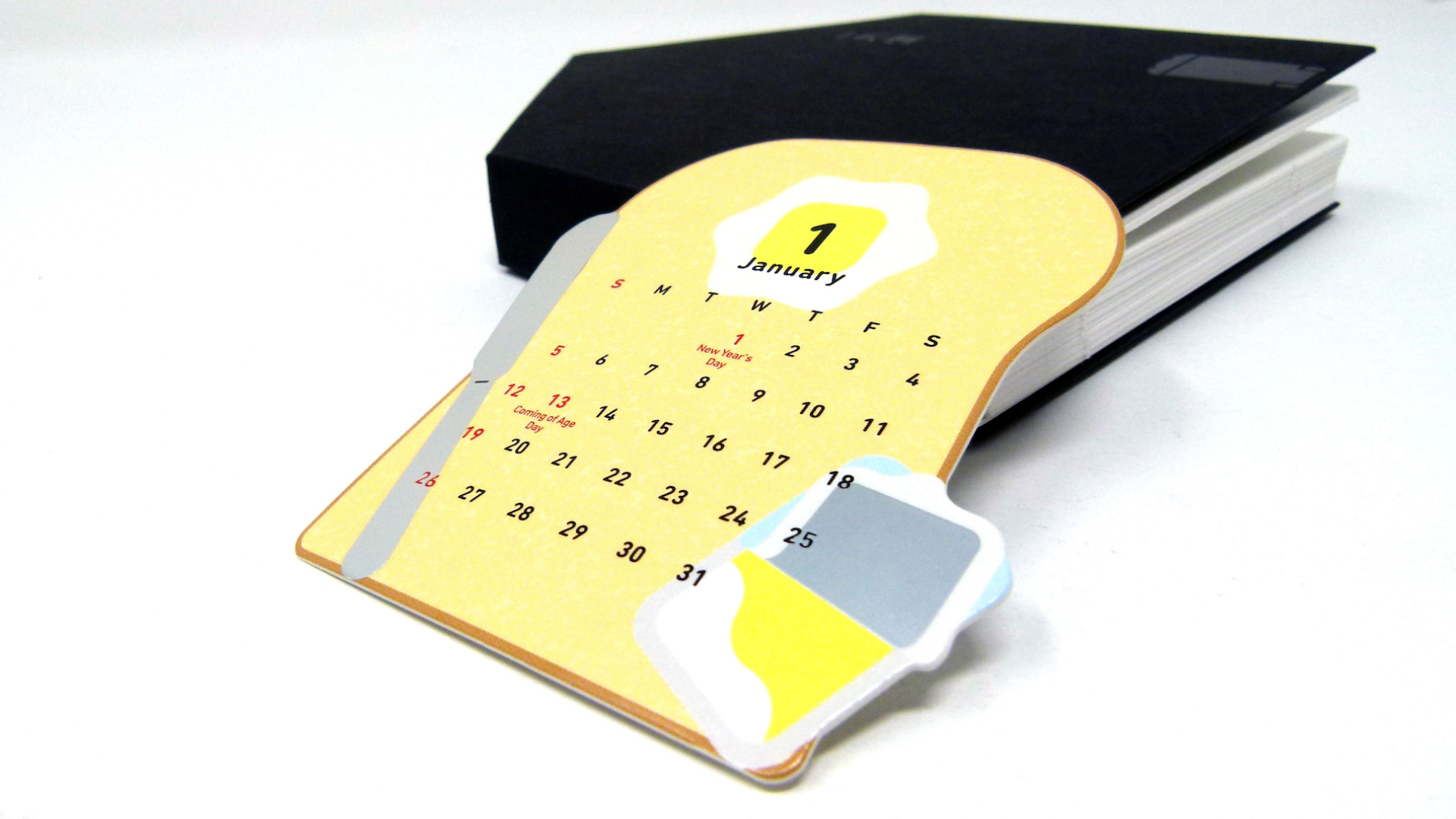
Setting the stage for what is to come, the January card instantly impresses as it’s been die cut and printed to resemble a slice of bread, flanked by a knife and an environmentally unfriendly plastic case. These last two items are realized through a combination of UV screen printing and hot foil stamping, their shapes cleverly included in the overall die cut of the bread slice. Simply amazing.
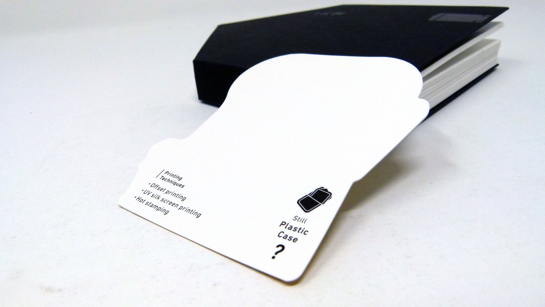
This and the remaining 11 cards are all printed on 330 gm (220 lb.) Iggesund Invercote G. Listed on the back of each are the printing and finishing techniques used, icons of the offending items glimpsed on the front, and the words “Still _____?,” as in “Still [using] plastic cutlery?”
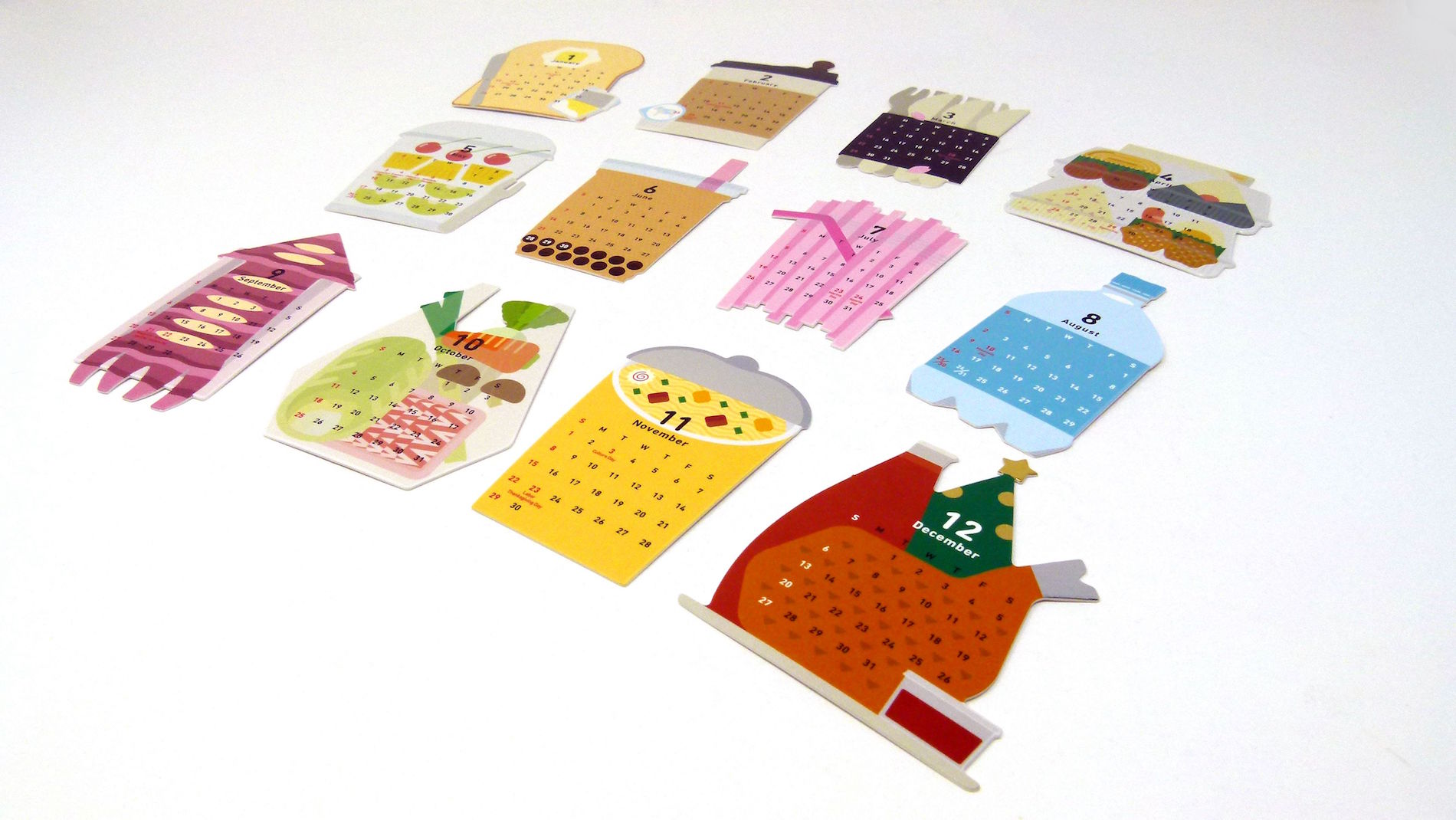
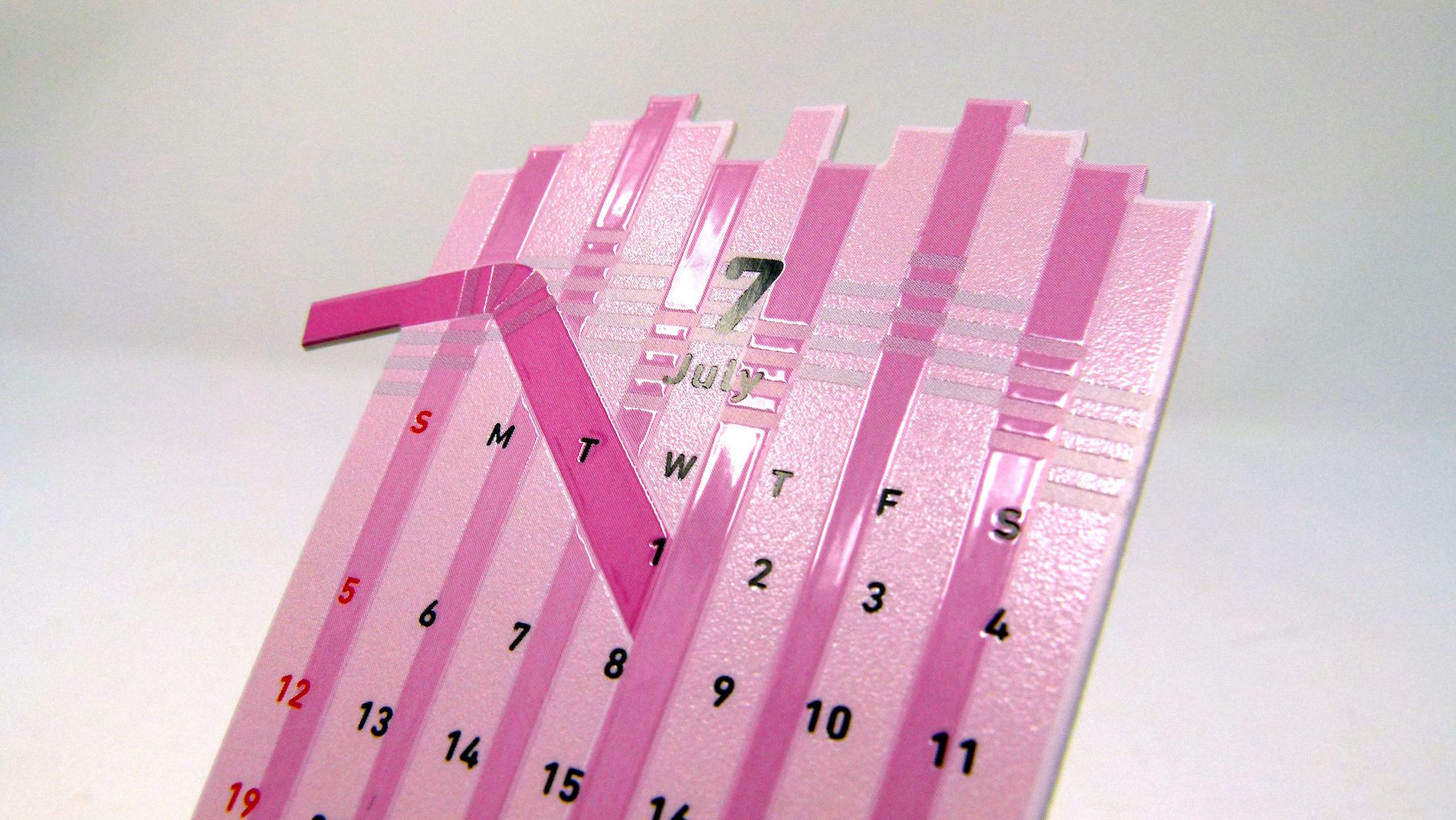
What’s truly breathtaking is the sheer variety of the cards themselves – no two are the same shape or look in the least bit similar. The clear standout here is July which, through a clever combination of die cut, offset and UV silk screen printing, resembles a bunch of straws side by side with one jutting out from the rest. From coffee cups to water bottles, all the usual suspects are represented in these cards – all our environmental sins in one fun calendar.
While it’s hard to say if this calendar will change anybody’s consumption habits, I’m sure it will inspire many New Year’s resolutions by designers to dream up new and interesting ways to use die cuts in the months to come.
Need a refresher course on how die cutting works and what you need to know to use it effectively? If you’re a PaperSpecs PRO member, be sure to check out our PRO Guide to Die Cutting. And if you’re a PaperSpecs PRO member, check out our inspiring webinar about calendar design with Kit Hinrichs!





Calendars have always played a great role and yes their design matters a lot. Thanks for this fantastic Information!