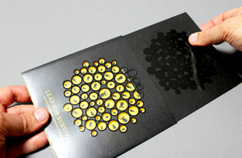
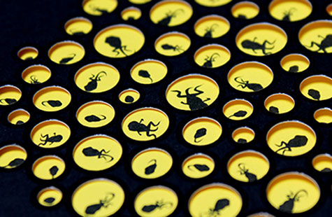
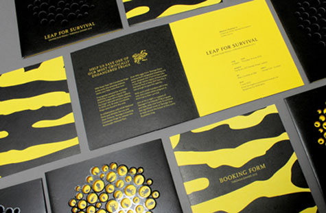
A series of holes were drilled into recycled black card, representing tiny frogs eggs. Each hole had black gloss along the rim to represent the egg’s membrane. The invitation worked in a series of layers – upon opening, the eggs appeared to hatch into tadpoles. We used the distinct pattern of the Corroboree Frog as the colour scheme for both invitation and booking form, and the egg cluster motif was also used on the program cover and throughout the event.
– Steve Scott
The reason for this fund-raising dinner? Very special frogs. With fewer than 120 corroboree frogs left in the wild, Australia’s Taronga Zoo required a stirring concept for their charity event, and Another Colour gave them just that with the Leap for Survival invitation.
To create a sense of hope that invitees could help rejuvenate the corroboree’s population, the design team decided to use the frog’s breeding and lifecycle as its inspiration – eggs and tadpoles. The palette – black and yellow – matched the colors of the corroboree. A cluster of circles in five sizes was designed to represent the frog’s eggs. (This motif was repeated on the program cover and throughout the event.)
On the invite’s front cover, a double hit of spot gloss varnish on the egg cluster was not only a great contrast to the matte black ink, but also mimicked the shine of the egg membrane. Remove the invite from its sleeve and a blazing yellow background shows through a lattice pattern that has been intricately and painstakingly drilled into the egg cluster. Illustrations of tadpoles show through the voids. A rim of varnish remains giving the piece a dimensional quality.
Love this piece?
Like it and share with your friends below.


Love it, Simply beautiful!
So glad you liked it, Margie!