“Build it and they will come” is often the motto for property developers these days. But when your residential prices start at half-a-million dollars for a 450-square-foot studio, as was the case with the McGregor Square residences in Downtown Denver, people expect to receive a little something extra while they wait for their new homes to be completed.
This 3-volume set, designed by our good friends at Ellen Bruss Design (EBD) [projects / website], didn’t simply help brokers sell condos, but they also served as a sort of keepsake for people’s experiences there for years to come.
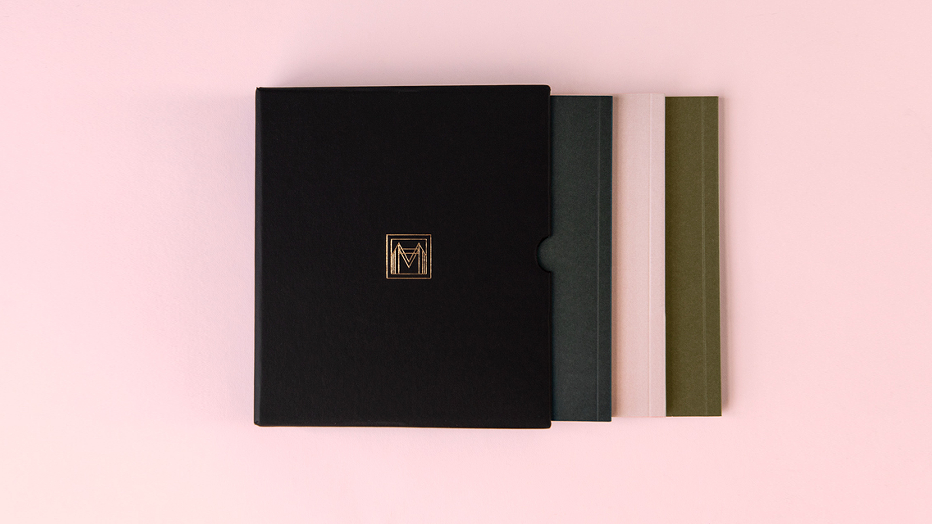
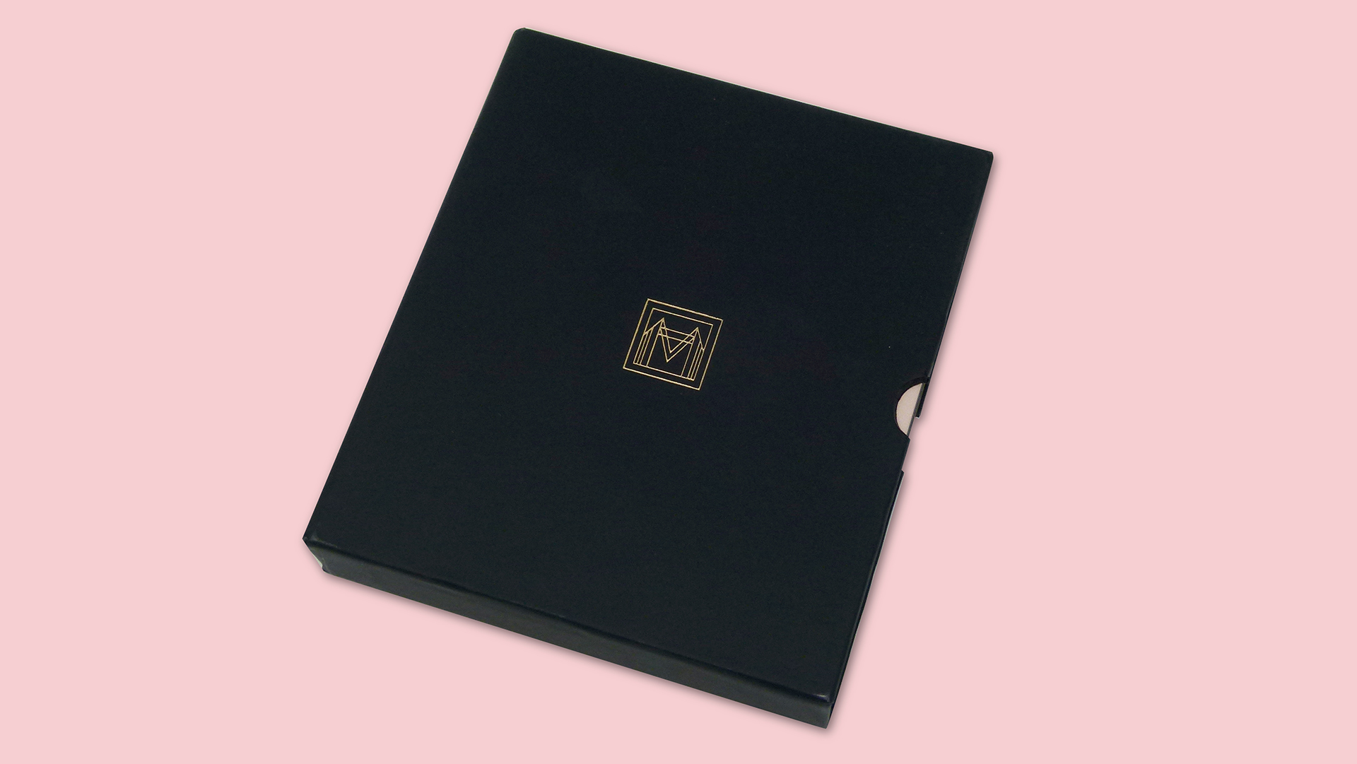
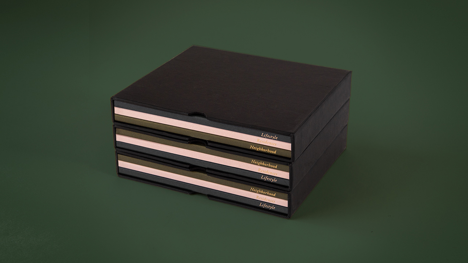
The first thing that you cannot help but notice is just how small-yet-impressive this package is. Though smaller than a CD double-album, it still feels incredibly substantial in your hands thanks to the rigid slipcase, and the relatively heavy papers used for the booklets inside.
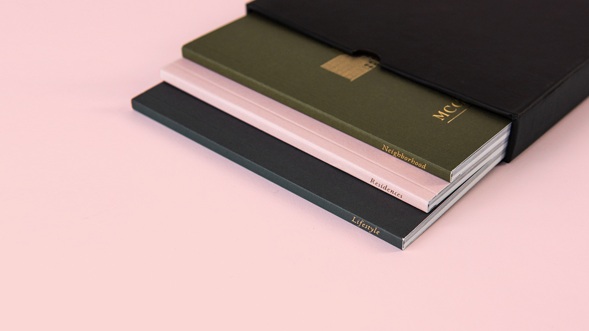
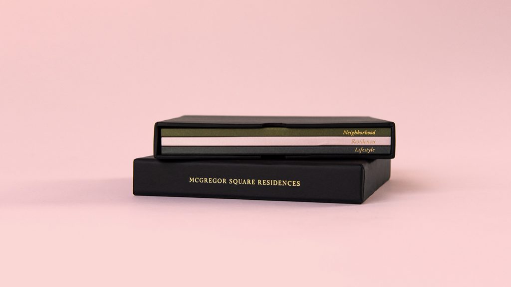
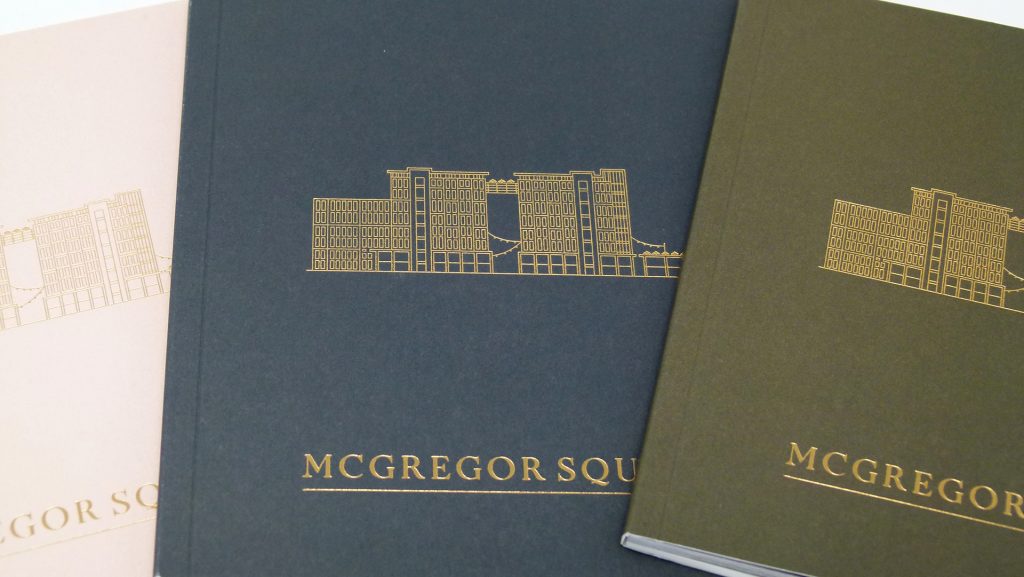
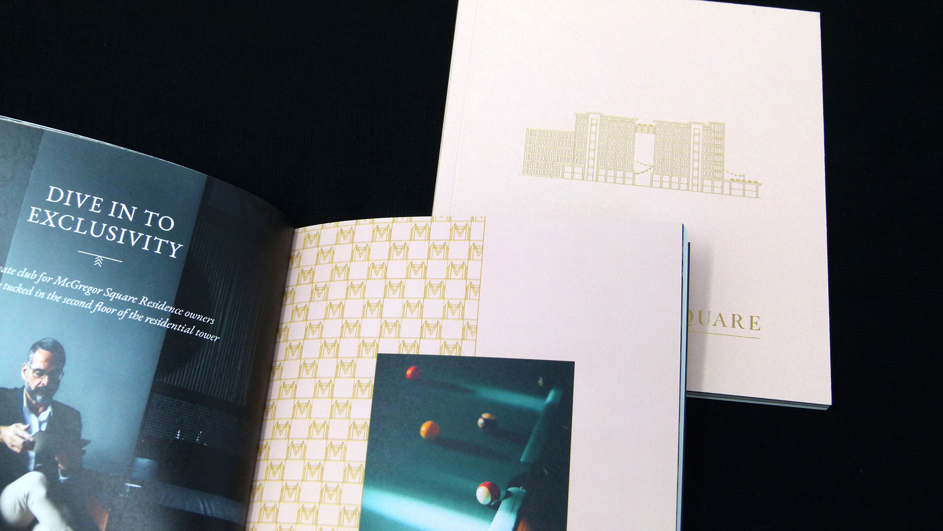
The Gold hot foil stamped logo on the front of the case is elegant, and nicely conveys both an architectural look and the letter “M” for McGregor. More Gold foil, this time along the spine, spells out the name of the property. Intrigued to see more, you find helpful die-cut thumb notches at the edges to make it easier to slide the pieces free from the case.
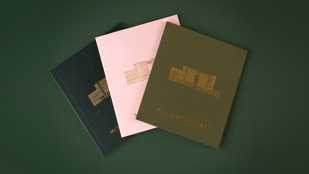
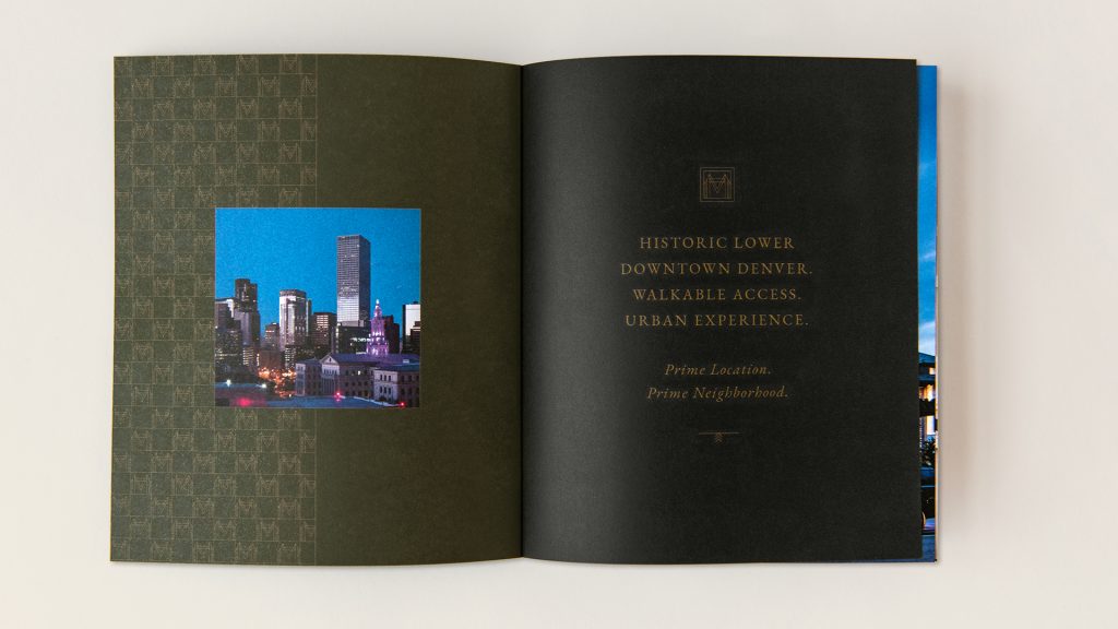
Each of the three 56-page booklets features a different colored cover on 120 lb. International Paper Accent Opaque Super Smooth Cover [Get Swatchbook!]. Each focuses on a different aspect of the property: Neighborhood, Lifestyle and Residences, with these titles foil stamped in Gold on their respective spines. The same Gold foil rendering of the building and “McGregor Square” title appears on the front cover of each, with the logo and web address stamped in foil on the back.
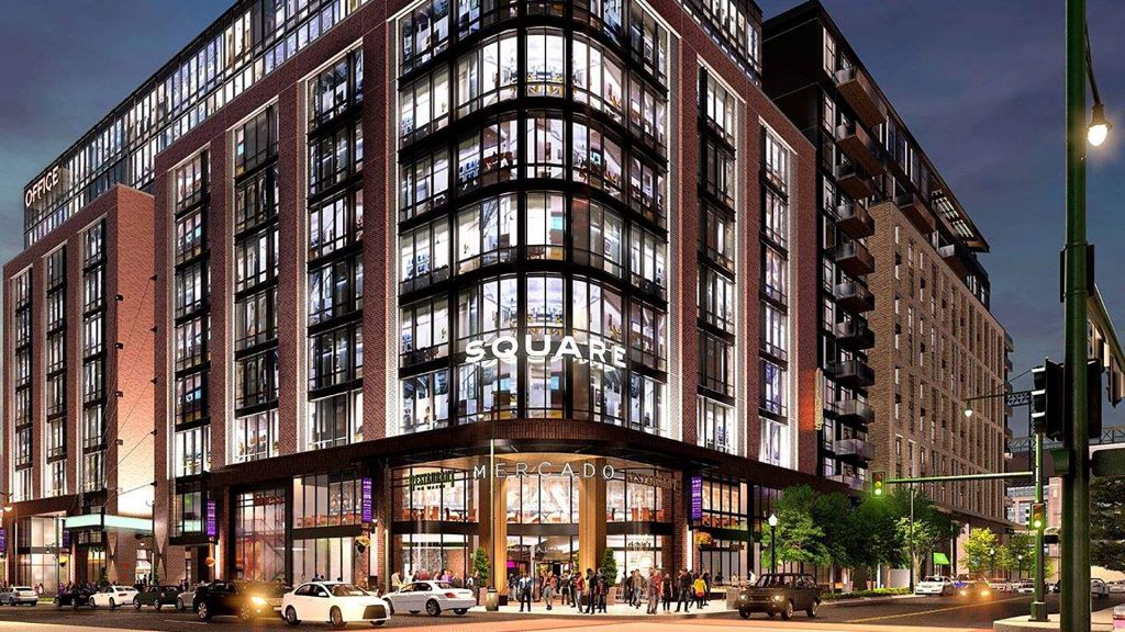
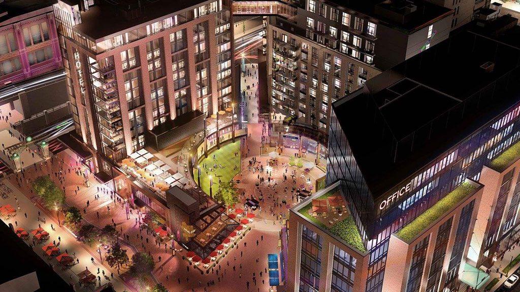
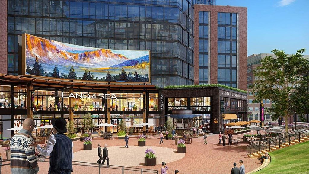
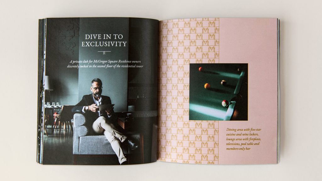
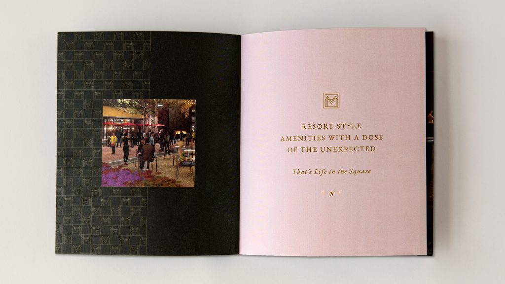
McGregor Square is an enormous multi-use complex designed to foster an upscale community beside the Colorado Rockies’ ballpark: Coors Field. It’s made up of three towers – a hotel, an office/retail space and a residential block – with a 28,000 square-foot outdoor plaza at their center. Residents can attend concerts and festivals there, or simply hang out on the grass berm enjoying their favorite movies on a giant LED screen. A members-only lounge includes outdoor kitchens and wet bars, heated pools and infrared saunas.
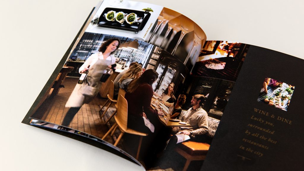
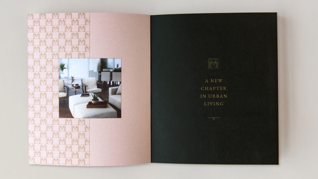
The perfect-bound booklets help potential residents appreciate all the possibilities of this self-contained neighborhood through the use of rich, moody photographs of life in the square.
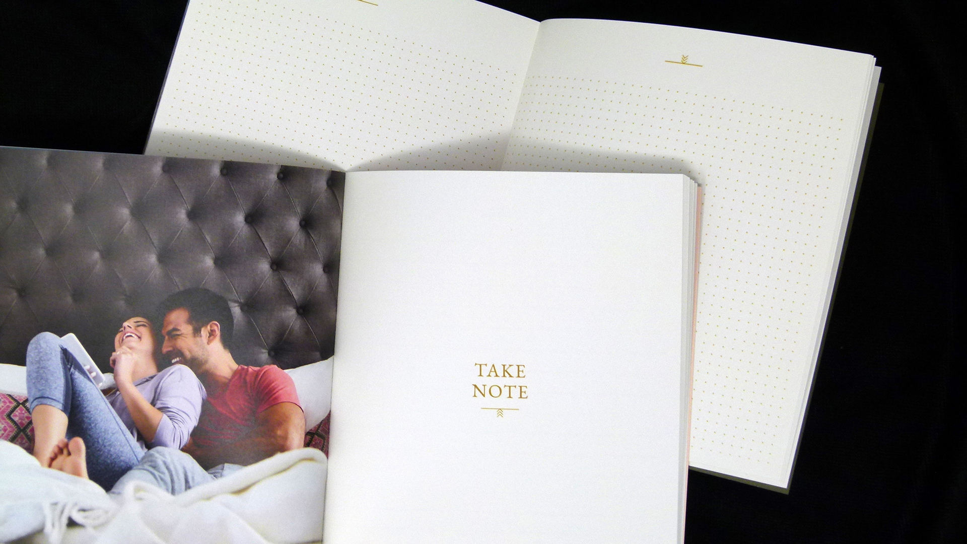
Digitally printed CMYK on 100 lb. Accent Opaque Digital Super Smooth Text, these pieces also include a helpful “Take Note” section at the back to allow potential residents to jot down favorite neighborhood restaurants and more – there’s even a dot grid section perfect for designers like us 😉
As a fellow designer you will also appreciate the trouble that EBD went to, including the matching of colors between the cover and interior feature pages – no easy feat as the former was printed offset and the latter digitally. This required a lot of color testing up front and, of course, a press check.
Coordination also became an issue when it came to ensuring that the booklets would actually fit snuggly inside the slipcase. Since the case was produced overseas, the designers ended up shipping dummies for testing. One of the biggest lessons learned: You should always allow more time than you think you’ll need when dealing with overseas vendors, just in case something needs to be redone or shipping takes longer than expected. (And this was before COVID!)

