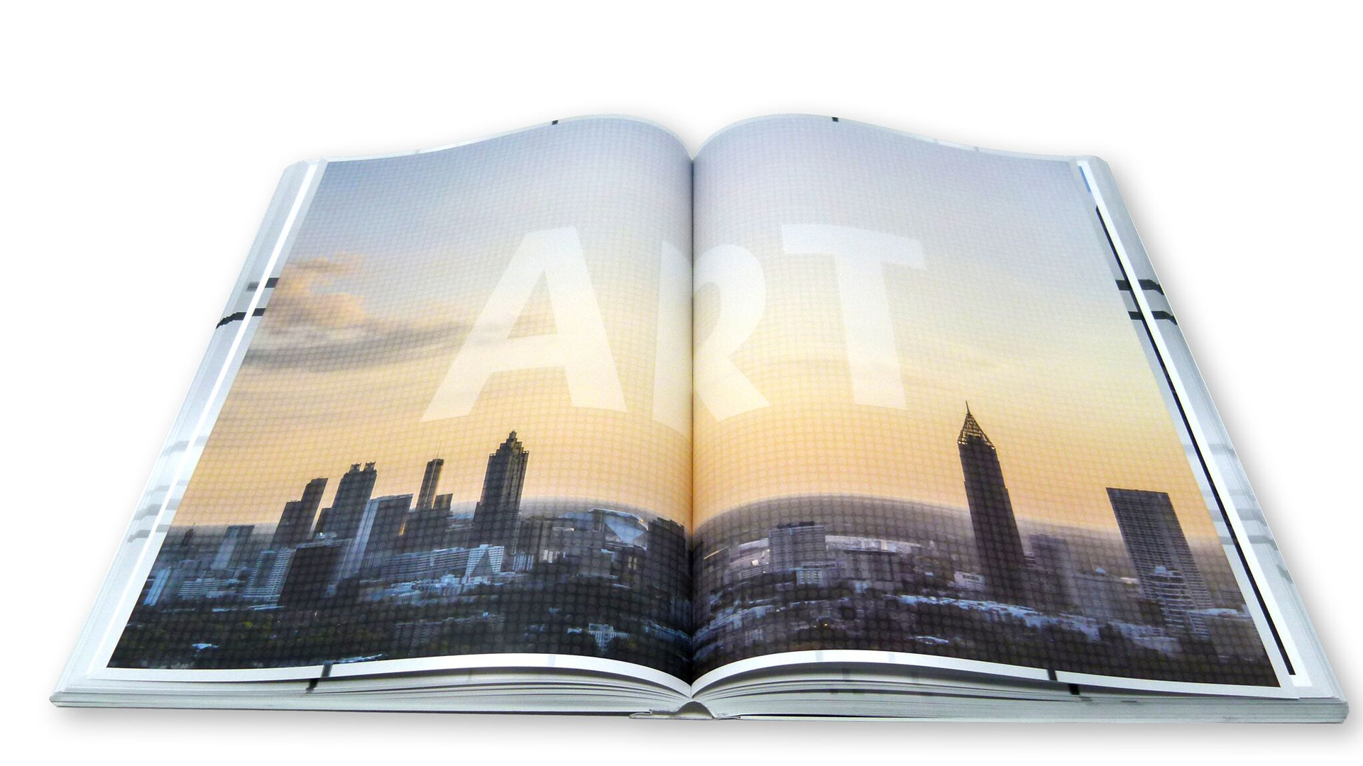
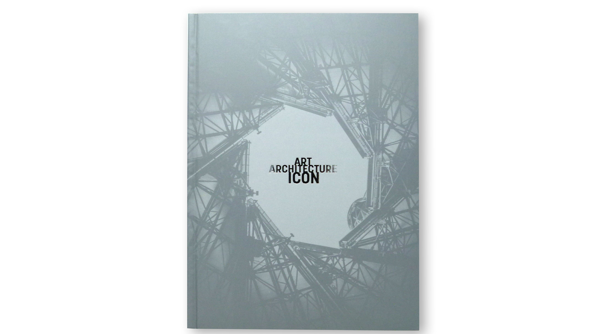
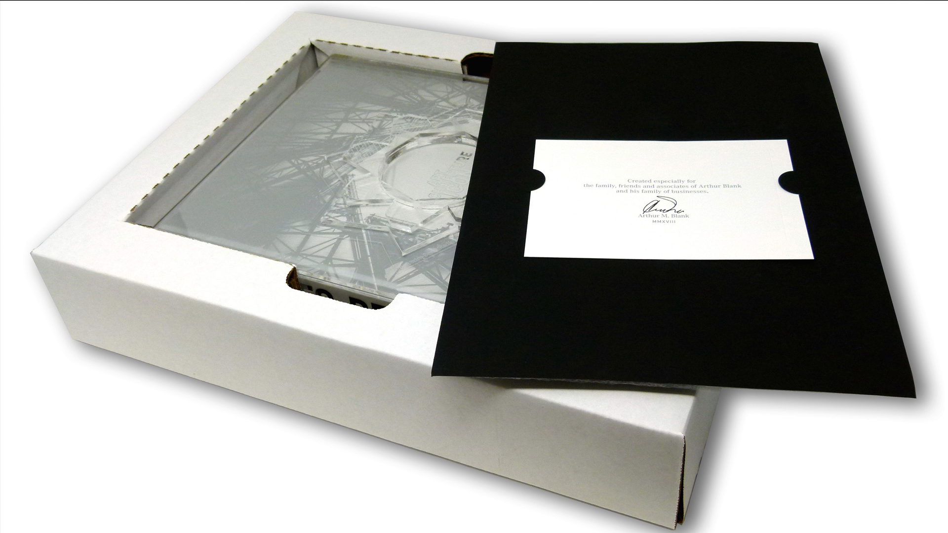
“This,” I said to myself when I first glimpsed a rare copy of “Art, Architecture, Icon: Mercedes-Benz Stadium,” “is precisely what books do better than anything else.” And when I say precisely, that’s exactly what I mean. That’s because this enormous 10-x-14-inch tome and its impressive translucent slipcase were painstakingly engineered down to the very last detail – a fitting tribute to an equally intricate structure.
Specially commissioned by Atlanta Falcons owner Arthur M. Blank to create a private, limited-edition monograph about Mercedes-Benz Stadium, Rigsby Hull outdid themselves by designing a 412-page volume that clocks in at nearly 20 lbs., yet which also includes delicate details you wouldn’t expect from such an enormous publication. (A lot like the stadium it celebrates, now that I think about it.)
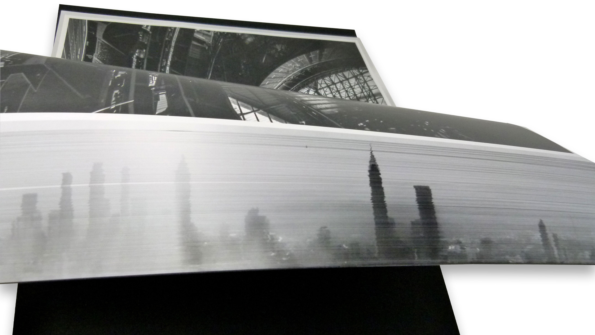
Lovingly printed 8-color offset by Print is Art Press (An imprint of GLS/Next Precision Marketing) on Sappi McCoy Silk [Get Swatchbook], this book buzzes with a number of beautiful touches. Yet there is one that absolutely begs to be mentioned first, and that is its disappearing fore-edge painting.
The Power of Fore-Edge Painting
As Lana Rigsby explains of fore-edge painting, a practice that goes back to at least the 16th century, “Early book designers painted scenes on a book’s fore edges then covered the scene with a smooth brush of silver or gold paint. Landscapes, erotic scenes or heraldic signatures identifying a book’s owner were ‘hidden’ beneath the gilding, invisible until the book’s pages were fanned open.”
In this case, the scene we’re presented with is that of the Atlanta skyline which, surely enough, disappears as predicted. Observes Lana, “Arthur Blank is deeply loyal to the City of Atlanta and wanted this stadium’s art and architecture to be uniquely rooted in the culture of its hometown. Reviving this timeless technique, we embedded the city’s skyline into the page edges to subtly ground the piece in the geography and culture of this southern city.”
More to Explore
What makes this beautiful tome so mind blowing (aside from the quality of the printing and finishing, which are truly exceptional) is just how closely the designers looked to the topic of this monograph for their own creative inspiration.
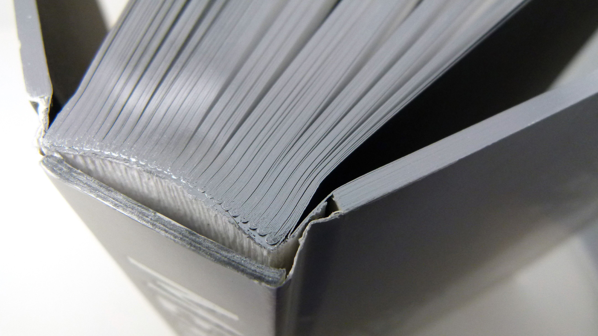
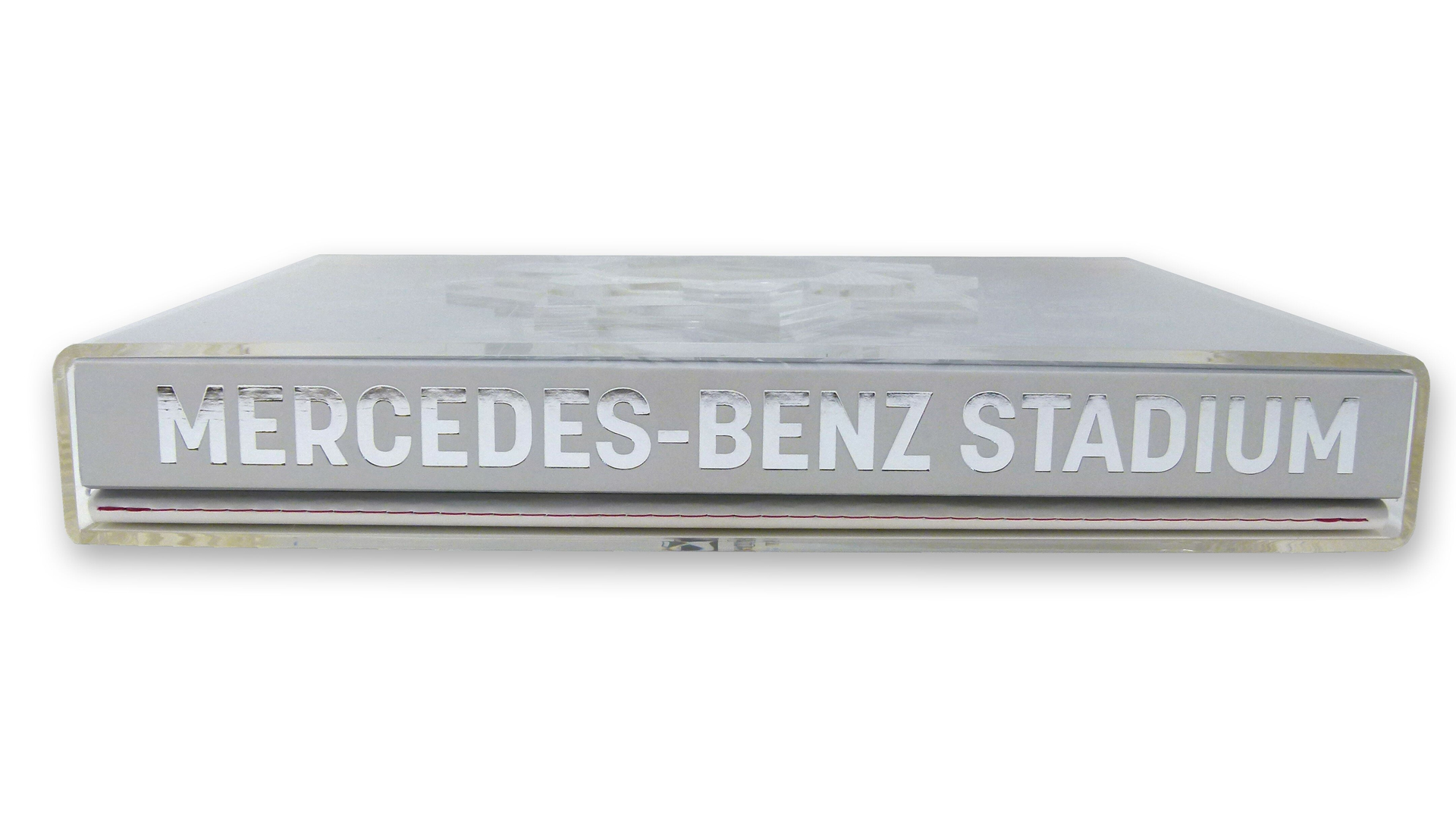
“The silver cover and gilt page edges mirror the building’s stainless steel cladding,” Lana points out, while “the patterned divider pages reflect the translucent bird-air material of the stadium’s massive window walls.” (The retractable, flower-petal-like roof atop the stadium also inspired this VIP event invitation from the NFL.)
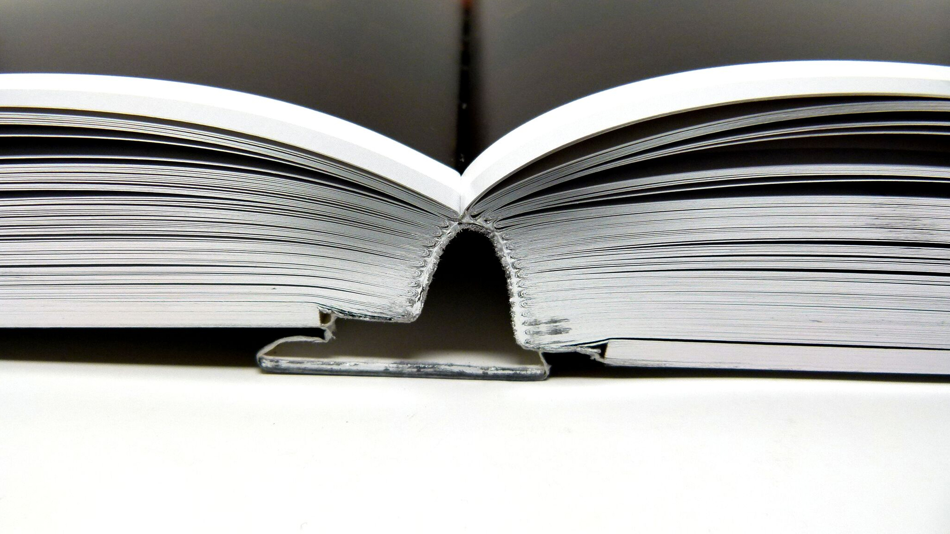
That’s not to say that Rigsby Hull ignored those details that make for a truly luxurious book. In addition to foil stamping the volume, it’s Smyth-sewn for easy lay-flat reading, and includes casebound covers flush-trimmed to the gilt page edges, giving it perfect square edges and transforming the whole piece into an attractive silver block.
To further stoke the reader’s creative fires, they also included a 60–page booklet of notes, sketches and rare photographs – printed on Mohawk Superfine – that reveal the evolution of the stadium’s design.
The Final Touch
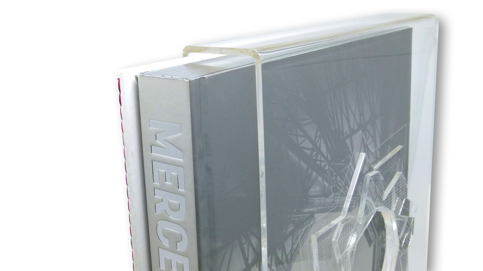
If you’re thinking this book is an art object fit for preservation under glass, the designers were way ahead of you: meet the Plexiglas slipcase.
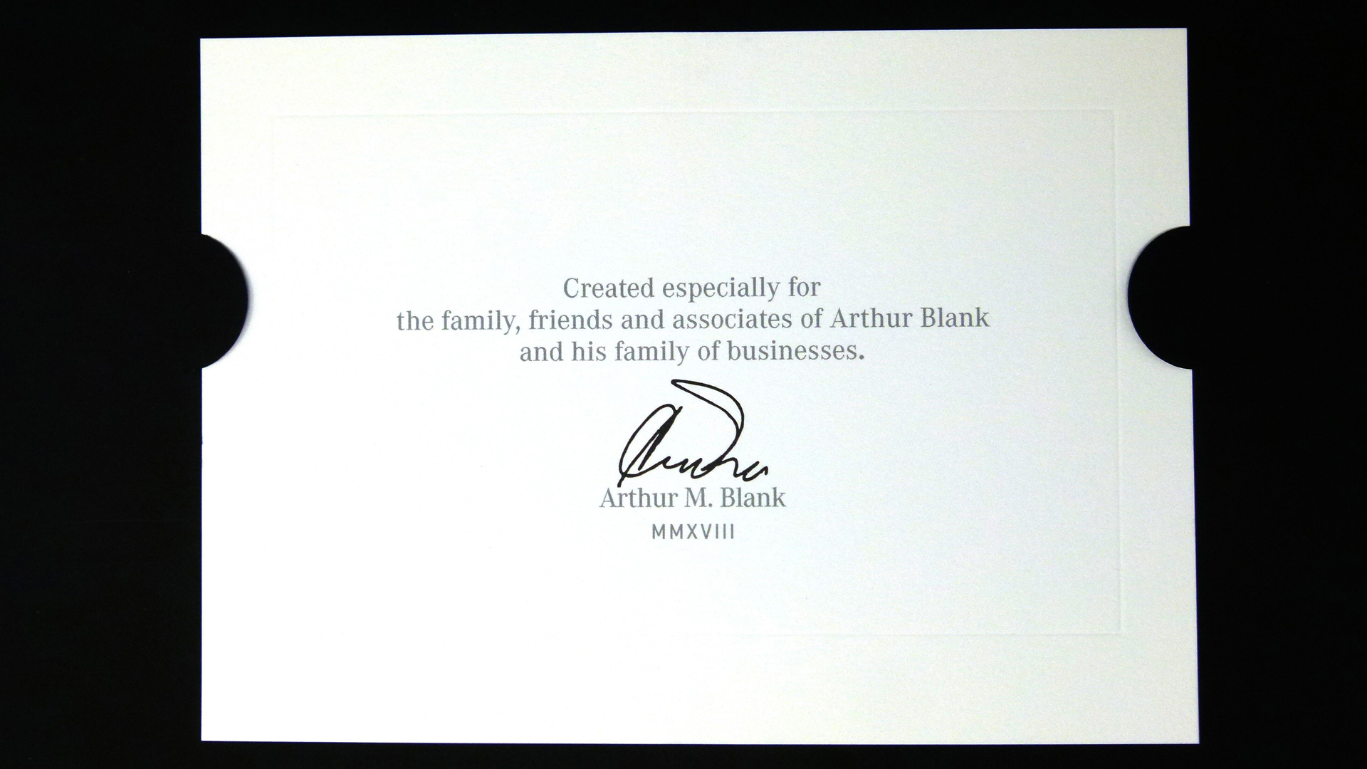
Three-layered sculpting enabled them to recreate the stadium’s distinctive open-aperture roof in such a way as to frame the book’s title. Each slipcase was also etched with the recipient’s name, as well as its number in the limited-edition print run. (Each book was also hand-signed, numbered, and included a hand-written gift card.)
If sports arenas are a monument to the spirit and physical prowess of a community, then this book is monument to what the art of book design can be when we set out to truly inspire.
There are so many different binding options available to you today – where to begin? For a handy, info-packed graphic chart laying out all your options, be sure to download our free Binding Cheat Sheet right now!

