The solar eclipse of April 2024 meant different things to different people.
However, for Dixon Schwabl + Company, it was a unique opportunity. They saw it as a chance to not only celebrate a rare event with clients, co-workers, and their families, but also to demonstrate how staging an “experiential event” could make a brand stand out in an increasingly crowded marketplace.
Crafting the Invitation: A Blend of Darkness and Light
Dixon Schwabl + Company designed the invitation holder, while Panther Graphics produced it. They captured the eclipse’s contrast by using a double hit of Black on 100 lb. Mohawk Via Felt Pure White Cover stock. Additionally, they rendered the event date in a sunny Light Orange, adding a striking visual element.
A small slip of paper, paper-clipped to the front, invited guests to bring a friend. Below the Black-on-Blue message, the RSVP deadline and a handy QR code ensured easy responses.
Now, let’s talk about the first bit of the “experience.” They cleverly incorporated a diagonal Zip-Strip. As guests tore it open, they unveiled the invitation, but not before revealing a thoughtful message in Black against a Light Orange background: “Just Because It’s Hidden Doesn’t Mean There is No Light.”
Opening the holder fully revealed two remarkable pieces designed to mirror the celestial event.
Poster and Spinner: The Ultimate Keepsakes
One of these pieces is a poster printed on Sylvamo Accent Opaque paper. Even when folded to fit inside the holder, it remains stunningly dramatic due to a close-up view of the moon’s surface.
When unfolded, it presents the same surface with the word “Eclipsed” rendered twice in Black ink, while a Blue moon illustration seems to leap off the page.
The other side of the poster features a Light Orange flood, except for the White halo of an eclipse. This design cleverly allows the White paper underneath to shine through, superimposed over a detailed, Dark Orange illustration of the moon.
The poster asks, “Where will you be when the sun and moon align?” and invites guests to experience this once-in-a-lifetime event. Additionally, a clear holographic foil subtly shares the date of the eclipse and the phrase “A ring of hope in the sky.”
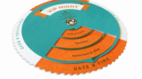
The invitation suite also includes a captivating “spinner wheel,” made of two Laser-Cut circles of Mohawk Via Felt, held together by a grommet. As you slowly rotate the top circle, it reveals the movement of the moon toward the sun through a technique called “scanimation.”
But the designers didn’t stop there.
By placing the spinner on the Blue moon and aligning the notches with the Roman numeral III (the time of the full eclipse), a secret message emerges in the Die Cut holes around the edges: “Ascend!”
This striking invitation suite shows that exquisitely designed print pieces can not only overshadow other media, but also give natural events a run for their money.


