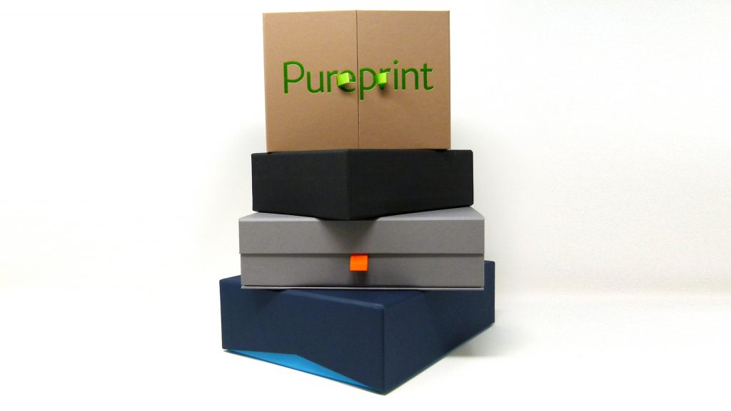
Blue-sky thinking is fantastic – it’s given birth to everything from the smartphone to your favorite artwork. But as every designer knows, it’s also easy for your clients to get lost in that big blue sky of “we could do this…or this….or this!” To bring their own clients back down to earth, print and marketing service provider Pureprint Group created a packaging sales kit that’s sensible yet full of surprises: three surprises, in fact.
As a company that produces everything from luxury packaging for retail products to high-end presentations for keepsake books, Pureprint wanted something that could easily give potential customers a sneak peek at what they could craft for them, while also reaffirming the impact that great packaging can have on any recipient.
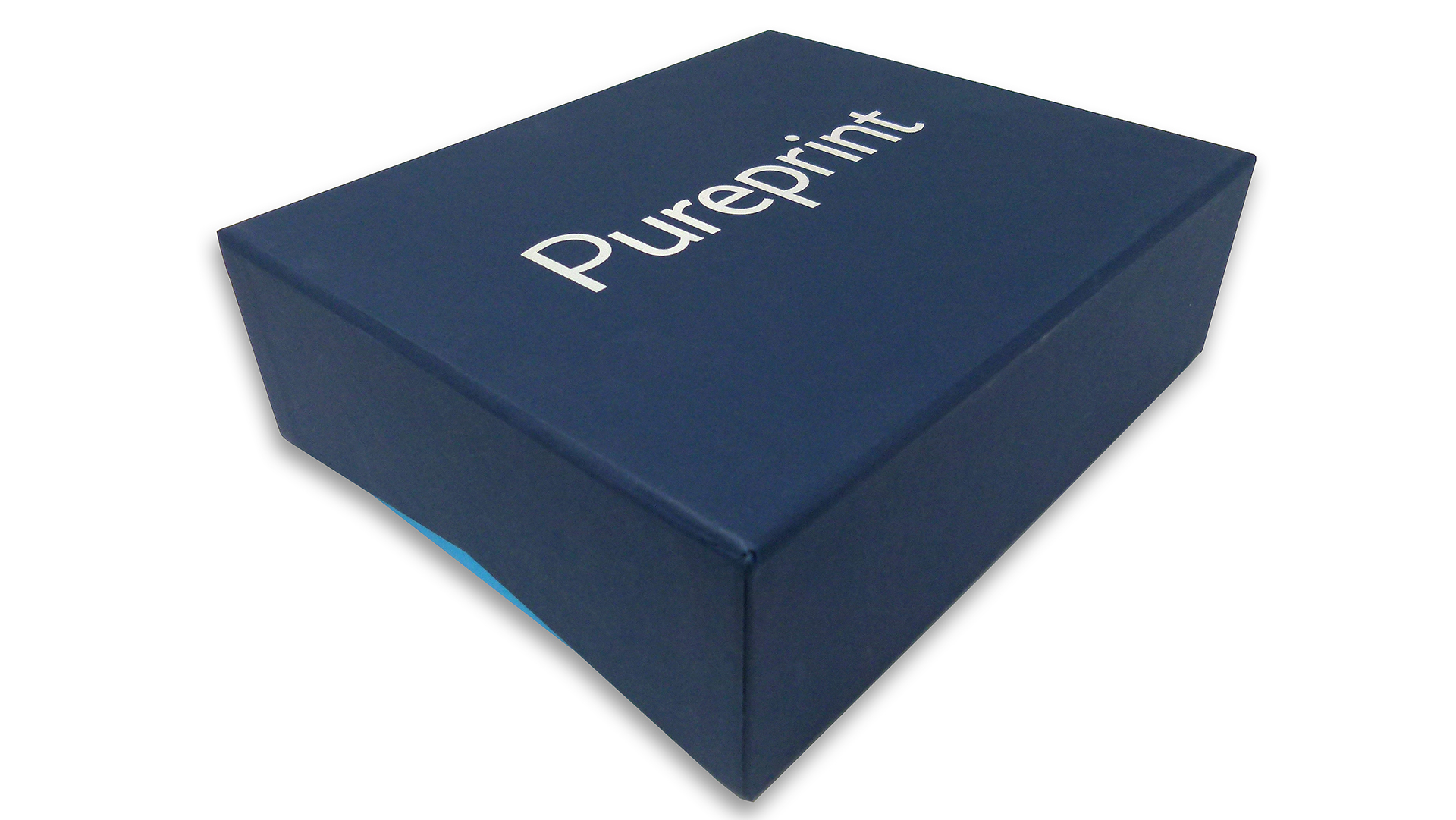
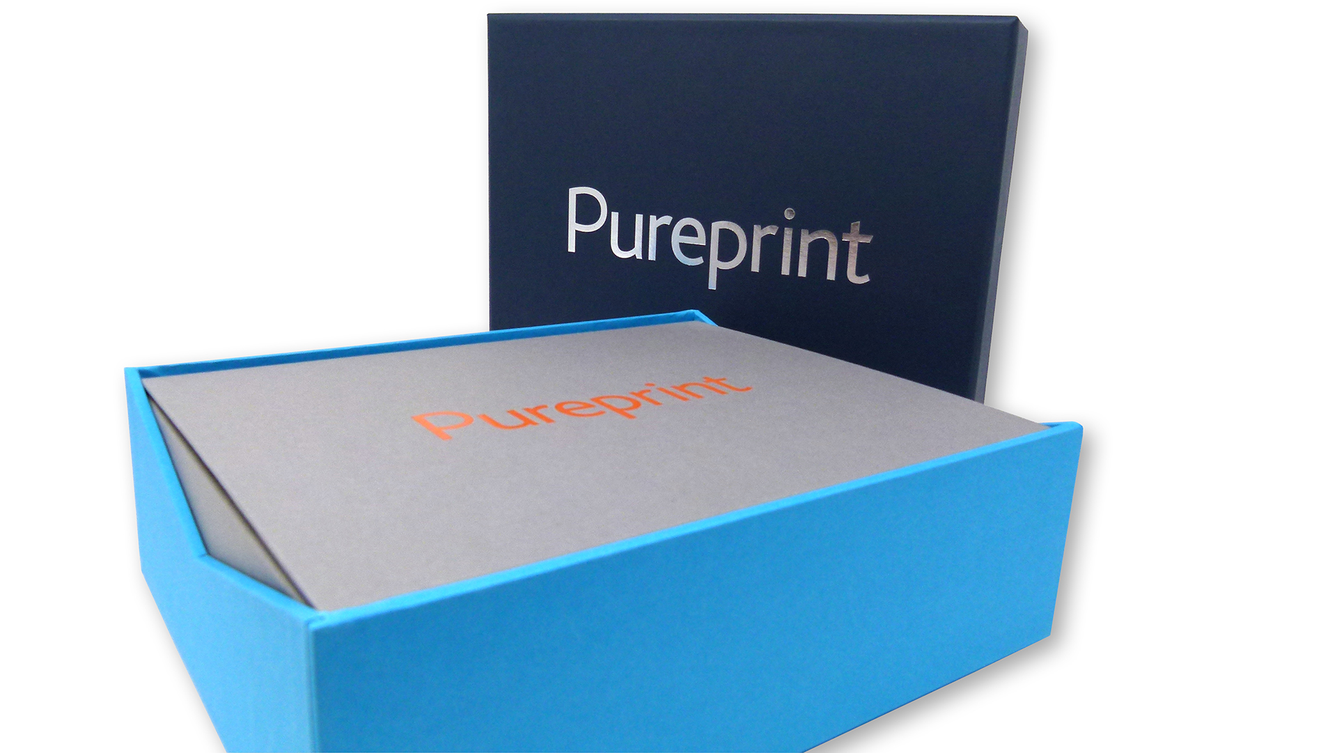
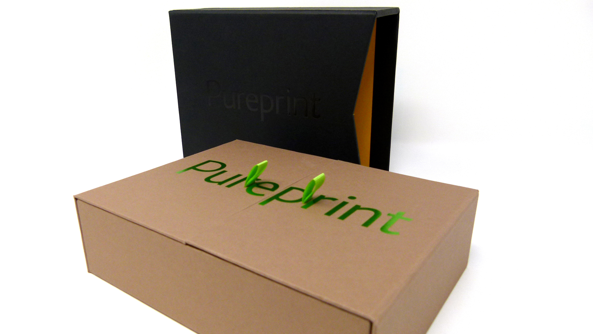
With that in mind, they created this sharp-looking rigid box comprised of boards wrapped in Colorplan Cobalt paper [Get Swatchbook], the Pureprint name smartly hot foil stamped in Silver on the lid. Take a closer look and you’ll notice that both sides of the lid feature wide, triangular die-cut notches, which give your fingers ample room to lift it off. And of course that extra space also allows the lower box covered in complementary Colorplan Tabriz Blue to peek out in a tantalizing way – a nice touch.
Now then…what do you imagine is inside? There’s only one way to find out. Removing the lid reveals….
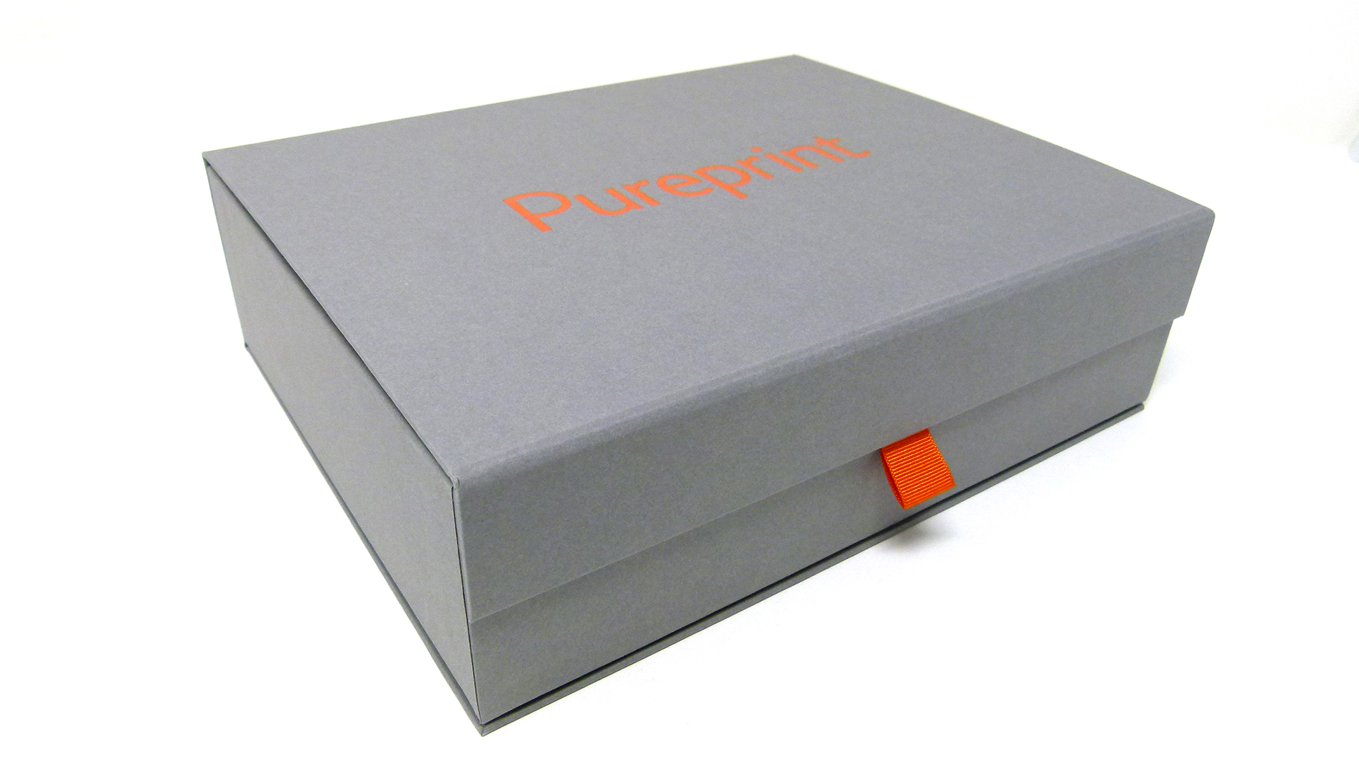
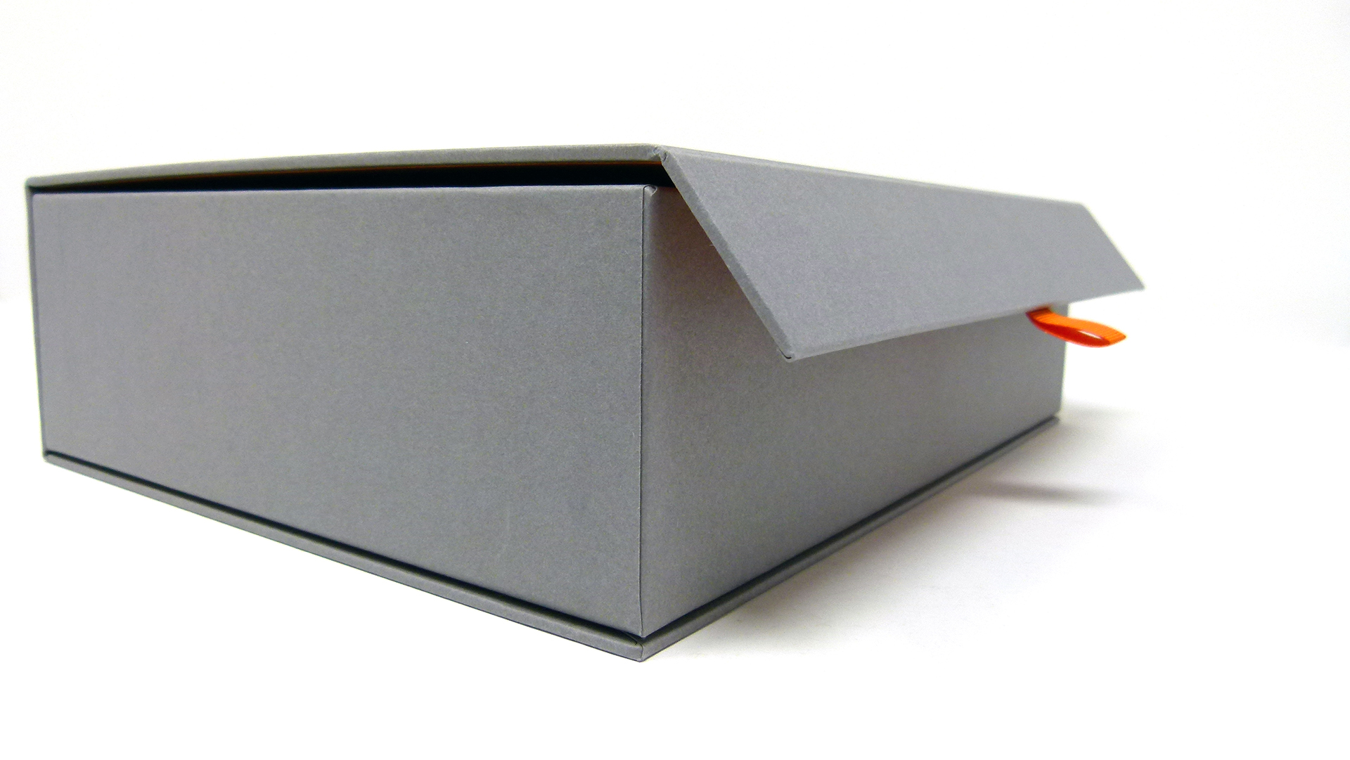
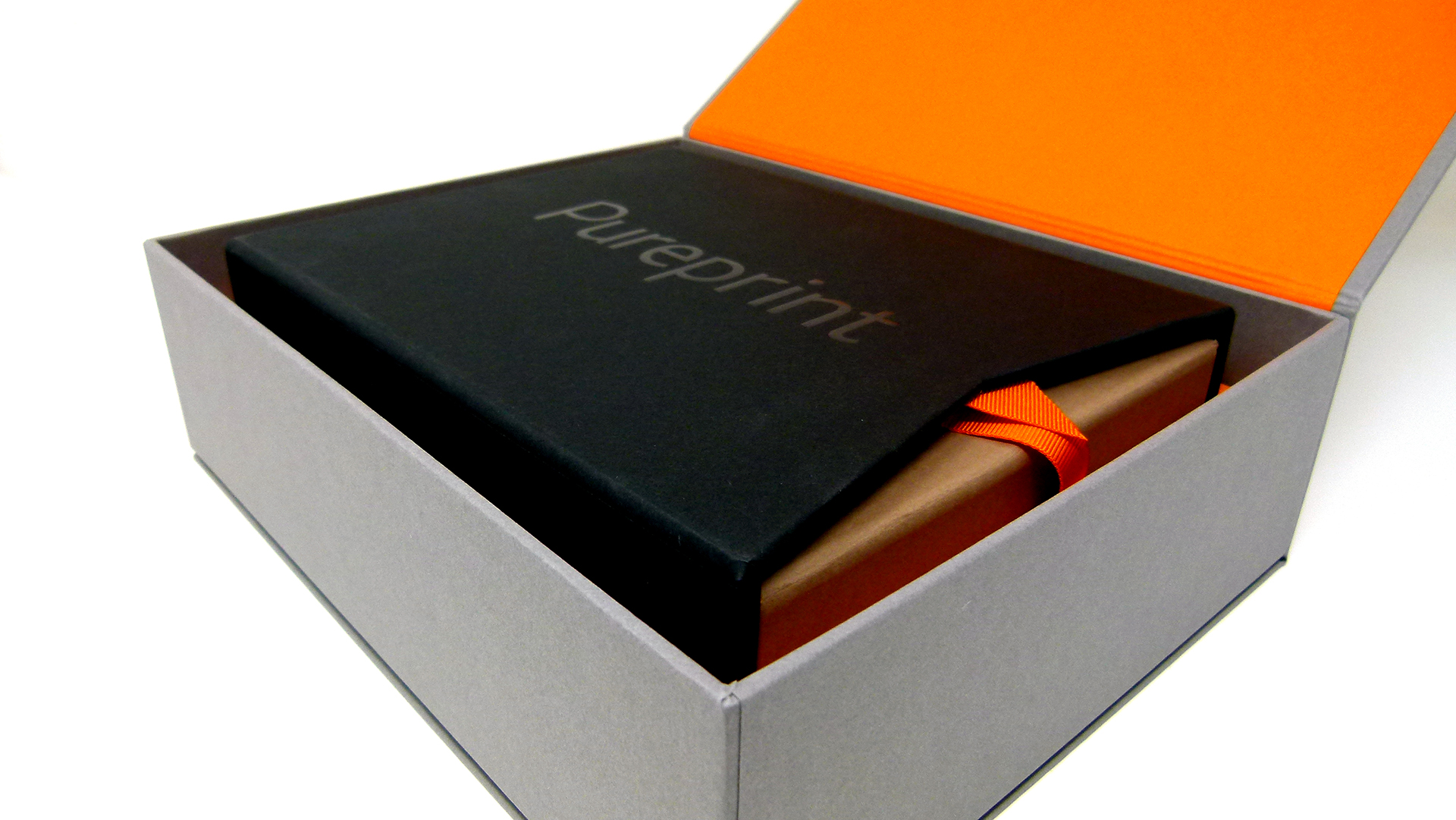
Box No. 2! Yep, we’re in Russian doll territory now 😉 This slightly smaller box, wrapped in Colorplan Smoke, also features the Pureprint logo, this time in Orange foil. Lifting it out (made easier by the triangular die cuts that mirror the ones on the lid of the top outer box), it’s clear that this package opens in a way different from the first. Tugging the Orange loop pull disengages a magnetic closure, allowing the lid to swing open, showing off an even smaller box inside.
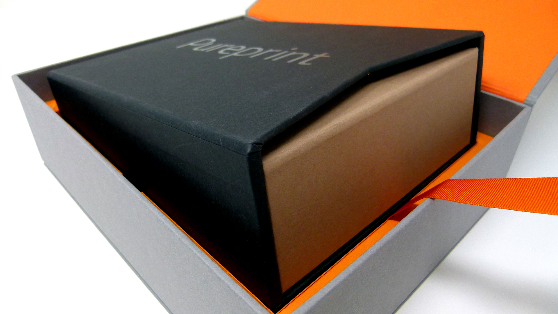
Box No. 3 is easily removed with the help of an Orange ribbon that pokes out from beneath it in its matching Orange tray. Simply pull the ribbon and up it rises. (Indeed, this is also a good time to note the thoughtful use of interior paper colors that complement those used on the outside of each box.)
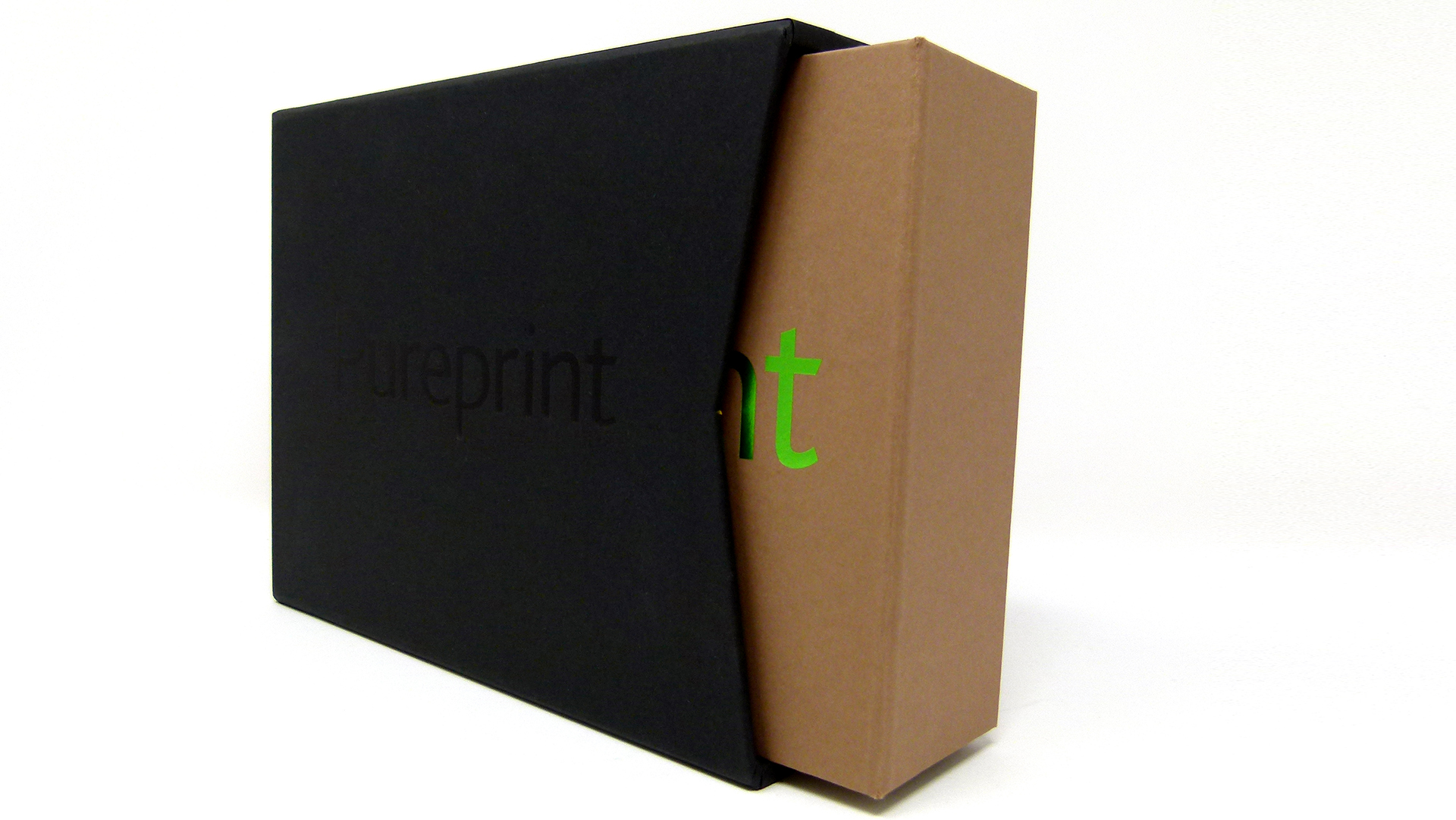
As it turns out, Box 3 is yet another type of packaging option: this time a slipcase! Wrapped in Colorplan Ebony with the logo in Black foil, it too boasts the now-familiar triangular die-cut notches, allowing for the package inside it to be slid out with ease.
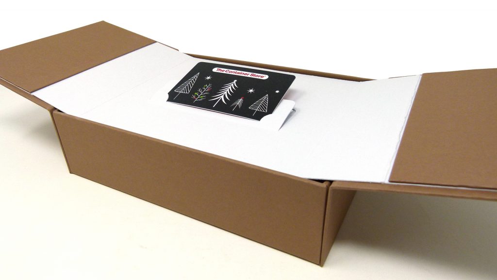
That final one – Box 4, for those of you keeping track at home – is wrapped in Colorplan Harvest. It also comes as something of a surprise in that it boasts not one lid but two – with the Pureprint name in Green foil running across both – held closed by magnetic closures. These open out like gatefold panels with the help of two Green pull loops. The super-smart final touch? As you pull them open, a clever bit of paper engineering inside raises a gift card holder up to meet the recipient – very dramatic!
On their own, these boxes show off some versatile packaging options. Together, with each tucked so neatly inside the last, they can’t help but inspire clients and designers alike.
While these boxes use hot foil stamping throughout, there are several other ways in which you can now add foil to your printed project. Get a quick overview of all your traditional – as well as digital – options: download our free Foil Cheat Sheet right now!







I think print has become a “gift’ in many ways today. It allows for choreography and pacing that ,when combined with tactility, can create unique experiences . This takes that idea to an entirely new level! Thanks for sharing.
Thank you for that elegant explanation of print’s appeal, Chris.