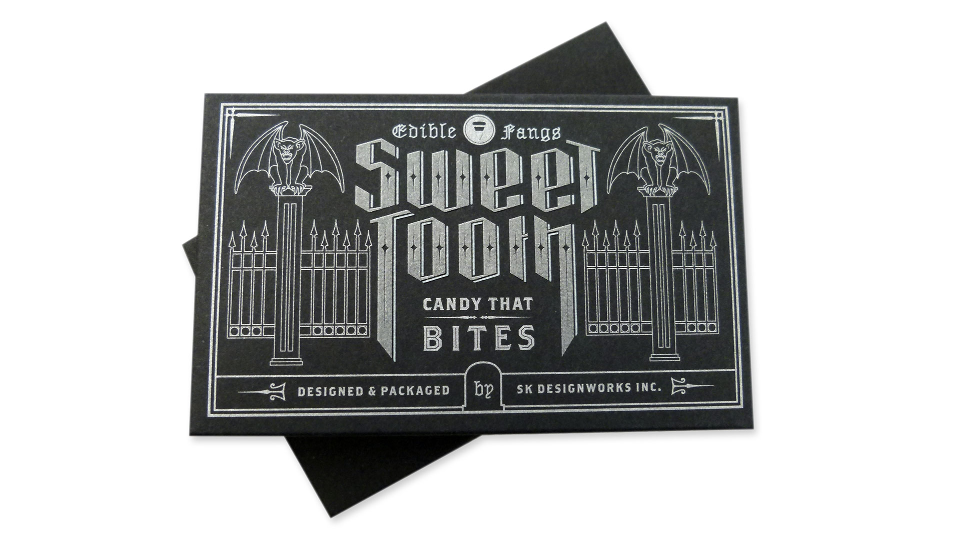
Every Halloween seems like a missed opportunity for whimsical design. SK Designworks felt the same way, conjuring up a hauntingly effective promo package stuffed with candy corn any recipient would be fangful for.
Before we get down to the paper-nerd gushing over technique, can we just take a moment to bask in the well-thought-out artwork? Consider just how difficult it is to come up with a Halloween-themed package illustration that is neither sickeningly cloying (we’re looking at YOU black cats and pumpkins) nor potentially offensive – you’d be amazed how many people have a hard time with skeletons and skulls, much less the ghosts and ghouls of tradition.
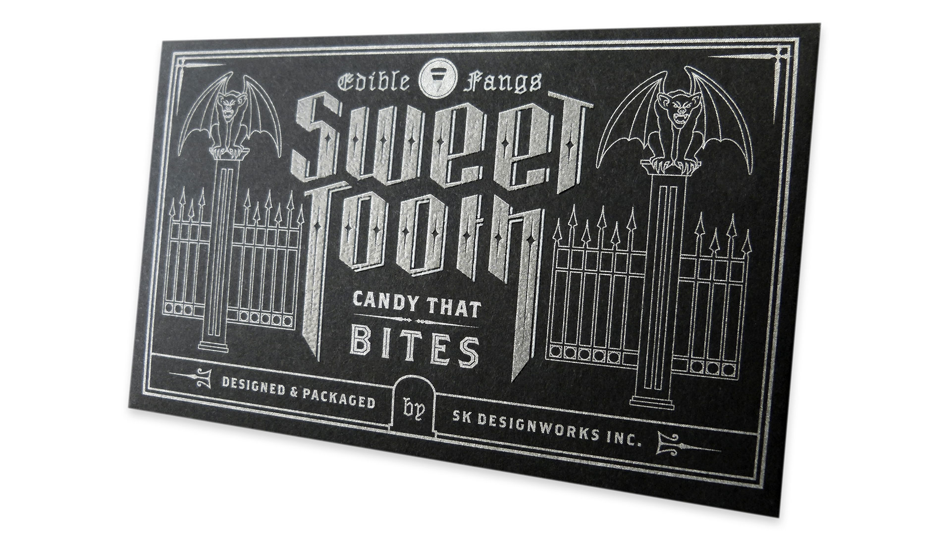
What SK Designworks came up with restricts the package’s fearsomeness to a pair of gargoyles that seem reasonably well behaved, and pointy fence posts that make their point nicely.
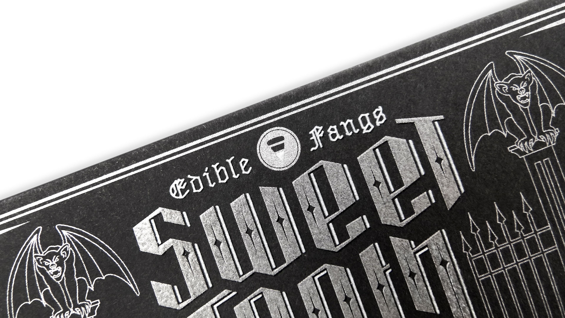
The star, of course, is the razor-sharp typography for “Sweet Tooth” that somehow manages to evoke both open gates AND sharp teeth, giving you an “edible fangs” serving suggestion for the sweetmeats inside.
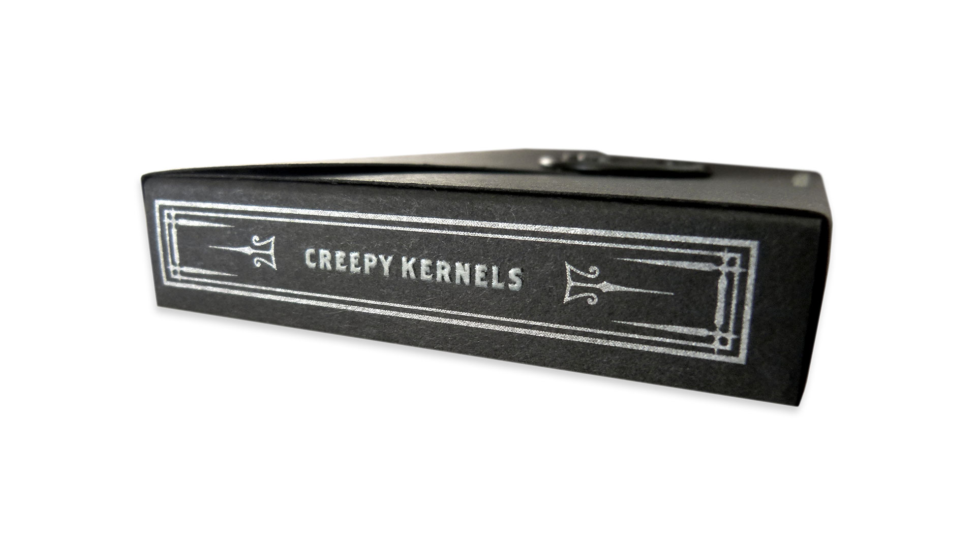
But enough of the empty calories, let’s sink our fangs into the main attraction – that gorgeous thermography. While occasionally dismissed as “imitation engraving,” the technique was the perfect choice for this packaging, lending it just the right dimensionality without breaking the bank. An added benefit: The slick, waxy feel that thermography leaves behind subtly mimics the waxy candy corn inside.
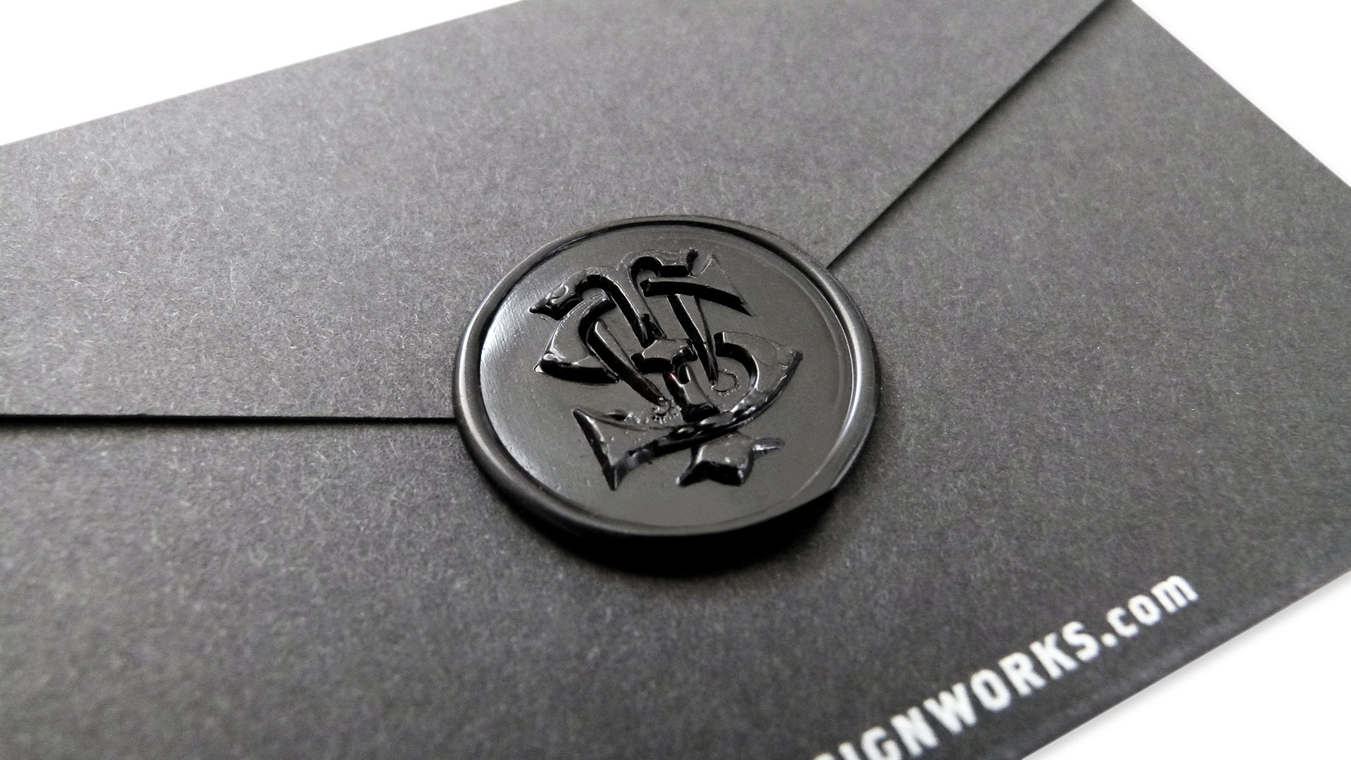
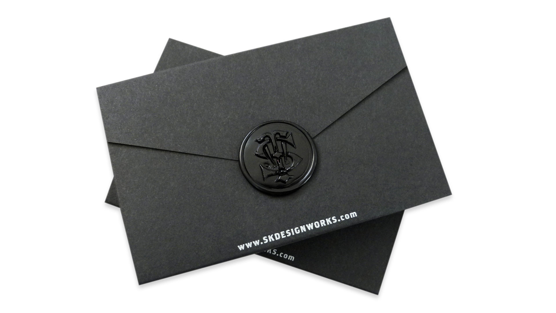
And just when you think you’re about as impressed as you’re going to be by a box of candy corn, you flip it over to discover a classy die-cut flap neatly closed with a monogrammed wax seal!
Ever on the lookout for tips and insights into printing and finishing techniques, we asked, as we always do, “What did you learn in designing and producing the piece?” Their response?
“Candy corn are addictive.”

