This brochure of tasting notes and wine club application certainly takes “flight” on many levels.
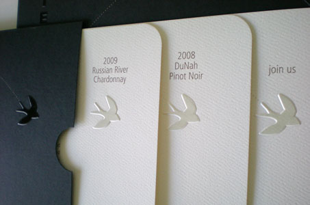
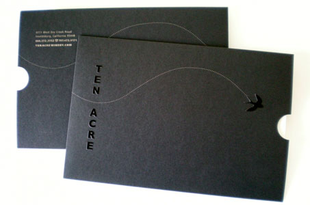
The visual of an embossed bird soaring across all the individual pieces instantly grabs my attention and ties the theme together nicely. I like the idea of this sweet birdie delivering a special invitation just to me to join this exclusive wine club.
The paper and palette used are understated and classic – again, the hallmark of something so special it needs no shouting to be noticed. The “legs” of the piece can be seen in the use of the opaque metallic ink on the black paper and the deep emboss combined with a registered clear foil.
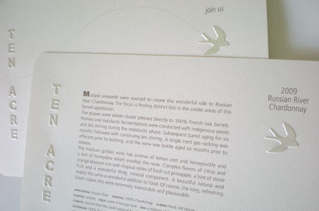
But the “breed” is achieved through the treatment of the bird on the application – an emboss on the front that backs up to the printed bird on the inside of the application becomes a register deboss on the opposite side.
The use of rounded corners and the contrast of the foil-stamped embossed areas against the more “rustic” and tactile felt stock produce a full-bodied brochure – definitely worth sampling.
Ten Acre Winery Brochure was featured as a Paper Inspiration.


