If you could hold 2022 in the palm of your hand, what would it feel like? It might feel something like The Cube Calendar, which combines an unusual design with understated printing, perforations, and an unexpected binding, to create an interactive, ergonomic treat. And I haven’t even gotten to the innovative packaging yet!
Crafted with discerning designers in mind, the piece, created by Philip Stroomberg, avoids the flashy colors and finishing techniques we often associate with calendars in favor of subtle details that impress one by one as you notice them.
It starts right off the bat with the packaging. At first it appears to be your typical box featuring a telescoping lid that covers the entire depth of the base box.
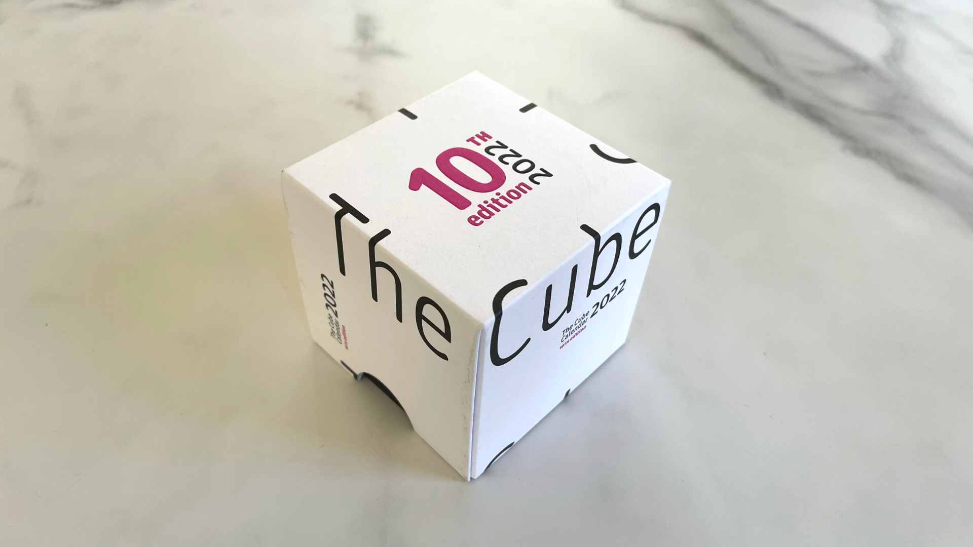
Offset printed by Kartonnage Amsterdam in Black ink on White Sappi Algro Design are fragments of the phrase “The Cube Calendar,” which is only complete when you line up 4 boxes in a row next to each other. But that’s not the spectacular bit.
Then there’s the eye-catching Pink words “10th Edition” offset printed and then embossed on the top of the box, which really pop on this otherwise Black-and-White piece. Putting your thumb and forefinger on the Black printed half-circles on the side of the box reveals 2 large die-cut notches, allowing you to easily slide the lid up and off the base. Though all of this is snazzy, it’s not the spectacular bit, either.
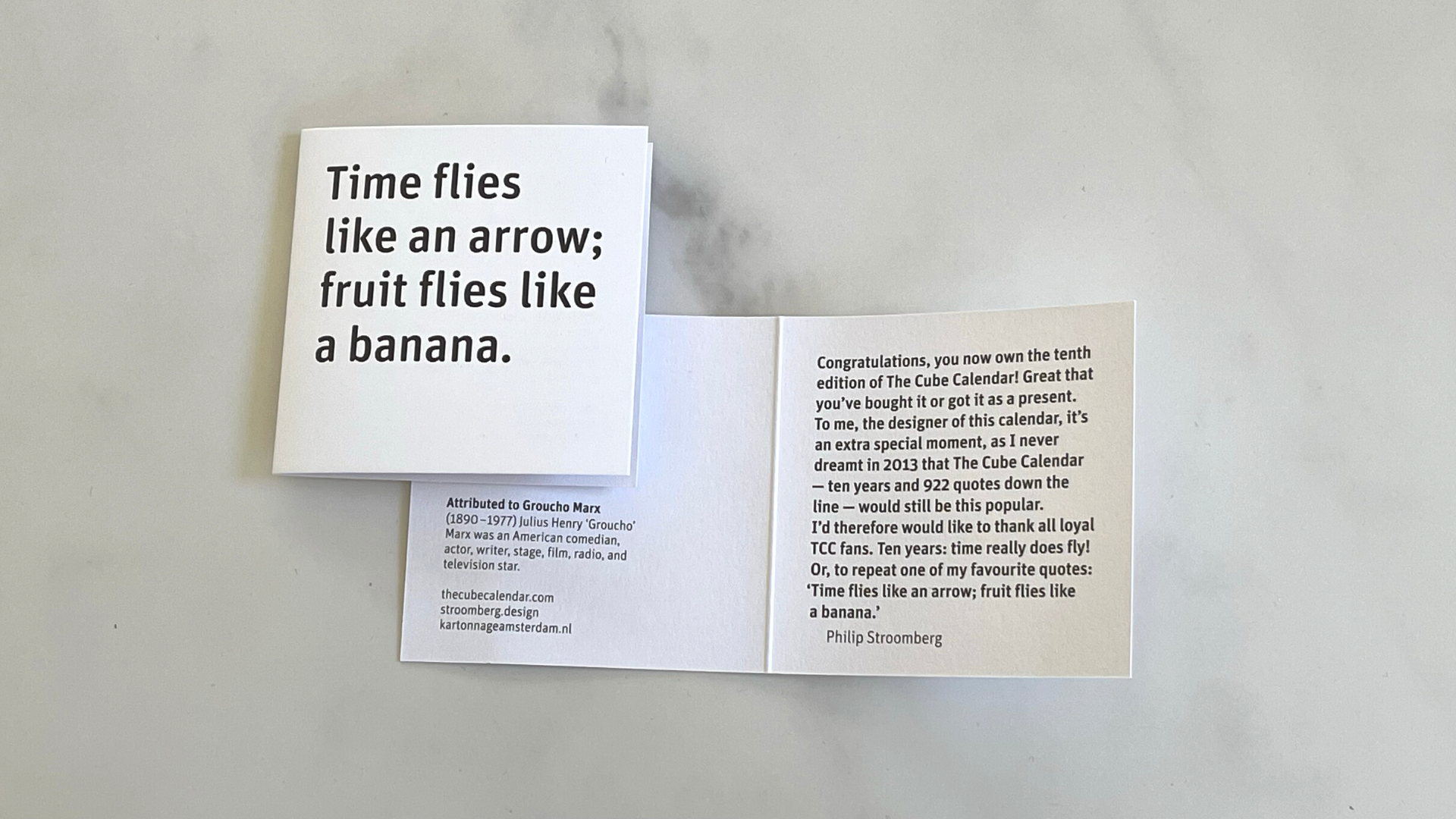
Removing the lid, you’re met with a simple folded White card with the following wordplay in Black ink on the cover: “Time flies like an arrow; fruit flies like a banana.” Inside the card, the designer relates a bit of history about the project.
Instinctively you pull the sides of the open box as you prepare to lift out the calendar – only to find all 4 sides falling open like an origami cross! A closer look at both parts of the box reveals that not a single drop of glue has been used to create the packaging – everything is constructed using clever folds and tucks. This, combined with the fact that no laminates were used in the making of the packaging, means it’s fully and easily recyclable.
Like its packaging, the cube-like calendar is full of tasteful, clever touches that are never showy.
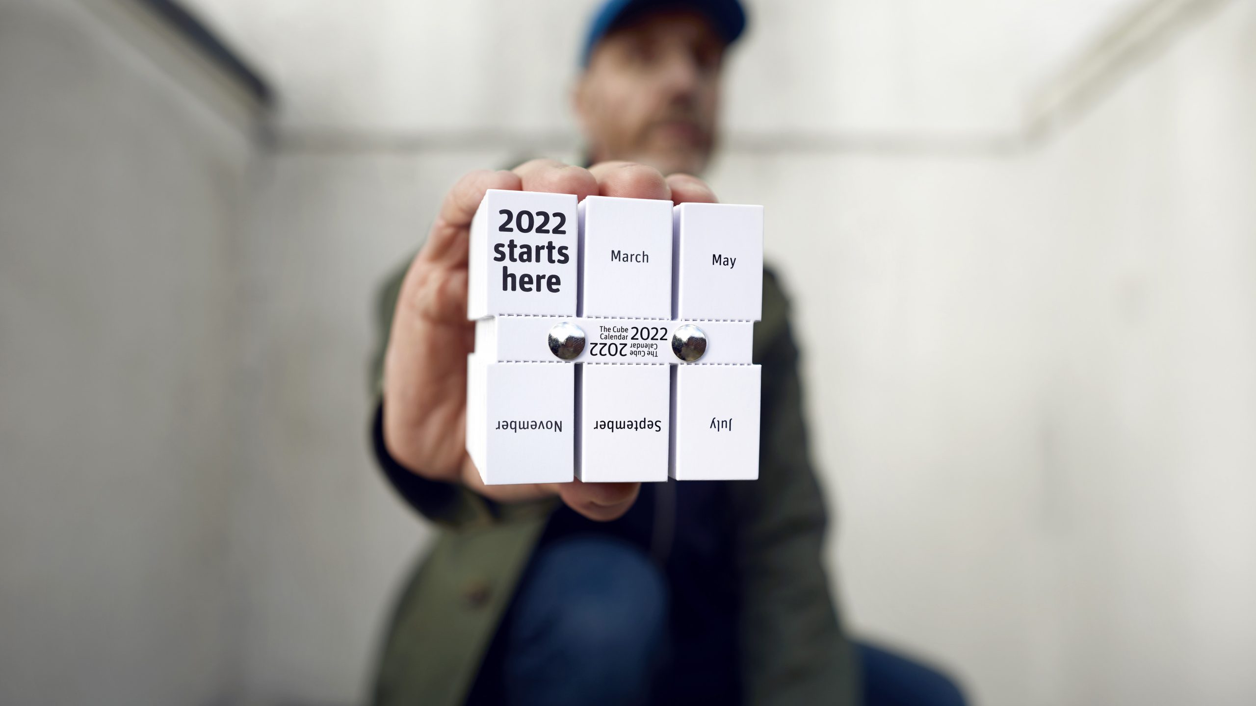
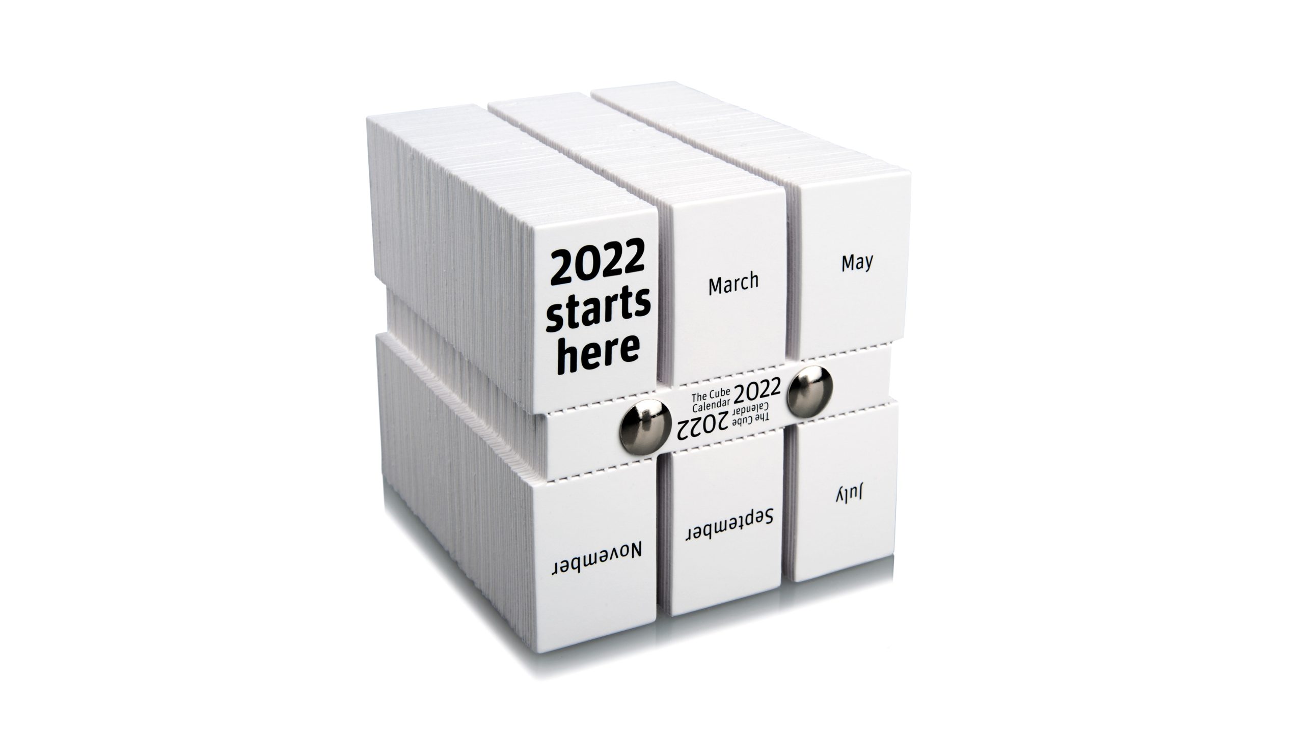
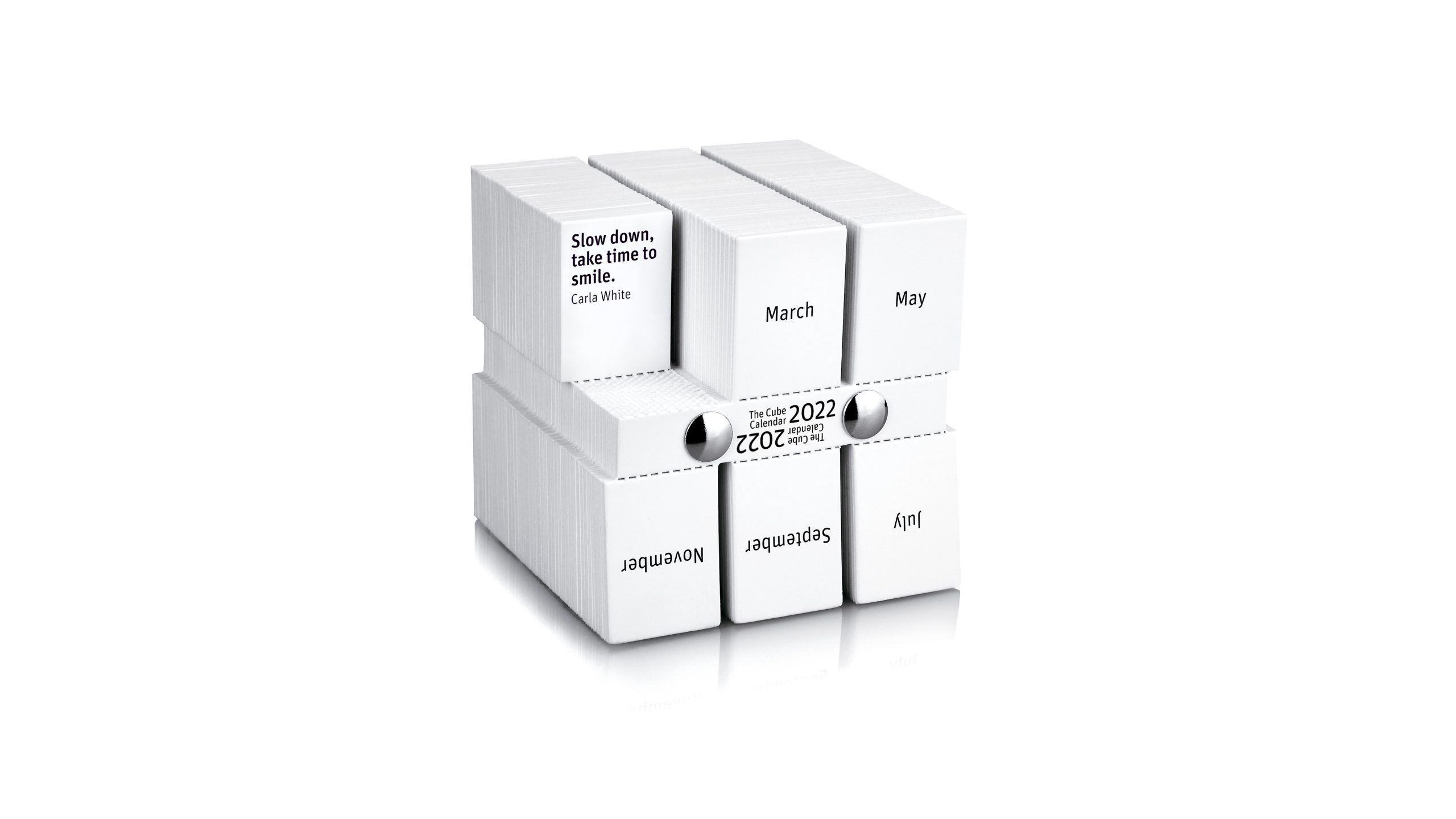
Take the Chicago screws that hold the sheets of the calendar together. Not only do they create a natural frame around the printing at the center – this can be customized with a company’s logo mark for those looking for a unique promotional gift – but the binding is just loose enough to make the entire cube slightly bendy, like a rubber Rubik’s Cube.
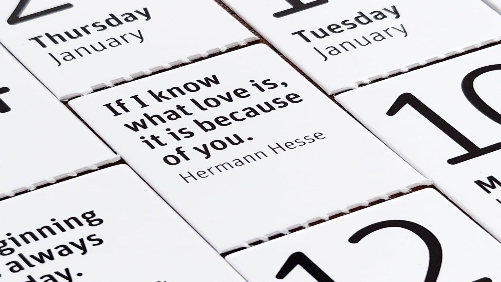
The calendar consists of 6 rows of perforated tabs – 3 on the top, 3 on the bottom – and begins appropriately enough with the first on the left marked “2022 starts here.” Tearing off each day’s tab reveals the next, with each tab containing the month, date and day of the week.
The use of Chicago screw binding here was both unexpected and inspired. Find even more inspiration when you download our free Binding Cheat Sheet, which features 12 of the most popular binding techniques, as well as crucial information about each.


