Once upon a time there was a luxurious Dallas condo development that promised to combine the best of small-town living with world-class amenities, all within walking distance of sophisticated stores and restaurants. And its marketing package was every bit as storybook-like as the developer’s vision.
Designed by King & Partners and produced by our good friends at DataGraphic [projects / website], the sales materials were sent to potential buyers before construction of The Knox Residences had even begun.

The goal was to not only give prospective residents a taste of what life in this neighborhood is like, but also to encourage them to imagine themselves living in one of the 58 residences once they were finally completed. To do this the designers adopted several design elements from traditional storybooks.

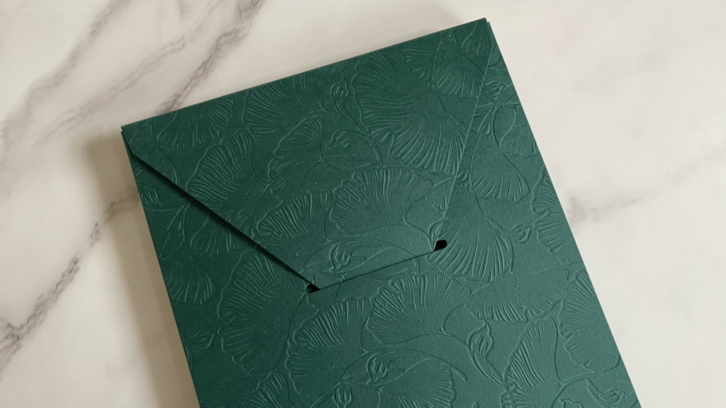
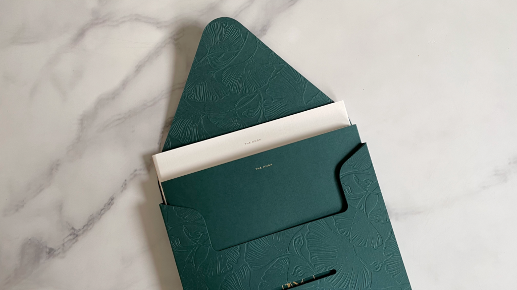
By far the most attention grabbing is the elaborate floral Blind Deboss – inspired by the leaves of the ginkgo trees found in many Dallas neighborhoods – which runs throughout, starting with this truly stunning envelope.
The Envelope
Taking its inspiration from the Katy Trail, which places nature within easy walking distance of The Knox area, the envelope is made from 80 lb. Mohawk Carnival Forest Green Cover duplex laminated to 160 lb.
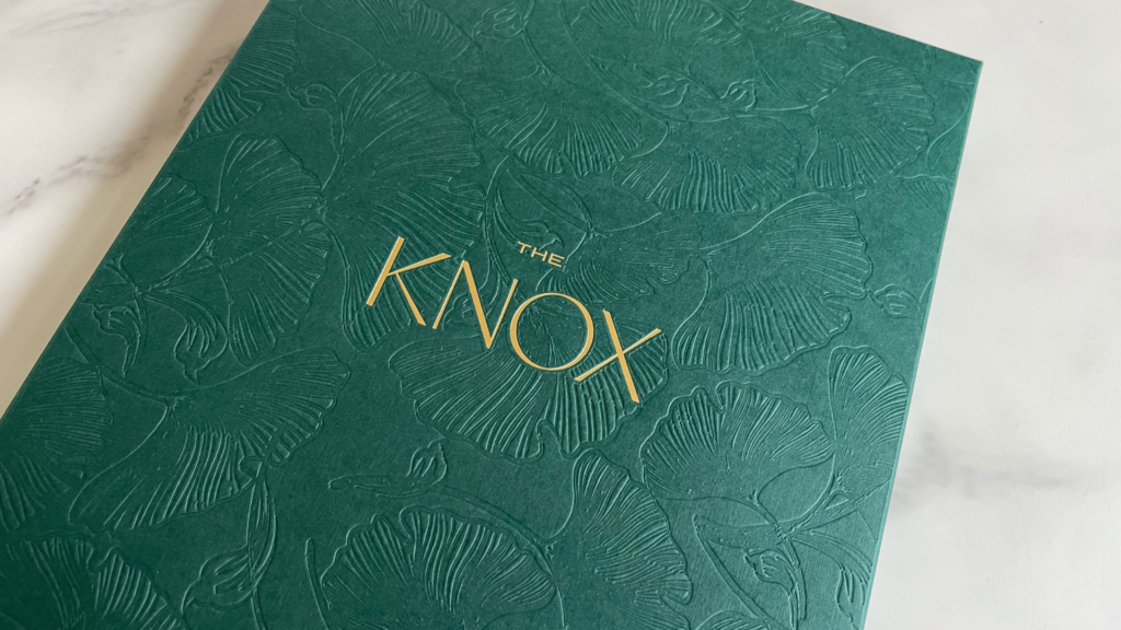
Gold Hot Foil Stamping of “The Knox” name – its typography another storybook nod – pops nicely against the darker background, while the Linen finish feels as delicate and elegant as the typography looks.
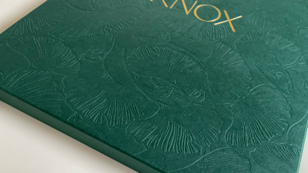
Yet it is the gorgeous floral Blind Debossing, covering every inch of the envelope except for the sides, that truly stuns both visually and on a tactile level. A simple tuck flap fits snuggly inside a Die Cut, keeping the package closed. Inside are 2 brochures that tie nicely into the branding.
‘The Knox: Overview’
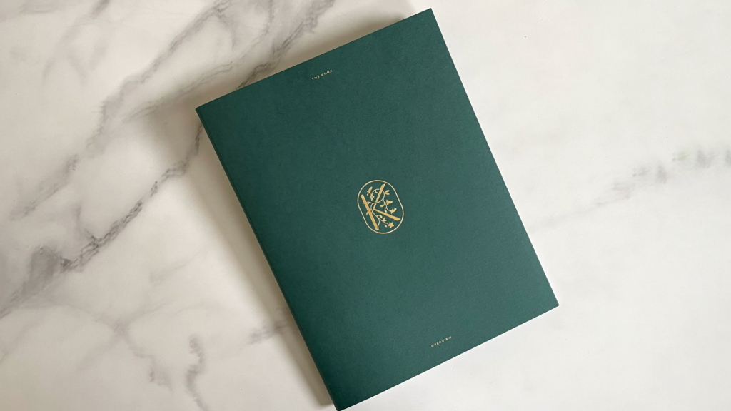
The outer cover of “The Knox: Overview” is, like the envelope, Mohawk Carnival Forest Green, its Linen finish providing a subtle, distinctive feel, while the title and an ornate floral “K” logo are Hot Foil Stamped in Gold.
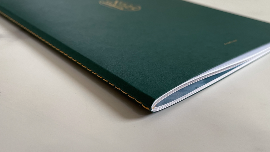
Matching Gold thread is used for the Singer-Sewn binding of this 52-page brochure.
Opening it reveals an elegant surprise.
The inside front and back covers feature the same floral pattern from the envelope, reminding us once more of the area’s close proximity to nature. What makes this so clever is the way DataGraphic found to include this Embossed pattern without adding a distracting bruising to the outer covers. Their solution: Embossing both ends of a long sheet, folding them in like book flaps, and then gluing them in place.
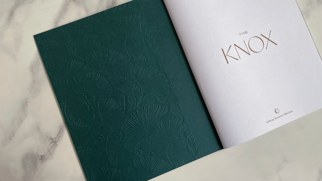
Not only did this hide the unwanted bruising from the other side, but it also beefed up the covers from 80 lb. to160 lb. Cover, giving the brochure the feel of a substantial book.
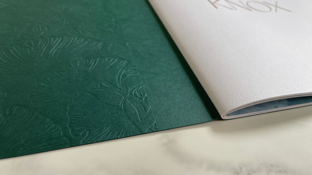
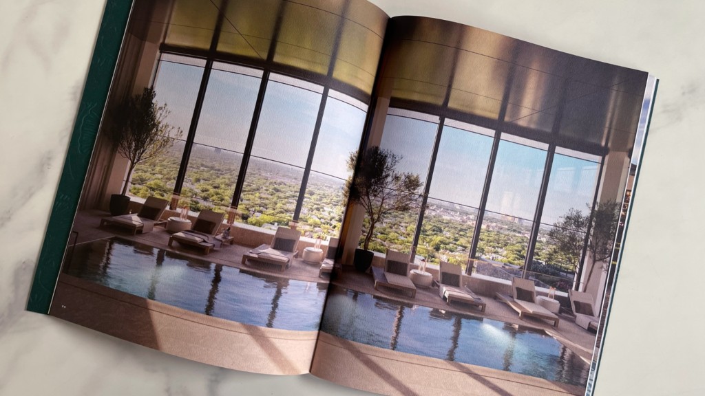
The interior pages, Mohawk Via Bright White Felt Text, were digitally printed CMYK, from the golden “Knox” title on the opening page which mimics the Gold Foil on the cover, to immersive full-bleed photo spreads of the neighborhood, as well as key details about all the perks of living in the area.
Strategically placed Die-Cut windows sprinkled throughout create unique frames for photographs on the pages behind them, providing tantalizing glimpses of key landmarks.
‘The Knox: The Residences’
The desirability of the neighborhood firmly established, the second brochure, “The Knox: The Residences,” gets down to whetting the reader’s appetite for the condos themselves.

With the exception of the title and the paper used – this time Mohawk Via Warm White Linen – the covers are the same as those of the first brochure, from the Duplex Laminated flaps right down to the botanical Blind Embossing on the inside.
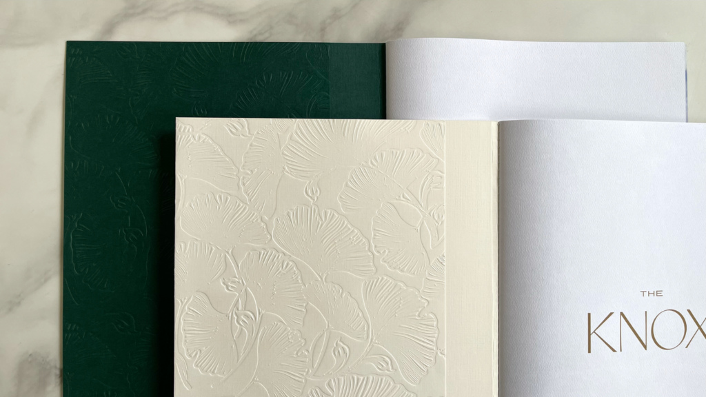
This is such a clever repurposing of the same die, and the pattern looks dramatically different thanks to the different colored paper used, yet still ties both brochures in with the Debossed envelope to make a single, cohesive brand.
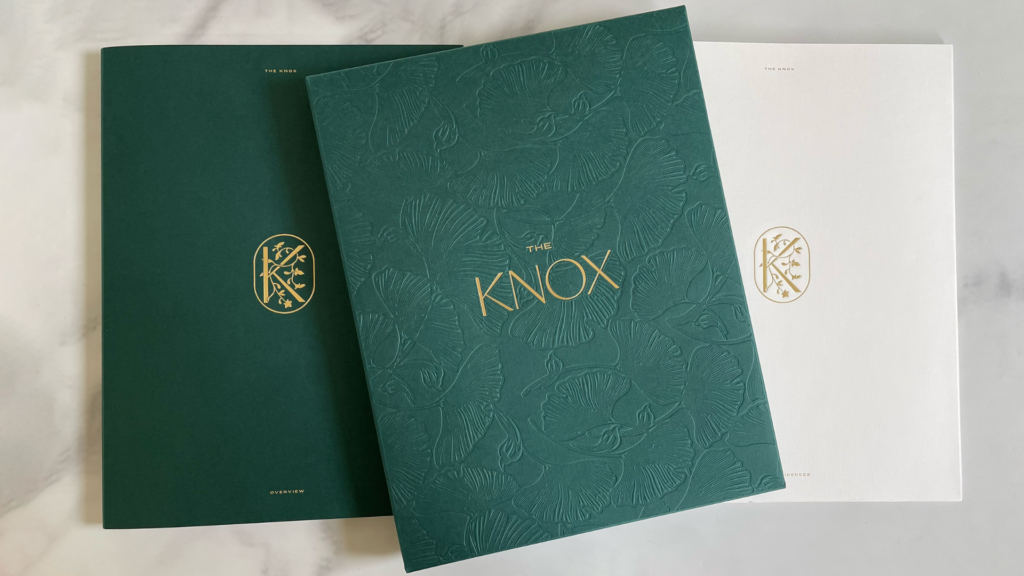
Since the residences hadn’t yet been constructed at the time of printing, the 28 pages inside intersperse information about the planned condos with mood boards and artistically assembled photo spreads, all digitally printed CMYK on Mohawk Via Bright White Felt Text.
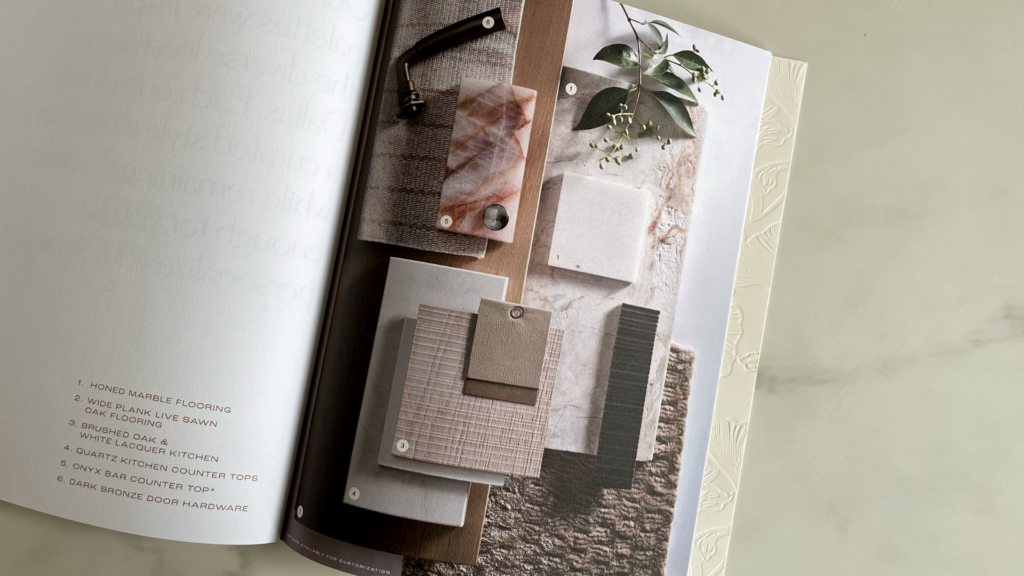
This suite uses paper’s tactile qualities, Gold Foil, Singer sewn binding and a clever use of Blind Debossing – along with dozens of luscious photo spreads – to bring to life storybook homes that hadn’t even been built.
Now that’s what I call a storybook happy ending. Or rather happy beginning! 😉


