When I first glimpsed the logo for San Francisco restaurant Trestle – a dancing bear balancing three plates – I thought “that pretty much sums up a designer’s life, doesn’t it?” After all, every day we’re balancing a budget, print materials and our client’s branding. And as it turns out, the Trestle identity itself pulls off this balancing act admirably, too.
Crafted by Unit Partners for longtime client Hi Neighbor Hospitality Group, the Trestle brand conveys several key concepts at once thanks to a smart combination of materials, printing and finishing techniques:
- The restaurant serves 3-course pre-fixed meals (hence the three plates)
- These meals are the hearty type (represented by our friend the bear)
- The cuisine is a modern twist on grandma’s home cooking, beautifully conveyed in Trestle’s menus and business cards through the juxtaposition of old-timey typography with foil stamping, and Neenah Classic Crest’s modern look and feel.
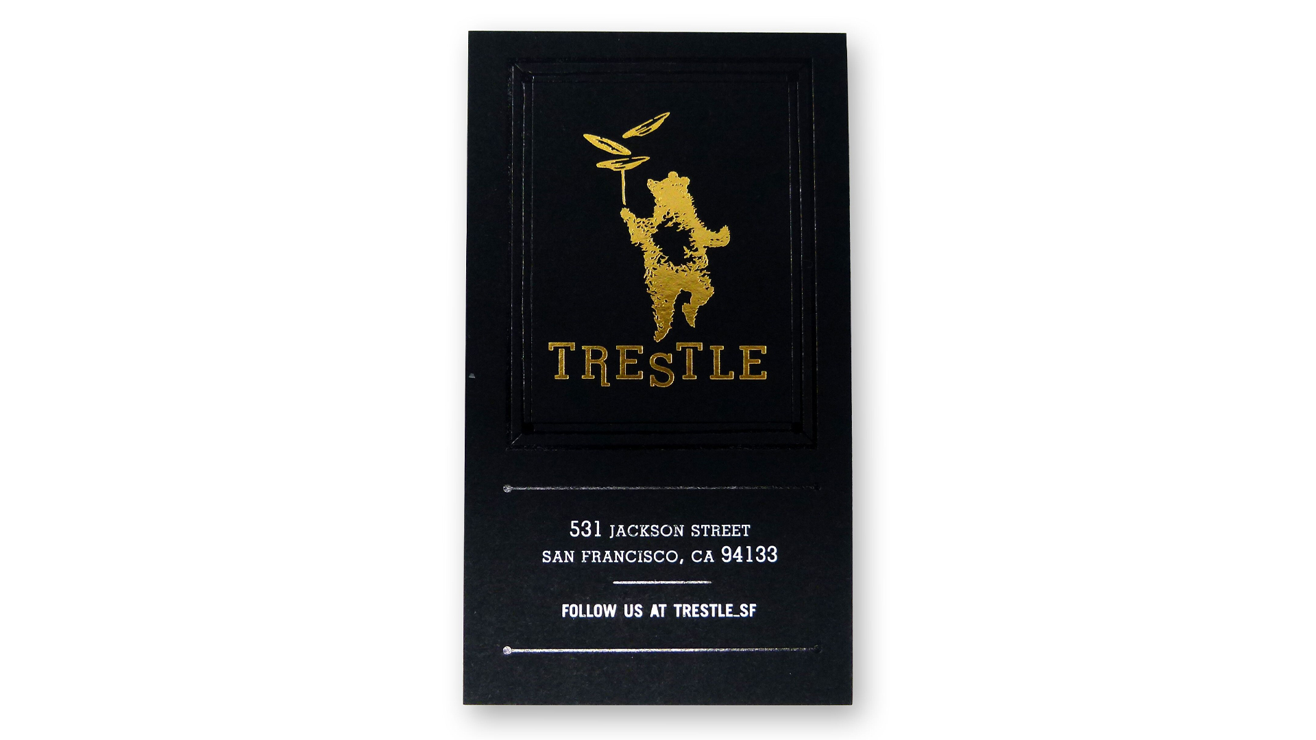
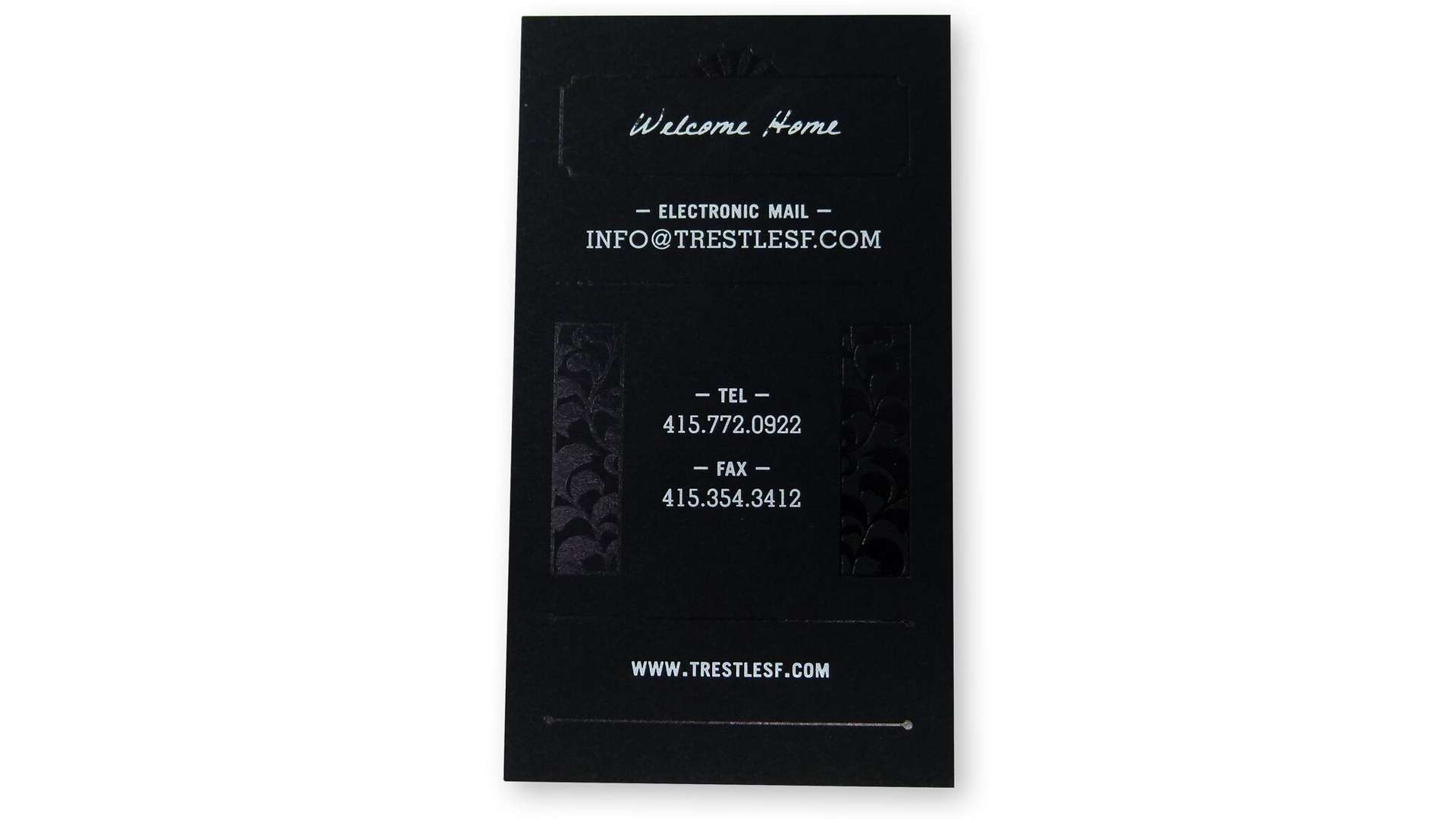
It is in Trestle’s black business cards that this joyful mash-up of old-fashioned and modern are most attention-grabbing. Gold foil brings our dancing bear to life while Black foil line work and floral patterns add a subtle intrigue, their sheen contrasting ever-so-slightly with the Neenah Classic Crest Epic Black paper [Get Swatchbook!] for an intriguing tone-on-tone effect.
Naturally the White foil highlighting the address and contact details practically leaps off the card, though this required a bit of trial and error to get right, the designers admit: “We explored White ink and ended up using White foil. However, reprints are using white ink to save on costs.”
This combination of logo mark, foils and design elements are equally potent when it comes to the menu and stationery.
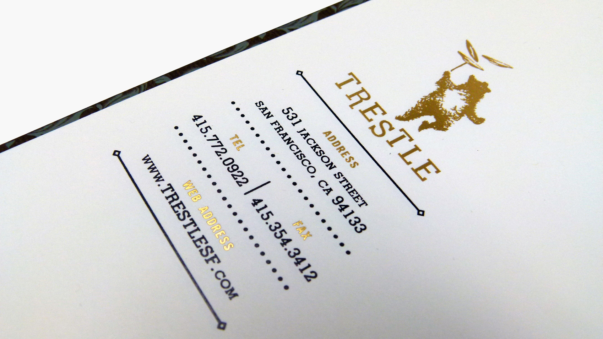
In the case of the stationery, the dancing bear and information headings are both rendered in Gold Foil, but it is the actual placement of these elements – in the left margin halfway down the page – that make it so eye-catching.
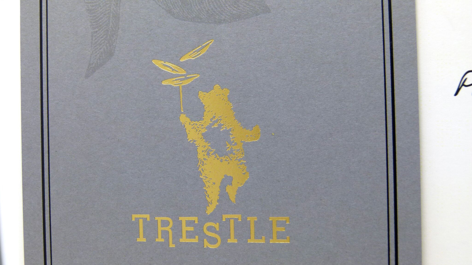
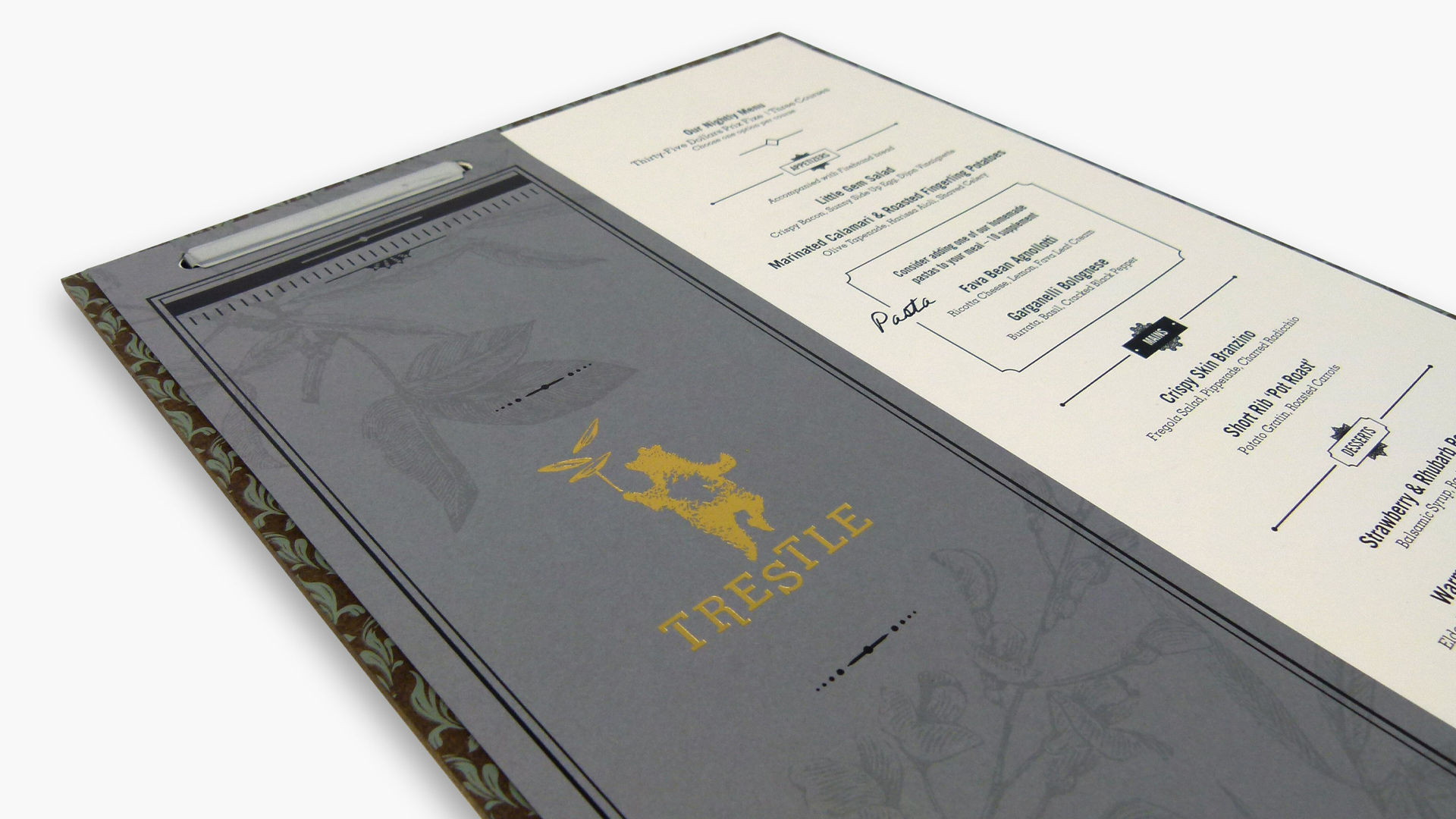
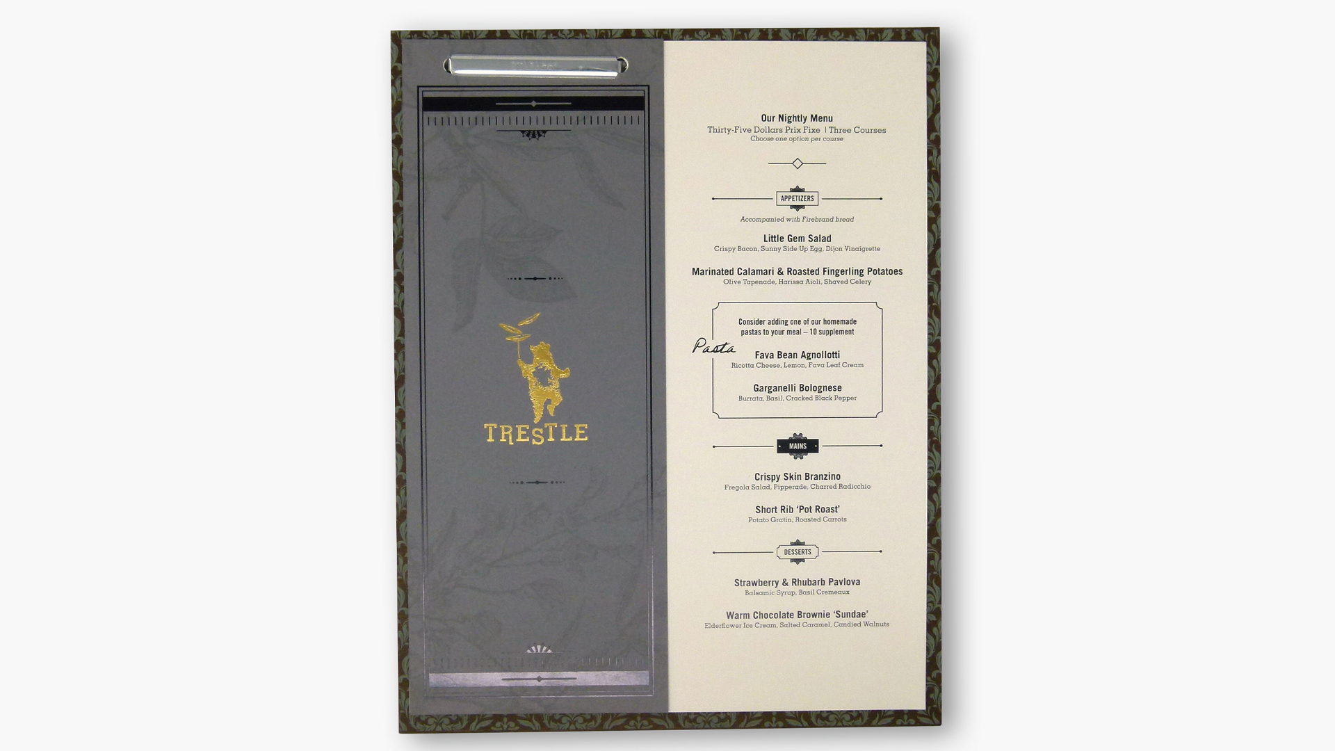
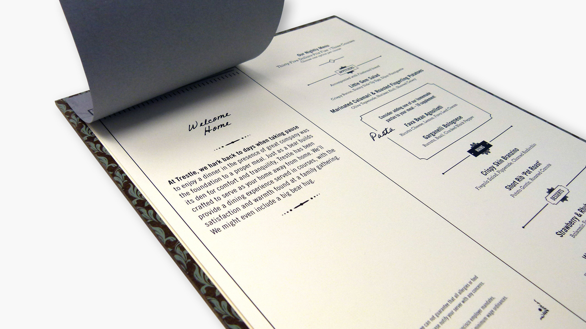
My personal favorite, though, is the menu. An elongated, notecard-sized cover features our friend the bear and restaurant name in Gold foil, while an intriguing Black foil border frames the subtle floral illustrations.
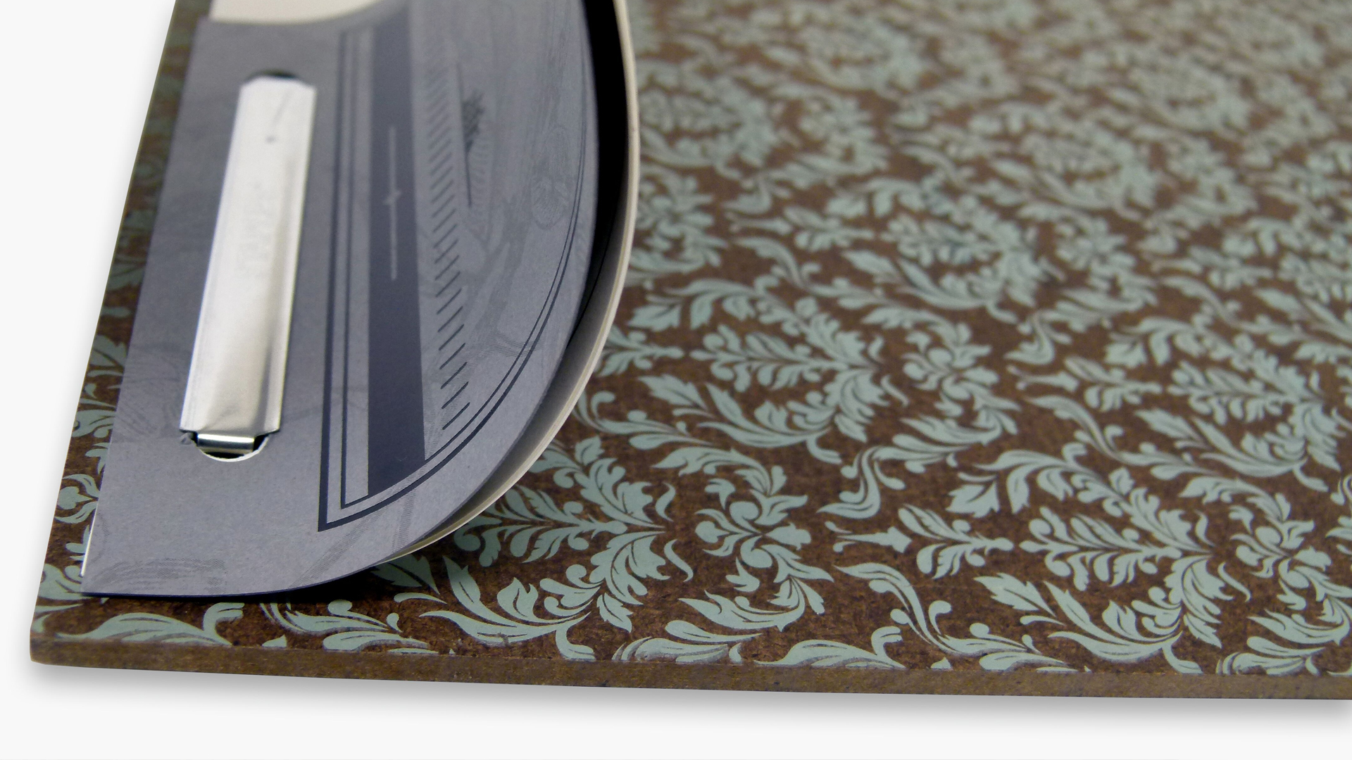
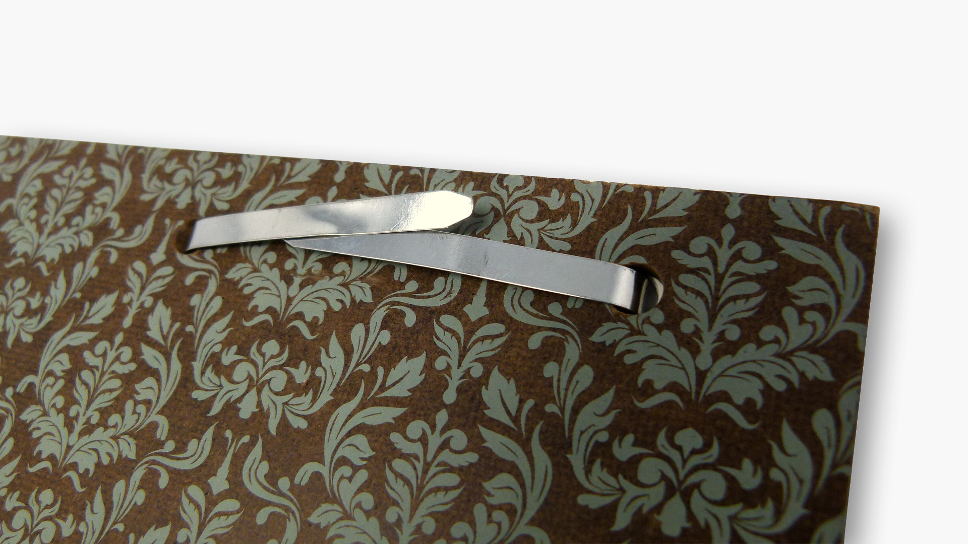
This unique cover size leaves ample room to show off the prix fixe menu on the right hand side. And all this is fastened to a heavy board covered with a classic floral pattern.
Feel a bit like a dancing bear juggling multiple dishes yourself these days? Haven’t the faintest idea what your foiling options are? Save yourself a lot of time (and expensive mistakes) – download our free Foil Cheat Sheet right now!






This is very interesting and helpful do to the way the menu is designed and setup to catch the customers attention seeing the setup of the menu and the detail it is on.