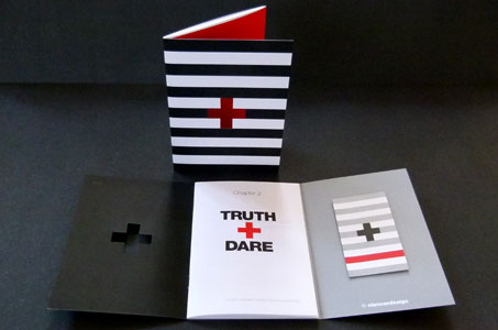
The truth is … a tidy, carry-in-your-back-pocket printed portfolio was a great way for this designer to showcase his design and advertising expertise as well as his approach to that work.
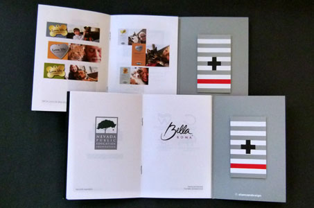
A tri-fold cover (six panels) offers the extra real estate to accomplish a number of interesting elements: stitching in a 20-page booklet featuring client projects, attaching the designer’s business card, and creating color blocks that add an extra punch of color. For example, one panel is done in solid red. This red color shows through a diecut “plus sign” on the front cover. The plus sign is of course part of the logo, which helps to re-enforce the brand.
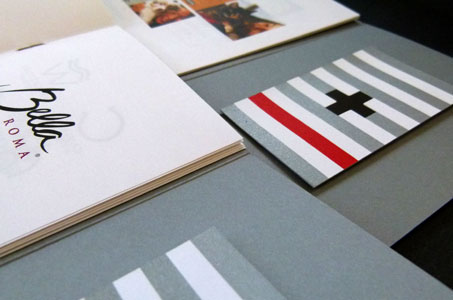
For the business card, two sheets of Neenah Classic Crest 100 lb. Cover are glued together to create a duplex. This enables the top sheet to get the diecut plus sign (black shows inside the diecut here) while the bottom sheet can be left intact.
The business card uses the same color palette as the booklet’s cover (red, black and silver), but adds interest by varying the placement of the color. The logo on this side is done with silver foil for some added pizzazz.
Dare we say it? This piece gets an A+!
Truth + Dare Booklet was featured as a Paper Inspiration.

