First the vitals, as Spiffy Design Principal Scott Wallin was thoughtful enough to supply them in his posting:
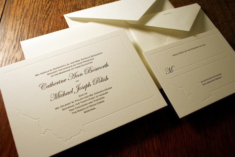
- Printed on a Vandercook 219 letterpress
- Crane’s Lettra 100% cotton paper, 220 lb. Cover stock, with matching envelopes
- Black ink
- 5″ x 7″
- The complete ensemble includes: panel card invitation and inner envelope, RSVP card and envelope, and outer envelope.
As Polish’s college buddy from way back, Wallin was in a unique position to not only be asked to design the invitations, but to also be on intimate enough terms with bride and groom to know what details to work into the finished product that would truly express who they are.
In truth, you don’t get the full effect of these pieces until the second or third viewing, something that seems to be part of the designer’s M.O. Rather than go through the usual gymnastics of trying to reword what he wrote so effectively, we’ll let him describe the invites in his own words:
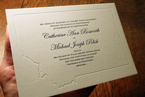
“The debossed outline of the state of Montana is an unconventional frame for the traditional script and small-cap text the couple wanted. The subtle outline of the state is repeated in the RSVP card and inner invitation envelope.
“I am a fan of hiding little details in all of my projects to make the concept and final result truly one of a kind and personal for each client.
“For example, since you can’t see it here, because you didn’t get an invite (sorry), I also custom-designed a stamp. A tiny twist on the American flag where I made the 41st star yellow to represent Montana.”
True, it would’ve been nice to see the stamp (way to twist the knife, Scott), but you get the picture.
At a time when celebrity weddings are most often reported in dollar signs, it’s nice to hear more about the thought and design involved.

