By Cyd Peroni
If Sasha Fierce was once the channel through which Beyoncé set stages across the world to rocking, then why can’t a designer tap into that same kind of inspiration for a little design gyration? While I’m not quite sure if wild hair tossing and hip shaking is akin to concepting and hand lettering, I do know the creative spark of alter ego has shaken it up for designer Brian Neumann a.k.a. Labzeus.
Neumann, who thinks of Labzeus as his moniker, won PaperSpecs’ Q1 2014 Take Note Award for his personal branding project. The winning piece, Labzeus Portfolio Kit, was initially created to help secure those first freelance clients after design school. During the process, it also helped to satisfy his craving for an array of fine printing and handcrafted techniques.
Shake It Up
The self-described husband, father and adventurer from Denver, Colorado caught the attention of guest judge, Tom Ingalls, founder and creative director of Ingalls Design (San Francisco), for the skilled way in which Neumann combined so many printing techniques into a cohesive design solution.
“It’s a portfolio book, direct mail piece and personal story rolled into one unified brand identity,” says Ingalls. “Neumann cleverly builds interest as we open each element, eagerly anticipating the next bit of revealing visual information.”
For the aspiring designer pitching new freelance clients or interviewing for that first full-time position, the one-off portfolio protectively carried to each interview is often the norm. Neumann shakes it up by combining this concept with a mass-mailing piece. It’s ambitious in its intent and expensive for the creative starting out, but the Labzeus Portfolio Kit has been well worth the effort for the positive attention it has garnered.
Mix It Up
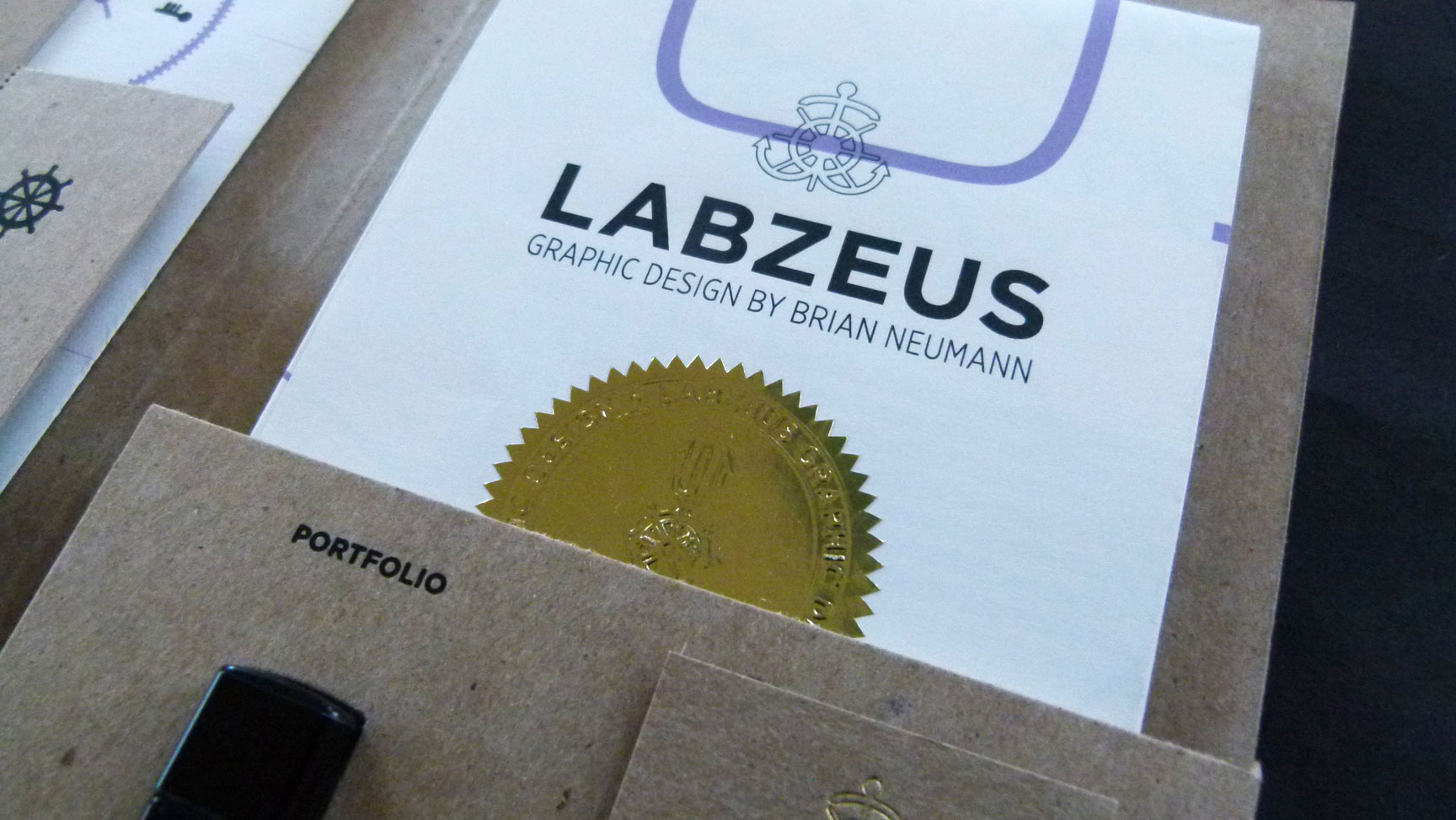
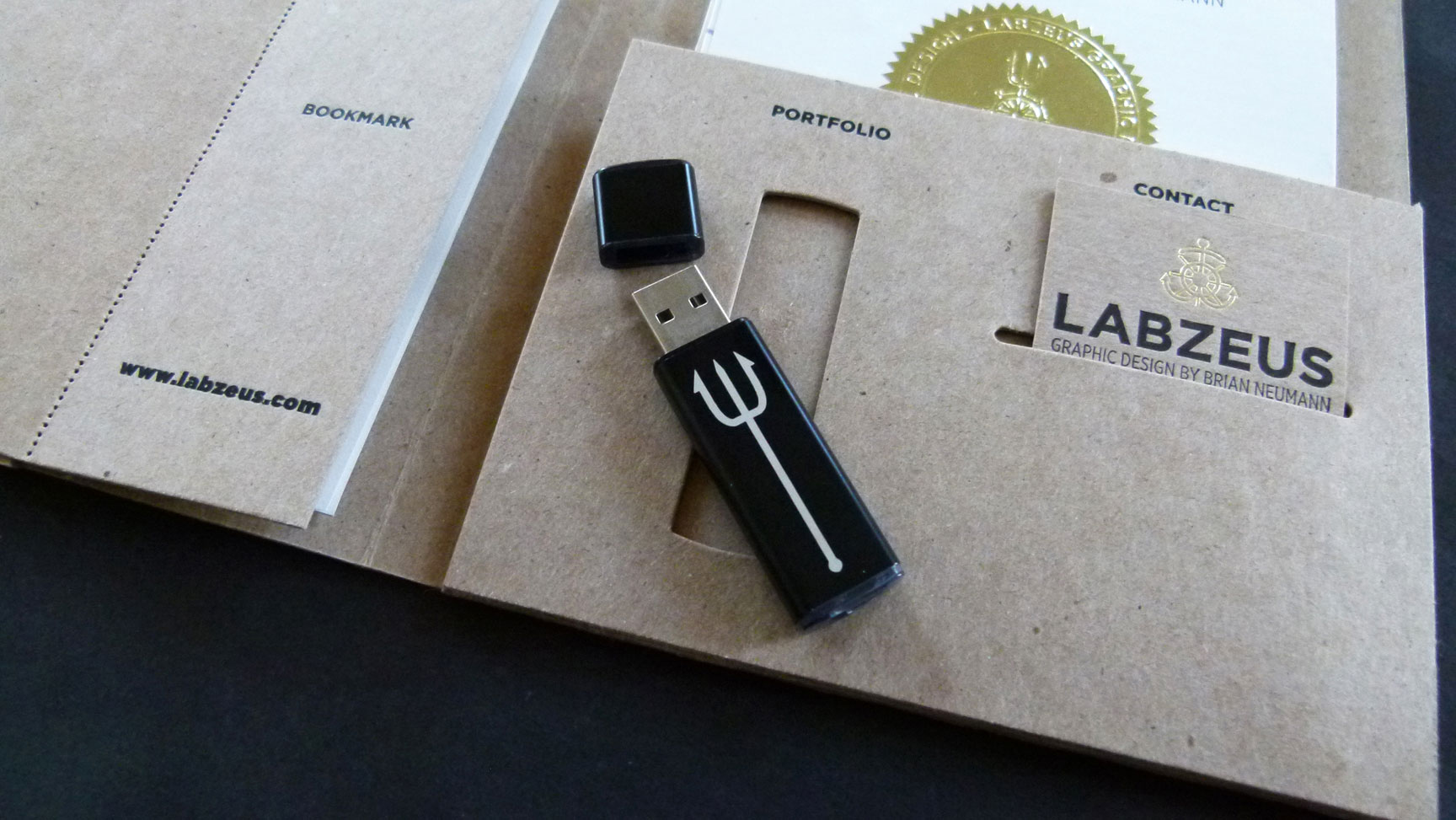
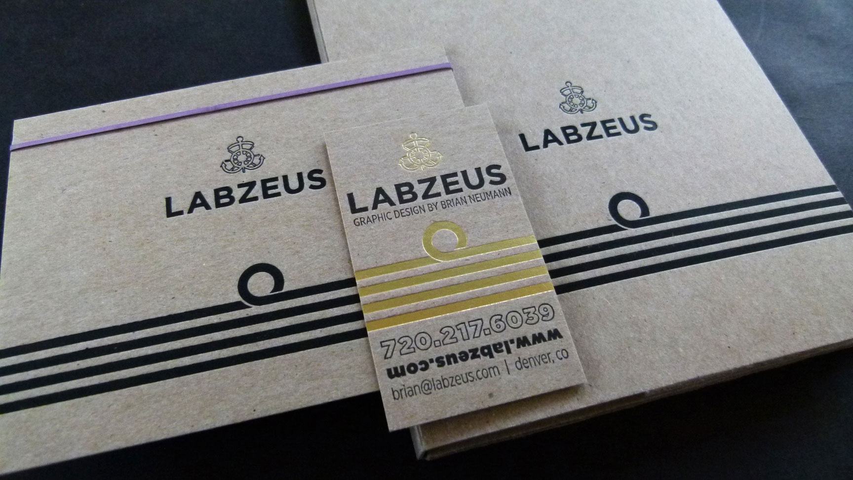
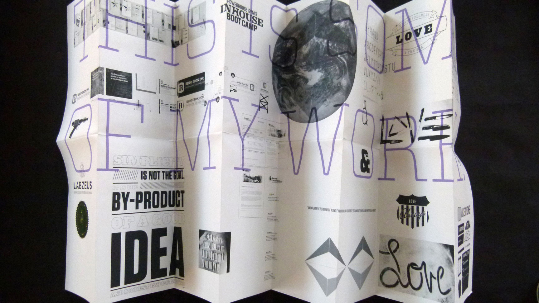
A raw chipboard folder opens to contain a map-folded, giclée-printed poster with hand-embossed foil seal; a bookmark that detached via a vintage-looking perf; a chemically etched flash drive containing more examples of Neumann’s design work; notecards with an eccentric green rubber band for added interest; the requisite business card on that same tactile chipboard; and a sheet customarily called a Curriculum Vitae executed with visual humor.
“It was a personal project so the slate was clean; I could do whatever I wanted … and I wanted to explore and challenge myself to combine a bunch of different processes that would work in an integrated piece. Figuring those techniques out and making all the details work together in a seamless way was part of the fun,” says Neumann.
A maritime theme unifies the design visually. Naval commander stripes repeat on the notecards as well as the pocket folder, and sea-inspired icons like Poseidon’s fork, anchors and boat wheel are scattered across the pieces. You can hear Neumann’s friendly voice in the copy and feel his open personality in the fun images and personal tidbits used on the poster.
The experience of opening the portfolio kit is like opening a set nesting Russian dolls. There’s something around every corner. First, there’s a flash drive to extract and view, a map to unfold and explore, a resumé to read, a bookmark to keep and use. Texture elicits a visceral response too – the feel of tactile letterpress printing on toothy paper, the silky shine of foil.
“I love how the first impression is that it’s quite simple, and then you open it up and it’s a lot more elaborate than initially meets the eye,” explains Neumann. “I love how you get more decadent layers of design as you dig deeper in the piece. It’s a minimal sort of aesthetic and simplicity at each level that allows those other things to open and really sing.”
Take It Away
Neumann learned a lot on this project. He had so many different techniques to manage and skills to muster – printing of the map, hand-embossing the seals, getting the flash drive etched, planning diecut folder and business card slits, adding the perfed bookmark, how the map folds, where to place the images, selecting fonts that worked to support the theme, adding unexpected elements like the rubber band.
“My biggest takeaway is in the details. Getting all of those things to sync and be usable took focus, precise measurements, fine-tuning, and a little bit of trial-and-error. I always focus on the details anyways, but with a project like this, when you’re trying to combine different techniques into one unified piece, you really have to get into weeds on the details.”
————–


