The paper swatchbook – long has it been the definitive guide to a paper line. Printers, designers, merchants and pretty much anyone in the paper business would turn to these treasure troves of information to select the ideal weight, color, finish and texture for their print projects. One could find all types of information critical to matching paper to project and press, yet the primary purpose has always been to compare and contrast individual papers.
Typically, paper companies would also include printed samples on select options within their swatchbooks to give audiences an idea of print quality. Rarely, however, would a paper brand offer up printed samples of every option, and customers would be left to make assumptions about printing subtleties among the individual papers.
When developing a new swatchbook for Accent Opaque, International Paper thought about how today’s user of a swatchbook would want to encounter the book, what type of information would be most useful, and considered how the piece could be formatted to make it more convenient to keep and use regularly.
The result is the introduction of a swatchbook with a new purpose for a new generation of printing and designing.
“Our challenge was a bit unique,” says Jeff Hester, marketing manager. “The Accent Portfolio is an ever-growing collection of premium opaques for both traditional and digital printers. Having a single resource to provide an overview of them all meant we couldn’t just roll out another piece with the same size and format. This swatchbook needed to be different.”
Different it is, starting right with content. In this new edition of the Accent swatchbook, a sample of every single sheet within the portfolio is provided. This means every basis weight of every item in every finish. This means virgin to recycled, standard to digital, text to cover, vellum to smooth to super smooth, and white to warm white all appear.
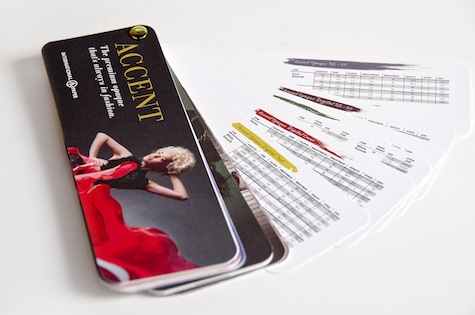
With approximately 60 individual items slated for inclusion, this new swatchbook needed a unique format. One that breaks the mold of traditional booklet-style pieces and provides the reader with an easy means to make direct comparisons between individual items. The format ultimately decided upon does exactly that.
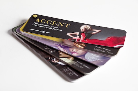
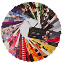
“By making the size of the piece 8.25” by 2.75”, we were able to have sizable but manageable samples of each item,” says Hester. “Binding the book in the corner with a grommet gives the user the capability to fan through the pages and call out those that are of interest. Then whether you are a printer, merchant, designer or just a paper aficionado, you have the Accent portfolio of papers in hand readily available to select your sheet of choice to compare it to any other samples. It’s not necessarily an unusual configuration, but one that serves this piece very well.”
The characteristic that pushes the new Accent swatchbook into completely new territory is the design of the piece. Each and every sheet has a printed sample on it, giving readers a chance to fully appreciate the print quality inherent in every product. Yet on the opposite side of the image is a blank page, giving printers and designers a chance to see the paper in its pristine, natural opaque state.
The images themselves are an intricate part of the design as well. Following the fashion-forward concept evident in new Accent collateral pieces, the individual pages contain glamorous, A-list style photography and illustrations, not chosen at random, but rather selected for their content as well as their color tones. As the reader “dials” through the pages, the color tones evolve, ultimately creating a spectrum of trendy colors – colors that printers and designers will certainly be looking to achieve on press.
To get a copy of the Accent Opaque Swatchbook, contact your local paper merchant or printing rep. Go to AccentAGame.com for the latest specs and product offerings for Accent Opaque Text, Cover, Digital, Heavyweight, Digital Inkjet and RE-30 production lines.
…
Accent is a registered trademark of International Paper.

