drib
Neenah Paper
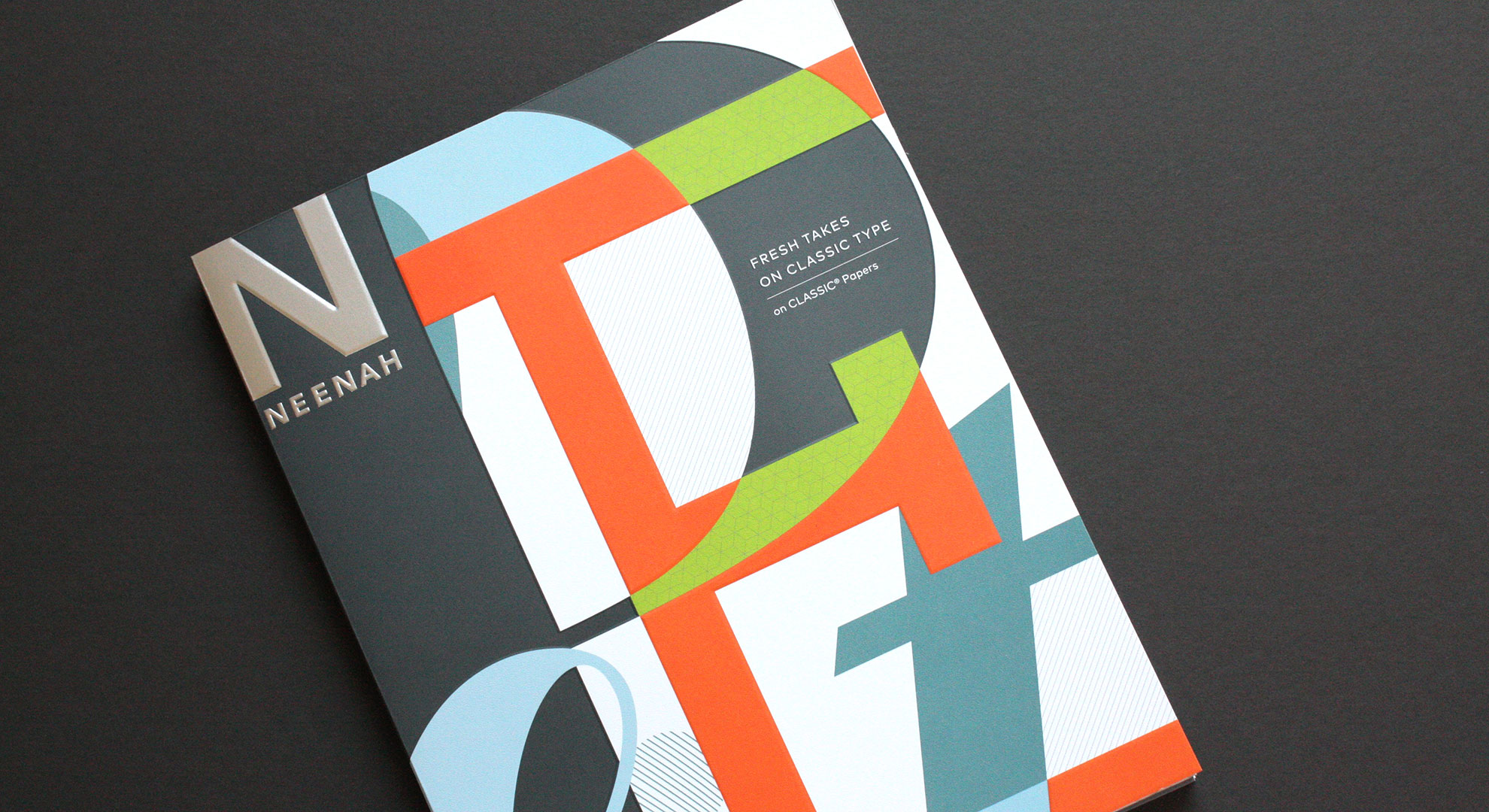
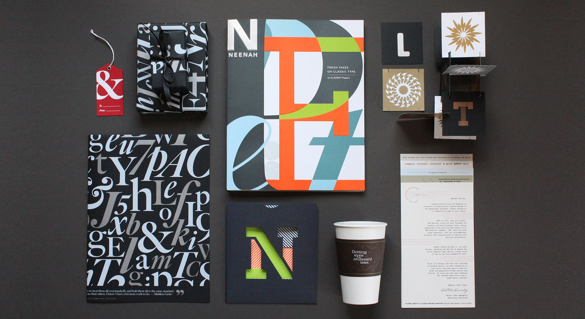
“Nothing makes a designer happier than type and paper,” says Willoughby Design Founder and Chief Creative Officer Ann Willoughby. That sentiment is clearly seen throughout the new book she and her team recently designed for Neenah — the just-released “Fresh Takes on Classic Type on CLASSIC Papers.”
Actually, let’s pause a moment and let you watch the book come to life, then we’ll tell you more about it.
As the central focus of the book’s design, the Willoughby team selected various typefaces to represent the “new classics” of typographic design, thus showcasing contemporary type, and the versatility of the legendary Neenah CLASSIC Papers: CLASSIC CREST, CLASSIC Linen, CLASSIC Laid and CLASSIC COLUMNS.
The book features six highly tactile, visually fresh, and delightfully interactive spreads that showcase the typefaces of prominent type designers including Jessica Hische, Erik Spiekermann and Matthew Carter.
We asked members of the Willoughby design team to share insights into the design of each spread.
Angela Snyder, Senior Designer, on Buttermilk and Brioche by Jessica Hische
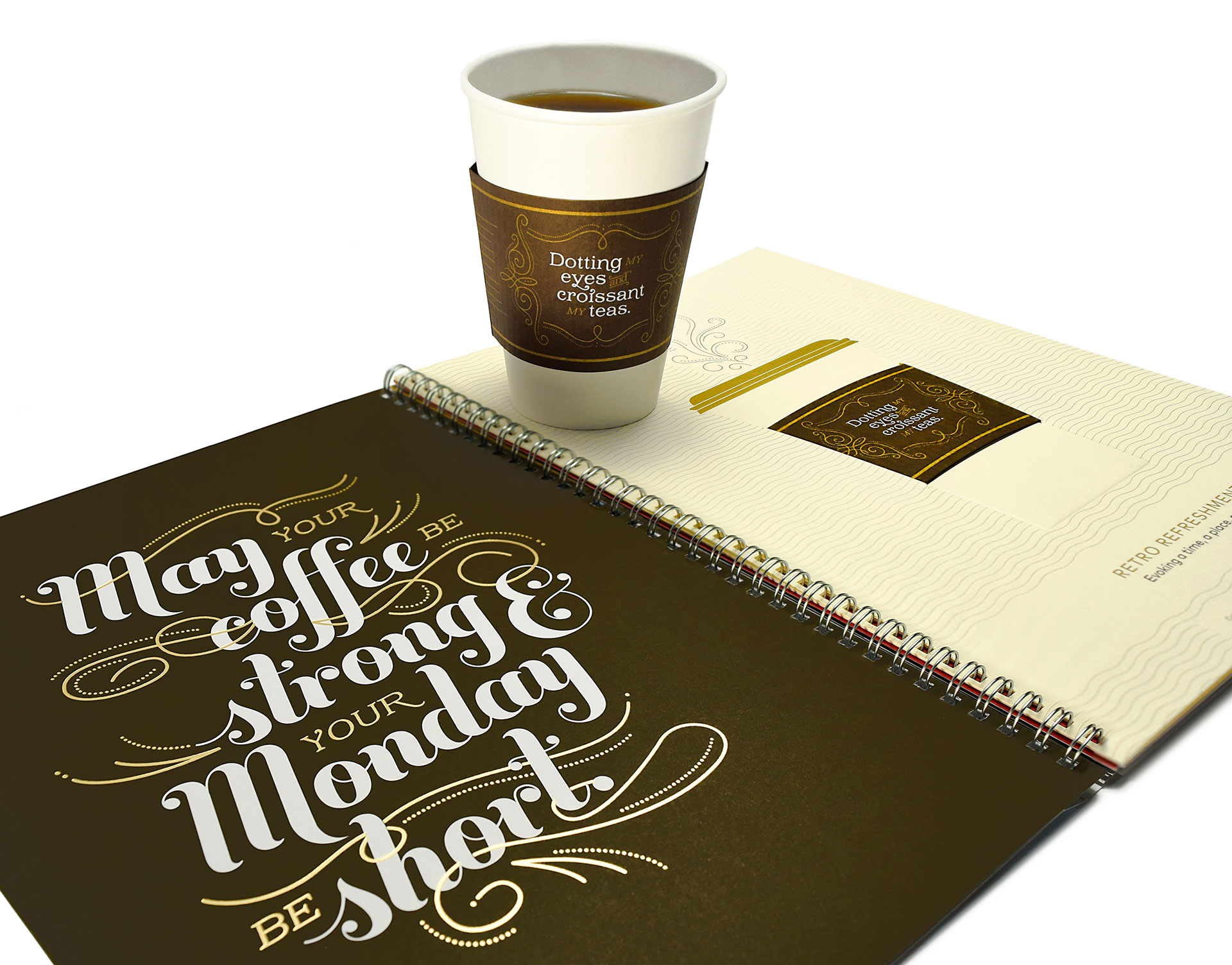
For the first spread in the book, we wanted to evoke a time and place. Jessica Hische’s portfolio of typefaces immediately came to mind. Jessica has created some really great display fonts that we knew would work beautifully.
We liked the idea of a cup sleeve and were tossing around coffee-themed quotes. By happenstance, the book’s writer, Alyson Kuhn, popped out with the phrase, “Dotting my eyes and croissant my teas!” and we knew we’d found our direction. Her quote blended perfectly with a quote I’d found, “May your coffee be strong and your Monday be short.” All that was left was to select the typeface. When we saw that our two favorites from her collection had fantastic food-themed names, Buttermilk and Brioche, we knew it was meant to be.
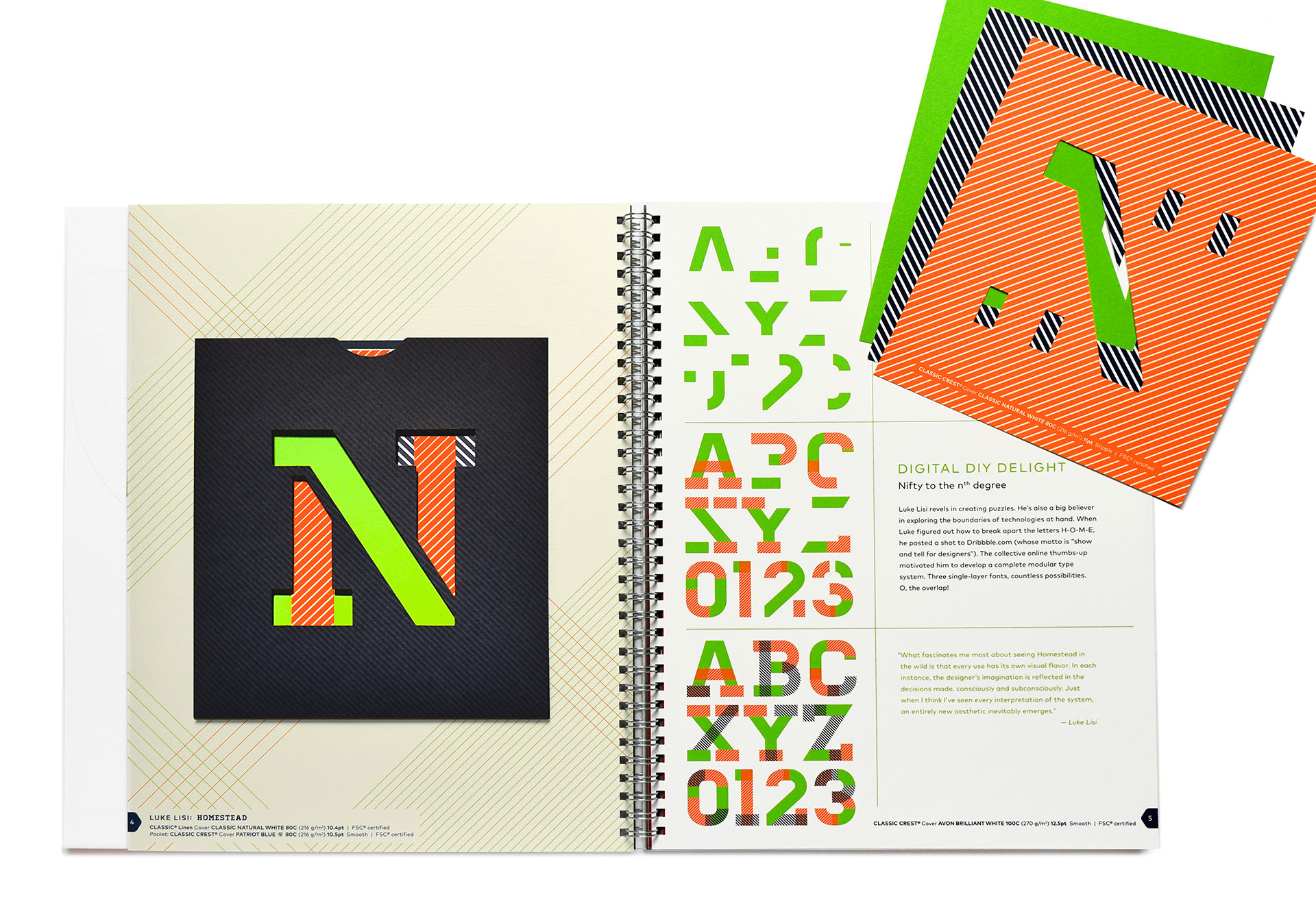
When assembling the list of typographers and typefaces, we really wanted to include someone from the Midwest. I knew the perfect choice was a previous Willoughby Design intern, Luke Lisi. He’s a talented designer who happens to make typefaces and apps on the side. His typeface Homestead has become widely popular over the past few years, appearing in ads and campaigns for companies like Gap, Nike, ESPN and more.
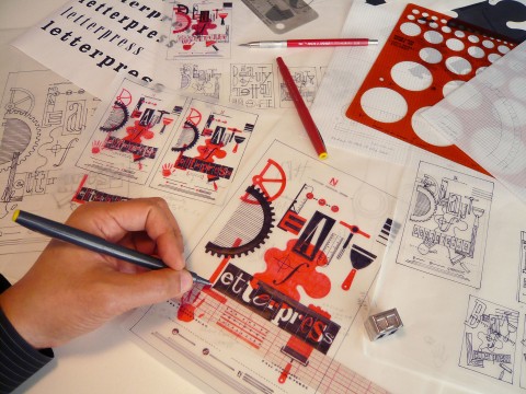
The story about how Luke created this typeface by breaking the letters H-O-M-E apart, receiving encouragement from the online community after posting it to Dribbble, and going on to develop it into the full layered typeface, highlights how technology enables more creatives to contribute great ideas in an open-source economy.
Ann Willoughby, Founder and Chief Creative Officer, on HWT Artz by Erik Spiekermann
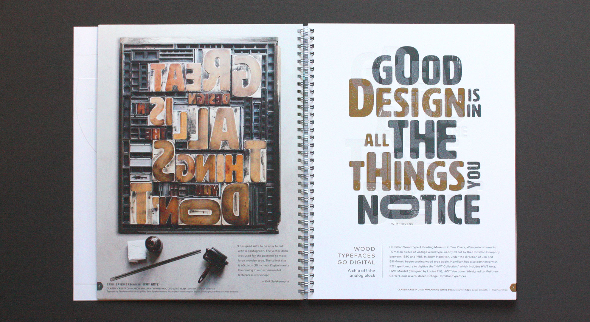
This is my favorite spread. It has a little secret. At first glance the printed quote reads, GOOD DESIGN IS IN ALL THE THINGS YOU NOTICE. But behind it is an embossed quote that reads, GREAT DESIGN IS IN ALL THE THINGS YOU DON’T. We intended for the reversed wood type to suggest the embossing on the right was letterpress printed.
The wood type, designed by Erik, was cut at Hamilton Wood Type & Printing Museum. The letters measure 10″, 6.5″ and 2.5″. At full scale the type bed is over 5 feet high! The digital version of HWT Artz is available to the public with proceeds benefitting the Hamilton Museum.
Alyson Kuhn, ‘Fresh Takes’ author, kuhncierge.com, on Typewriter Type
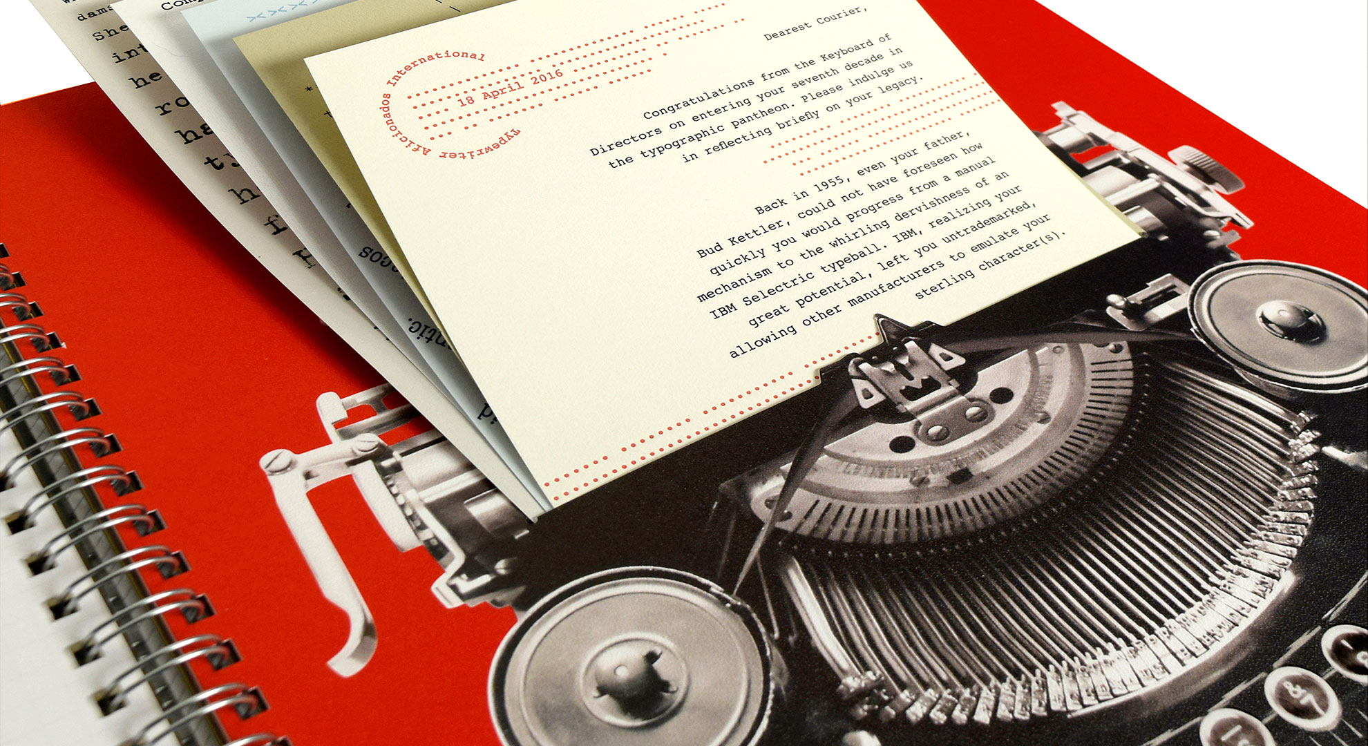
I am particularly fond of the typewriter spread for several reasons. At very first glance, you could think it’s a trompe l’oeil effect, designed to look as if five sheets of paper are coming out of the vintage typewriter. But your hand reaches out… and you discover they are really five separate pieces.
This handful of inserts gave us the creative leeway to showcase a wide array of popular “typewriter typefaces” in different formats, including a timeline and a quiz, on various CLASSIC Papers. And the printer was able to do some understated engineering, die cutting the slit—which you don’t even see once you remove the inserts—and sealing the edges of the page, to create a foolproof pocket. It all makes my heart sing, with that friendly right-margin ding.
Nicole Satterwhite, Creative Director and Partner, on Big Caslon FB by Matthew Carter
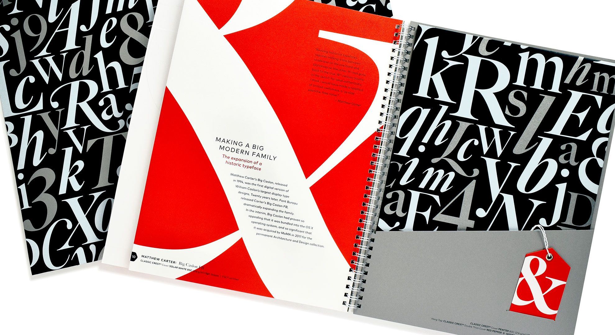
How could we create a book about typography and NOT include the iconic Matthew Carter? We chose to feature his Big Caslon FB typeface and pay homage to its roots by keeping the color palette and the concept simple. The type is showcased on gift wrap inserted into the pocket, and a hangtag was added, because a gift is all about those special touches.
Drue Flynn, Designer, on Roto by Nicole and Petra Kapitza
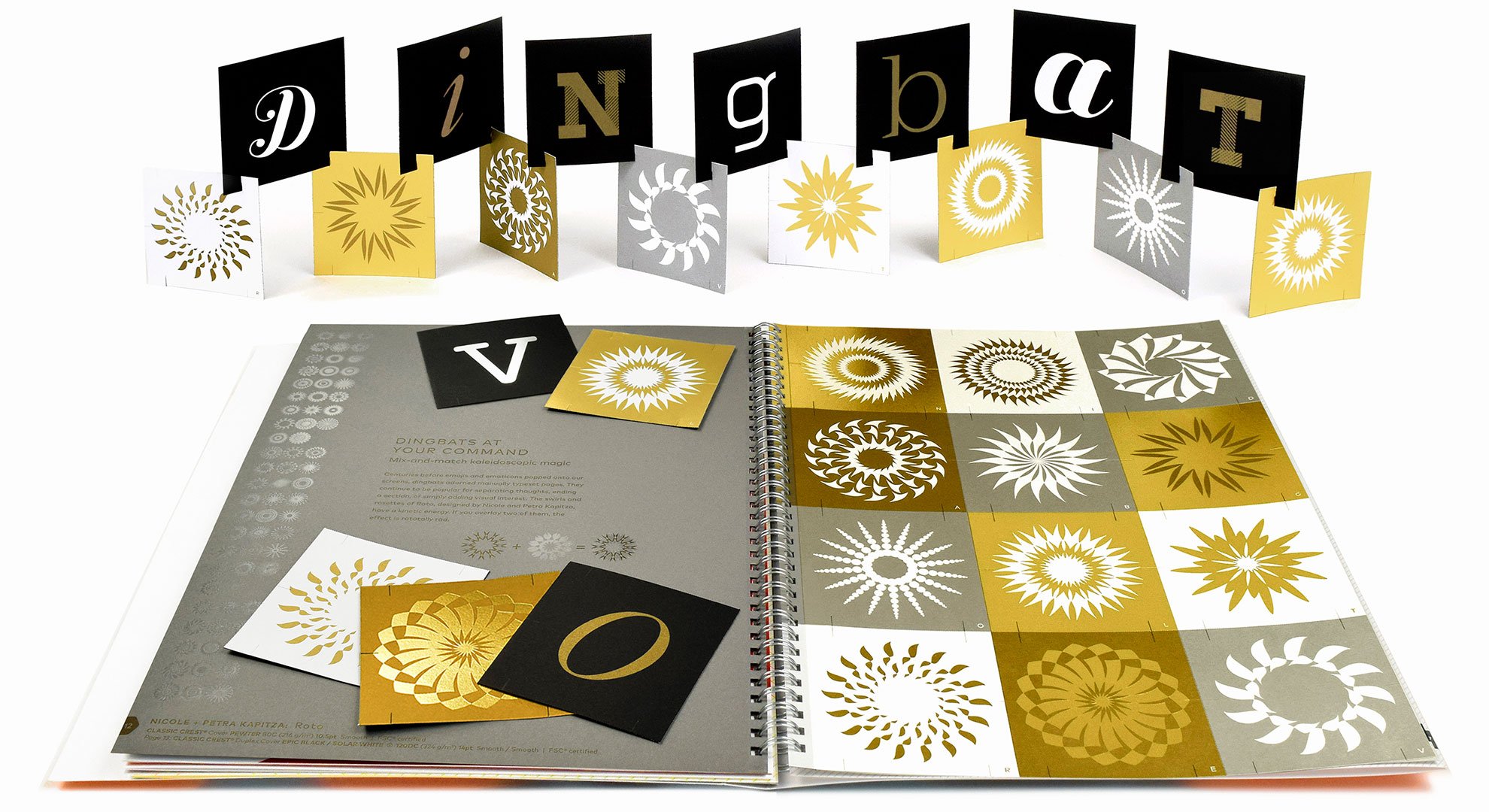
As designers, we know that typography is more than 26 letters, so why not show dingbats some love? We really enjoyed researching and prototyping the interactive paper sculpture on this spread. Our desks were covered in mockups of all shapes and sizes before arriving at the “Dingbat Lover” punch-out cards. The final piece works as a takeaway while also showcasing the versatility and functionality of dingbats and the playful nature of paper.
“Fresh Takes on Classic Type on CLASSIC Papers” is available for free from your Neenah rep or local merchant. Find a distributor here.
Love to get this amazing new Neenah promotion in your hands? Enter to win one of 25 copies right now! Hurry, contest ends Sept. 21st!
SORRY THIS OFFER HAS EXPIRED!
PRO members: Order your copy right here!
Photos: Images 1, 4 and 8 courtesy of Willoughby Design. All other images courtesy of StudioAlex.
CLASSIC CREST, CLASSIC Linen, CLASSIC Laid, and CLASSIC COLUMNS, are all registered trademarks of Neenah.

