 Neenah
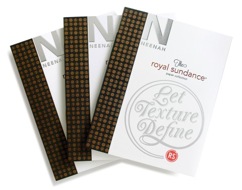
Since the revision to the CLASSIC Paper offering and branding in 2011, Neenah has reinforced the uniqueness of the four CLASSIC Brands, all offering 10 complete, consistent, compatible, perfect colors, as well as digital offerings and a wide range of weights. They called it “PERFECT10N.” In fact, the first CLASSIC promotion was titled “PERFECT10N.”
This was soon followed by the CLASSIC Tool Kit, which was followed by the CLASSIC Colored Folders, and then by the launch of the “What Moves You” CLASSIC dance video. Each time they have attempted to rethink their brand so customers appreciate it for being fresh, new and relevant.
Like any company’s desire for its brand, Neenah has worked hard at keeping its message and look clean, accessible and alive throughout this ongoing campaign.
 Neenah Respects the Past, but Welcomes the Future
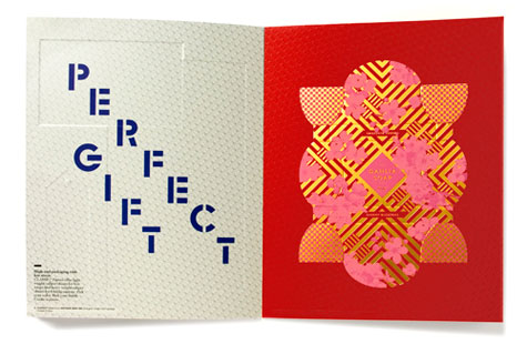
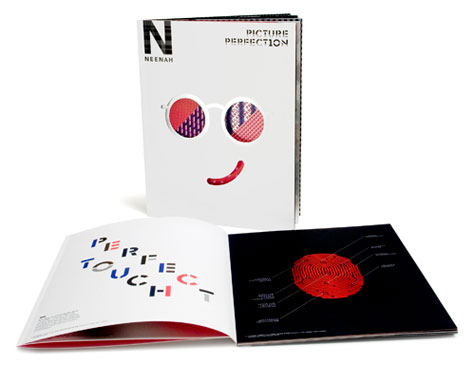
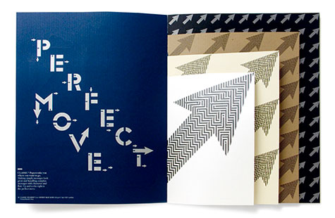
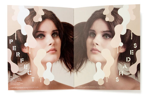
In this fabulous new CLASSIC Paper promotion, “PICTURE PERFECT10N,” Neenah continues to keep it simple-yet-intelligent with common design elements like the dots and lines. For example, on the cover you will see a striking version of the “NEENAH N” logo in plaid. It’s unusual for a company to alter its logo. However, this is actually a new brand phenomenon supported by one of the stronger brands today—Google. It’s a bold, fresh move that fits at the forefront of today’s culture, yet remains completely recognizable.
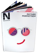
From the smirk on the Avalanche White cover to the metallic ink abstract art on the Epic Black back cover, this promotion delights. It is sure to inspire you to create your own piece of perfection.
PaperSpecs readers, enter to win one of 100 copies of “PICTURE PERFECT10N.” But if you miss out, contact your Neenah sales representative.

