Spotlight: Canon Solutions America
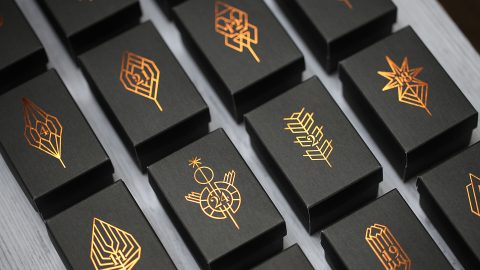
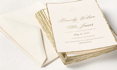
Prepare yourself. What you’re about to see could change the way you approach print design from today onwards. “Aw c’mon,” you say. “I’ve seen it all before: engraving, foil stamping, intricate laser cuts. And it all costs a small fortune.” Yes, it does. But what we’re talking about here is something more fundamental: They are the color and texture of your paper. And when you see what an impact those have on your design when paired with the Canon imagePRESS C10000VP and C8000VP color digital presses, you’re going to realize just how powerful a combination that can be.
Pushing the Envelope Beyond CMYK
It’s an idea that seems so obvious in hindsight, yet how often do you actually see designers use colors and textures this way? There are as many reasons to do so as there are colored and textured stocks with which to experiment; here are just a few:
- Breaking out of the CMYK rut gets you noticed. Everything today is 4-color and Photoshopped within an inch of its life. But choose a sheet in a hot, intense color and print a single color – often black – on top of it, and you’ll capture attention in a hurry.
- Color-on-color printing will blow your audience away. Nothing grabs an audience’s attention faster than an exciting combination of colors, and color printing on top of a color sheet is a powerful way to pull this off. This is really where digital presses such as the Canon imagePRESS C10000VP and C8000VP really shine. Your print service provider has the ability to make on-the-fly changes to the colors during printing, and can generate proof after proof until you get the perfect color balance between ink and paper. All of this without the time and expense of offset makeready.
- Colored stock is more budget friendly than a 5th color. One of this year’s big digital printing trends is the use of a 5th color or clear ink to add extra verve to pieces. While this can be effective, it’s also pricey. As it can take anywhere from 3-12 passes of that 5th color to achieve an acceptable quality, that additional ink or toner you use can really add up. An exciting colored substrate, on the other hand, can give your design the added boost it needs without breaking the bank.
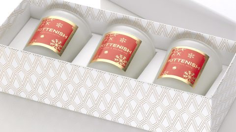
- There are so many papers from which to choose. You can approach the idea of “paper as your 5th color” metaphorically by choosing a sheet with an intriguing finish that seduces the eye as well as the fingertips (linens, textured stocks or even plastic substrates, for example). Or you can do so literally with a wide range of colored papers. There are so many to choose from, all specially treated for perfect printing on digital presses such as the Canon imagePRESS C10000VP and C8000VP.
See For Yourself
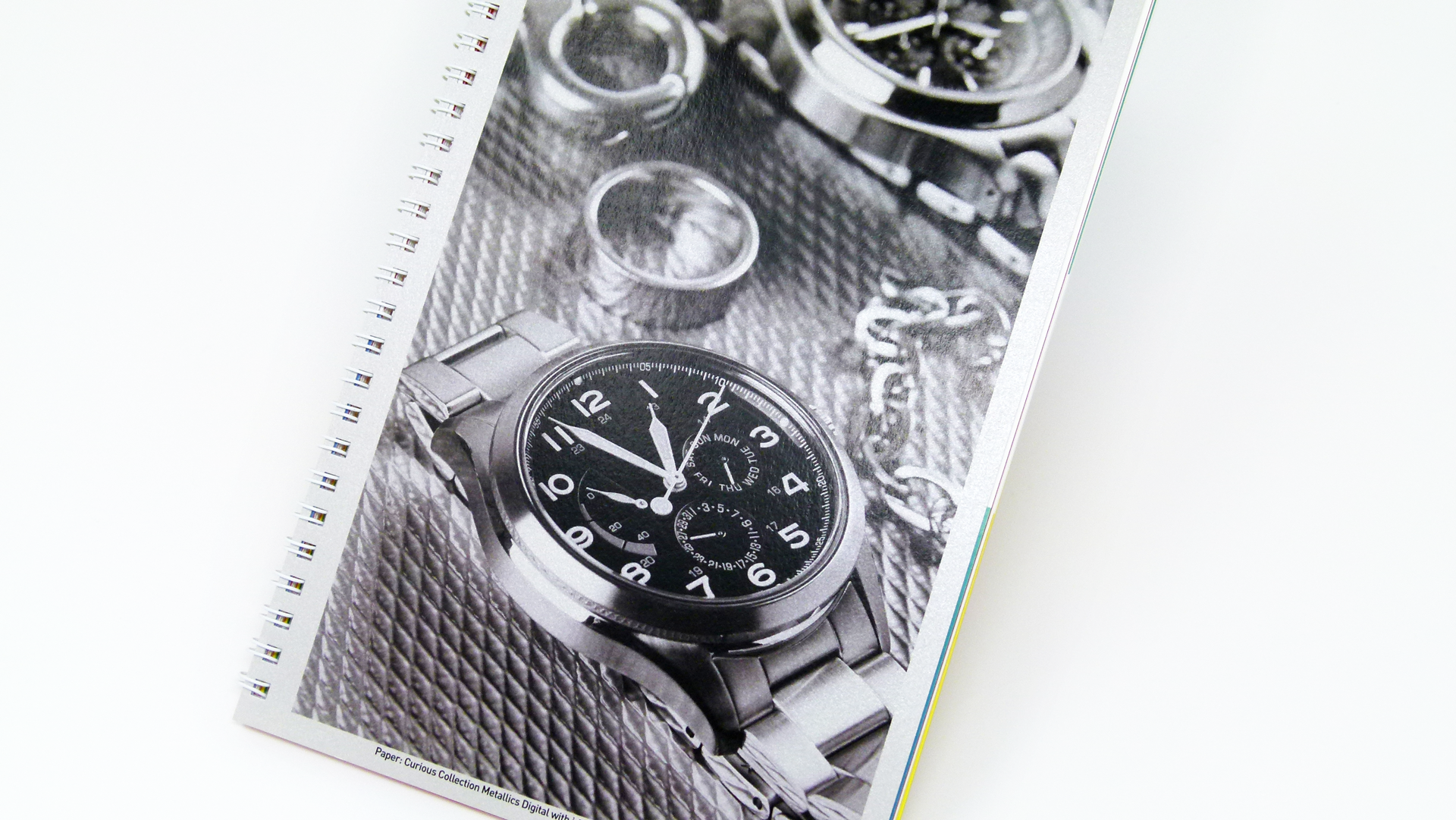
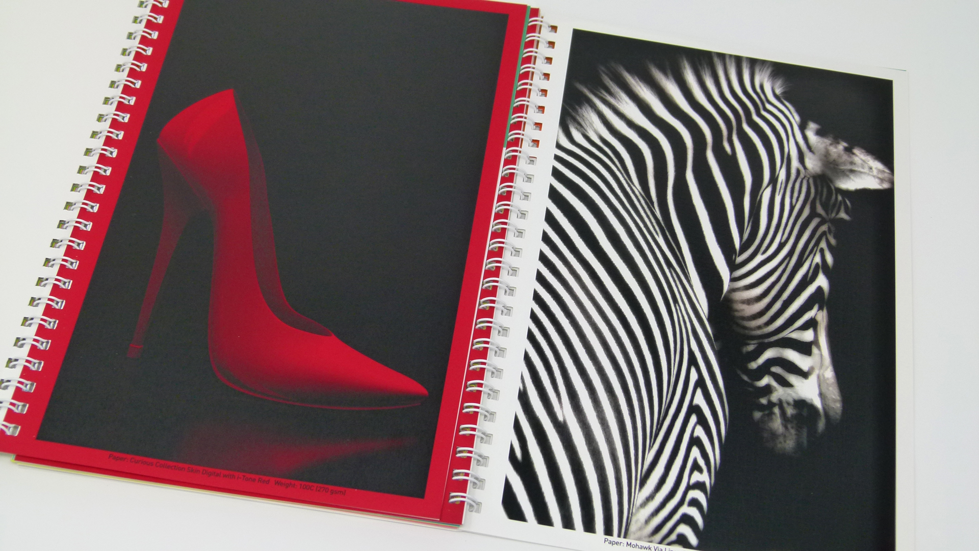
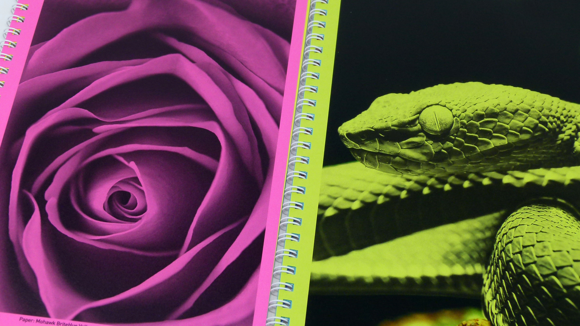
The brilliance of strategically spec’ing colored and textured paper will hit you like a revelation the moment you start thumbing through Canon’s eye-catching showcase: “imPRESS with imagePRESS: Let Paper Be Your 5th Color!” The book is broken up into three sections:
- Bright: All printed on Mohawk BriteHue Vellum in fluorescent “highlighter” colors
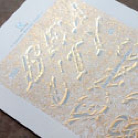
- Dazzling: Featuring Mohawk-distributed Curious Collection Metallics by Arjowiggins
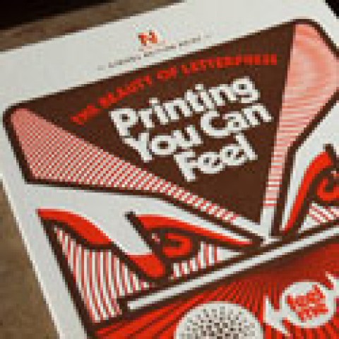
- Bold: Mohawk-distributed Arjowiggins Curious Collection using i-Tone Red and Mohawk Via Linen White.
Ready to see for yourself how easy and impactful using paper as your 5th color can be? [CLOSED] Enter to win one of 100 copies of the “Let Paper Be Your 5th Color” book right now! Hurry, contest ends Nov. 15th! (North American entries only, please.)

