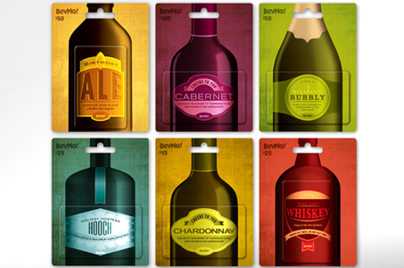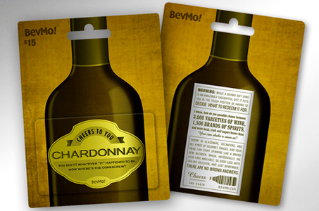
Gift cards combine the best of many worlds – easy, convenient, and unlike its totally electronic cousin, looks and FEELS like a wrapped present. And as a gift card user, these BevMo! varieties are way over the legal limit for great design.
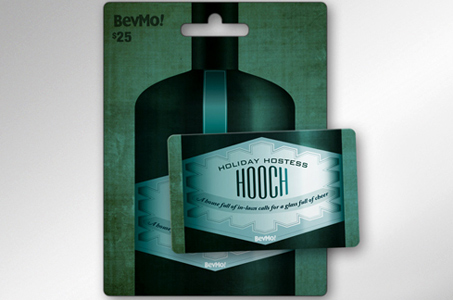
First, the printer (Diamond Graphics) was printing on two very different substrates: 10 pt. C2S paper for the backers and 3 mil PVC for the cards. The cards contained the image of the shape of the bottle as well as the label, so color and finish had to match between the two. Plus, the diecut cards had to be adhered perfectly to the backers so that the two pieces looked like one. Amaaaazing job!
Color palette was deliciously deep, warm and rich. Typography was intricate and expertly executed. The label illustrations were artistically crafted right down to the highlights and reflections you’d see on the real vintage beer and wine bottles that inspired the designers.
Copywriting was smooth and satisfying – what looks like your standard alcohol warning label blends wit and essential product info into a clever and fun marketing message.
Cheers to Fame Retail for an intoxicatingly good project!

