Paper is versatile, vibrant and pleasing to the touch. But sometimes you just want to break out of the paper mold to create business cards that will truly stop people in their tracks. This week, we bake up some goodies, run through the autumn leaves despite the climbing temperature, and find a concrete solution for our next calling card.
Travel Writer’s Business Card
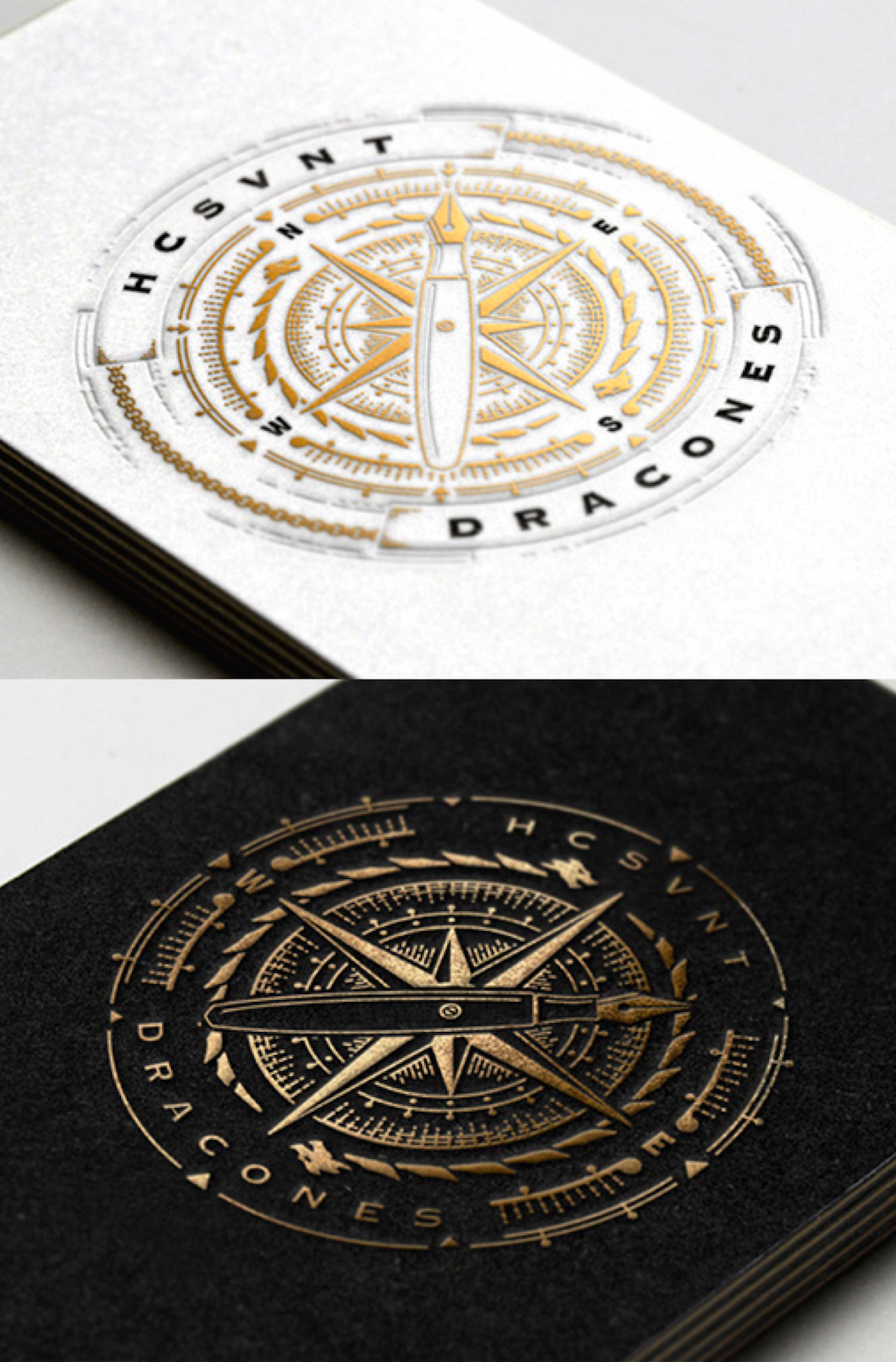
Designed by Joe White for travel writer Biju Sukumaran, these beauties effortlessly wed the traditional compass star with a fountain pen to get the point across, standing out in gold foil whether on a black or white card. The accompanying Latin phrase “Hic sunt dracones” (usually translated as “Here there be dragons”) comes, of course, from the ancient practice of placing illustrations of dragons and other beasts on maps in areas that remained uncharted. A regal, dignified card, this. You feel your credit score rise 5 points just looking at it.
Sliced Bread Business Card
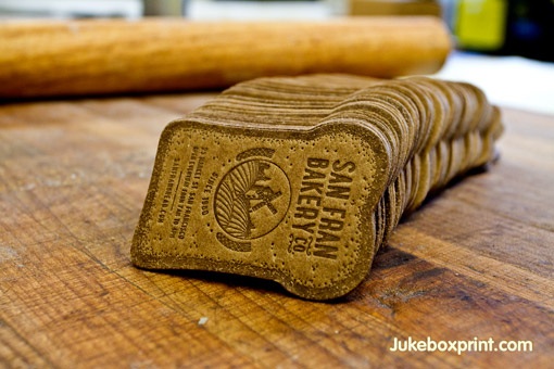
This first one’s a cheat, we grant you, but with a twist. Yes, it’s produced on kraft paper, but then Juke Box Print got good and crazy with these cards for a bakery. As CardObserver explains:
“This complex business card was produced on a 45pt kraft stock with lots of heat and pressure. The outer card was glazed with real baking ingredients before baked in a UV coater.”
Scrummy!
Autumn Leaf Business Card
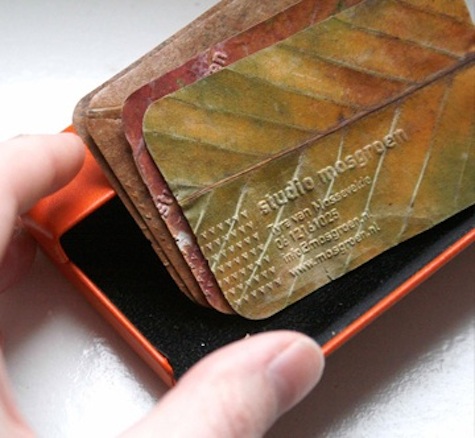
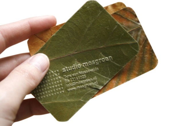
Here’s an impressive – if maddeningly ephemeral – business card concept: dried leaves. Designed by Tyra van Mosseveld, the leaf’s corners are rounded and contact details are embossed on the leaf itself. While we have to assume these require special handling, no one but no one will be able to question your commitment to the environment as far as your cards are concerned.
Concrete Business Card
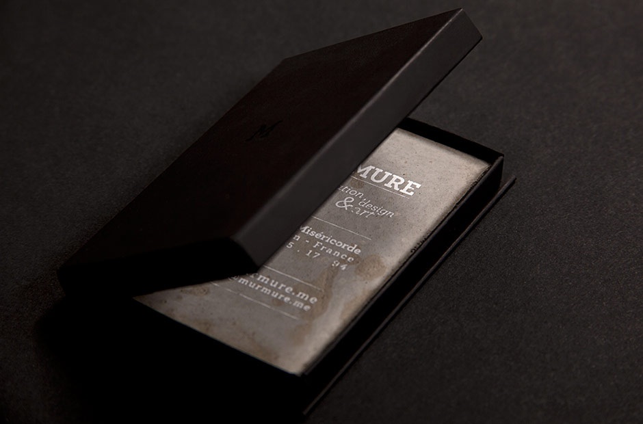
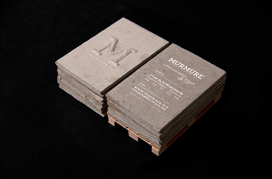
There are thousands of design studios throughout the world doing amazing work, yet you always find yourself coming back to a handful of favorites time and again. France’s Murmure is one of those for us. That’s simply because they don’t seem to let anything stand in the way of their creativity. (You can check out a few of their other projects here.) Who else would create business cards out of concrete? “The refinement and the technique required for the typography highlight the harshness and the roughness of the used material,” they explain on their site but really, no explanation necessary. Sold!

