Packaging the Tools of a Perfect 10
“Unique, smart, useful, creative – the CLASSIC Papers Tool Kit of Color and Texture really stood out for me,” said Patrick Coyne, editor of Communication Arts.
Coyne, who served as PaperSpecs Gallery’s guest judge, selected the Neenah Paper boxed set of resource materials as the winner of the Take Note Award for Quarter Two 2012.
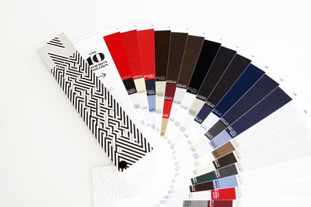
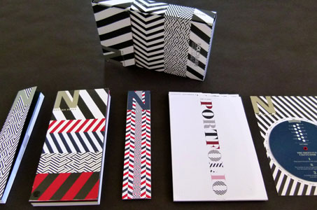
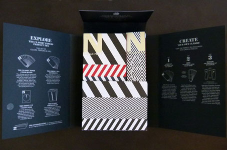
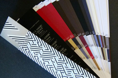
Neenah created a resourceful and inspiring tool kit consisting of five elements: The CLASSIC Paper Color Mixer, The Perfect Ten Fan Swatch, The Sheet Cut Calculator, The Classic Portfolio Kit, and The Envelope Guide.
Boxing a Perfect 10
The toolkit takes Neenah’s “Perfect 10” marketing message, which refers to the 10 colors that CLASSIC Laid, CLASSIC Linen, CLASSIC Crest, and CLASSIC Columns have in common, to a deeper level.
“I really wanted the tool kit to be something that showed people how to use the colors, textures and weights of our papers not only within, but across the four brands,” explains Tom Wright, senior director of advertising and promotion for Neenah Paper.
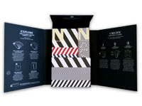
Printed on a beautiful duplex combination with silver metallic ink and black ink, the design is simple, but striking.
The CLASSIC Paper Color Mixer
“I want to touch and feel the papers!” Wright hears this refrain daily and wanted the tools inside the kit to answer this need and to help designers meet the challenges of their day-to-day activities.
“I envisioned the mood boards used by interior design and architectural professionals. These boards elicit the feeling of a room or how a space may end up looking with its various textures and layers. That’s what I wanted this package to do for graphic designers.”
With mood boards in mind, Neenah and the team at Design Army came up with the wonderful idea of a CLASSIC Paper Color Mixer. The Color Mixer provides designers with different ideas about how to mix and match these 10 paper colors.
“For each of the 10 colors in the Color Mixer, we start with a very large chip of color. The first one is Red Pepper. We married three additional colors that work well with it, then we selected three additional samples that show that color combination starting with Red Pepper, but working with other colors within the four different grade lines. All of a sudden, you have 12 different color combinations you could consider putting together without having to dig through each and every swatchbook to try to invent your own.”
The Inspiration of a Classic Portfolio Kit
“I created the PaperSpecs Gallery because I don’t think there’s anything that gets the creative juices flowing like seeing what other talented designers are doing,” says Sabine Lenz, founder of PaperSpecs.com. “But obtaining quality samples and getting them to fit into the format of your presentation package is problematic at best. Neenah came up with a truly unique solution – a mini portfolio of work designed specifically for this tool kit.”
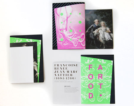
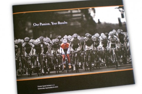
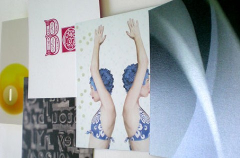
Design Army created various types of promotional materials to show graphic designers how they could use the colors and textures shown in the Color Mixer as a jumping off point for their own beautiful pieces.
The first examples are VIP bracelets in three different colors that were diecut, foil stamped and embossed. The second project happens to be hotel stationery designed around the Monarch size rather than the traditional 8.5 x 11 – a necessity for the format of the portfolio, but also a very appealing design approach.
“One of my favorite portfolio pieces is a museum brochure that has so much texture and visual appeal. It’s printed with fluorescent ink and has different sizes of signatures stacked, saddle-stitched and diecut at unique angles,” says Wright.
Design Army did two more sample designs to round out the portfolio: a diecut ring-sizing chart for a jewelry company, which helps to show off Neenah’s pearlized papers and a table tent made with a great duplex paper combination showing cocktail recipes front and back.
Everything Old is New Again
From the retro Sheet Calculator Wheel, which is much more fun than its electronic counterpart, to the small gap inside the box that inspired the creation of the Envelope Guide, Neenah ultimately produced a tool kit with classic elements, relevant content and modern context. It allows designers to be brave and to use color combinations they may never have envisioned. That alone is an award-winning idea for busy professionals.
NOTE: See more inspiring designs in our weekly Paper Inspiration video series.

