Inspired by a big dilemma brought on by what often doesn’t get taught in design school – preparing files for printing – Andy Brown designed a small but mighty manual. Now in its third printing, The Print Handbook presents critical, basic information in a clean and concise way.
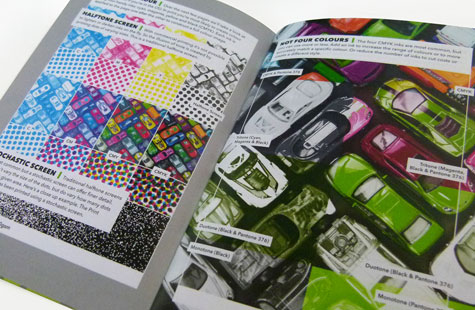
Getting viewers to read is a big challenge for any designer – even if the audience is interested. Brown does this well. The 28-page booklet is a user-friendly length and its 4.7 x 7 size handy enough to take anywhere or store computer-side. Visually, the CMYK plus bright green spot color is engaging.
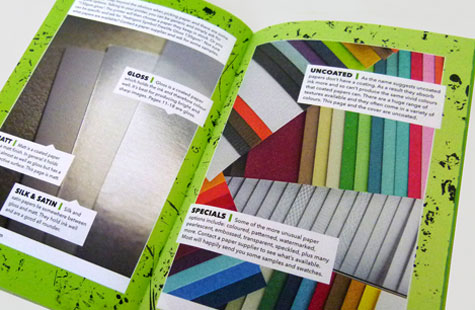
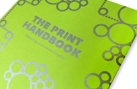
The mix of stocks was not only needed for illustrative purposes, but was beautiful to look at and delightful to touch. A Sirio Lime uncoated cover stock paired with metallic silver ink sets a fresh tone. I really liked the illustration on the cover as well. I’ve seen a lot of graphics depicting press rollers with paper and thought the pattern here was fun.

