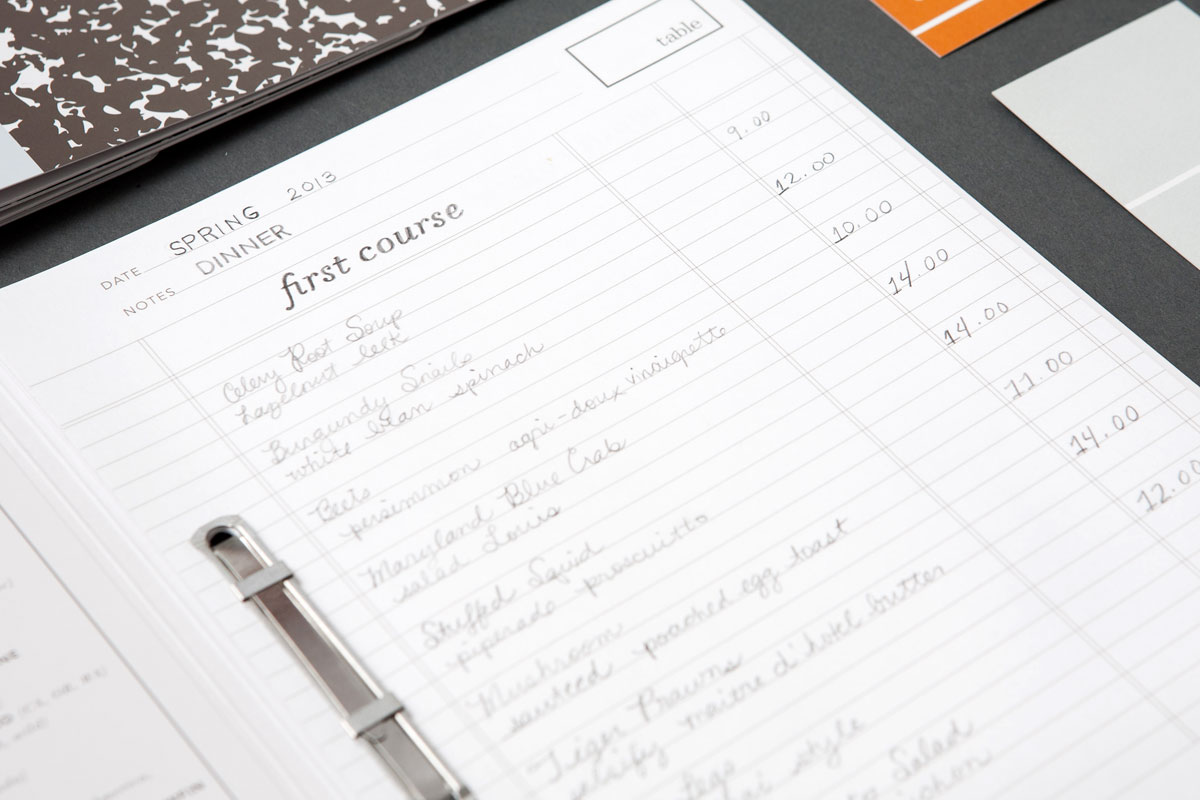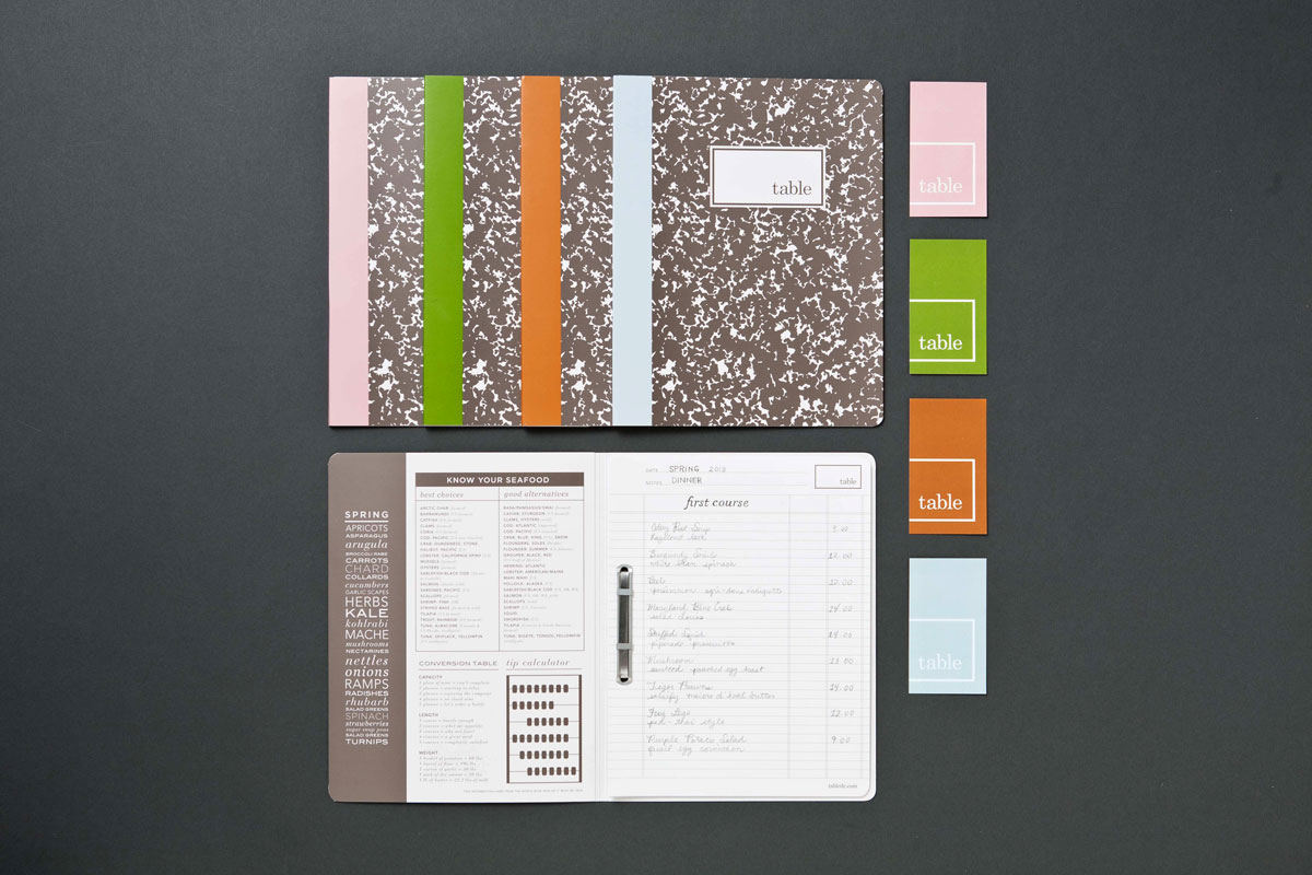
The notebook design was inspired by the restaurant owner’s approach to food and cooking and his experience working in France where restaurants use handwritten ledgers for wine lists.
When Table Restaurant first opened, its unique handwritten menus received so much press and became so popular that patrons began taking them home. As you might imagine, this charming personal touch became too time-consuming. The General Design Company came up with a perfect solution that maintained the character and appeal of those original menus.
The team designed a ledger paper that could be printed in-house and inserted into the notebook-style covers. Their printer suggested folded-and-glued covers, which not only kept the printing on one side of the sheet (a money-saver), but also offered additional durability. Two-prong paper fasteners bound the two-hole-punched covers and interior pages together.
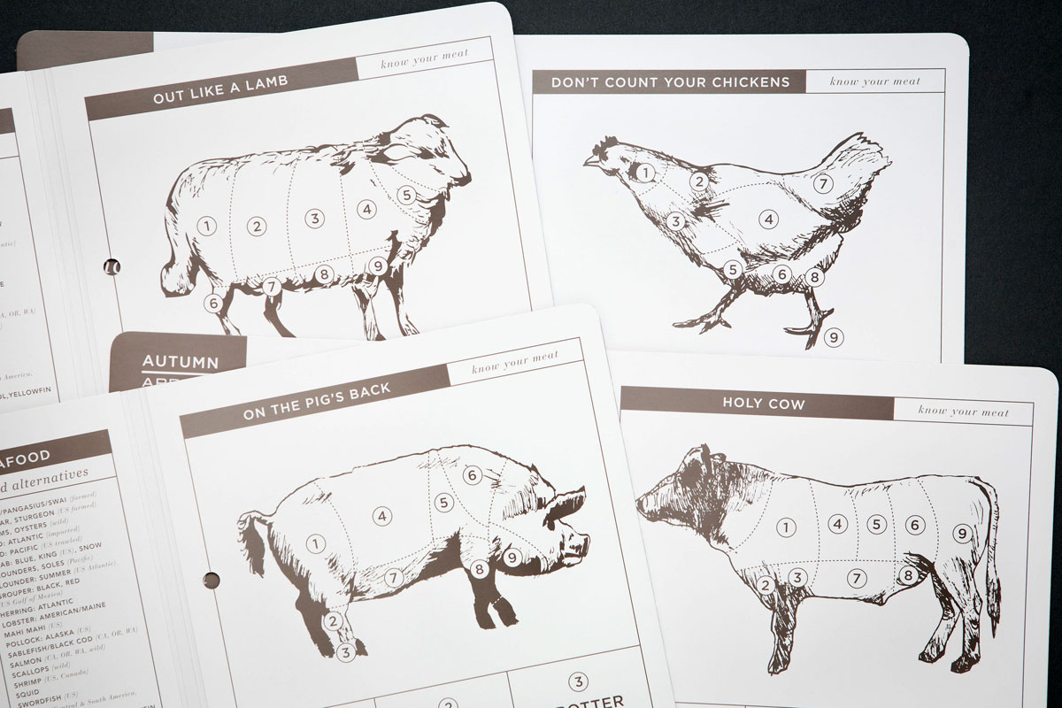
An emphasis on seasonal ingredients inform the menus colors, which change every season. Details on the inside of the covers are playful and engaging. Once you’ve decided on your meal, you can explore the copy for funny tidbits of information (2 glasses of wine = starting to relax, 3 glasses of wine = enjoying the company …)

